Inorsa
Reimagining a brand for coverage
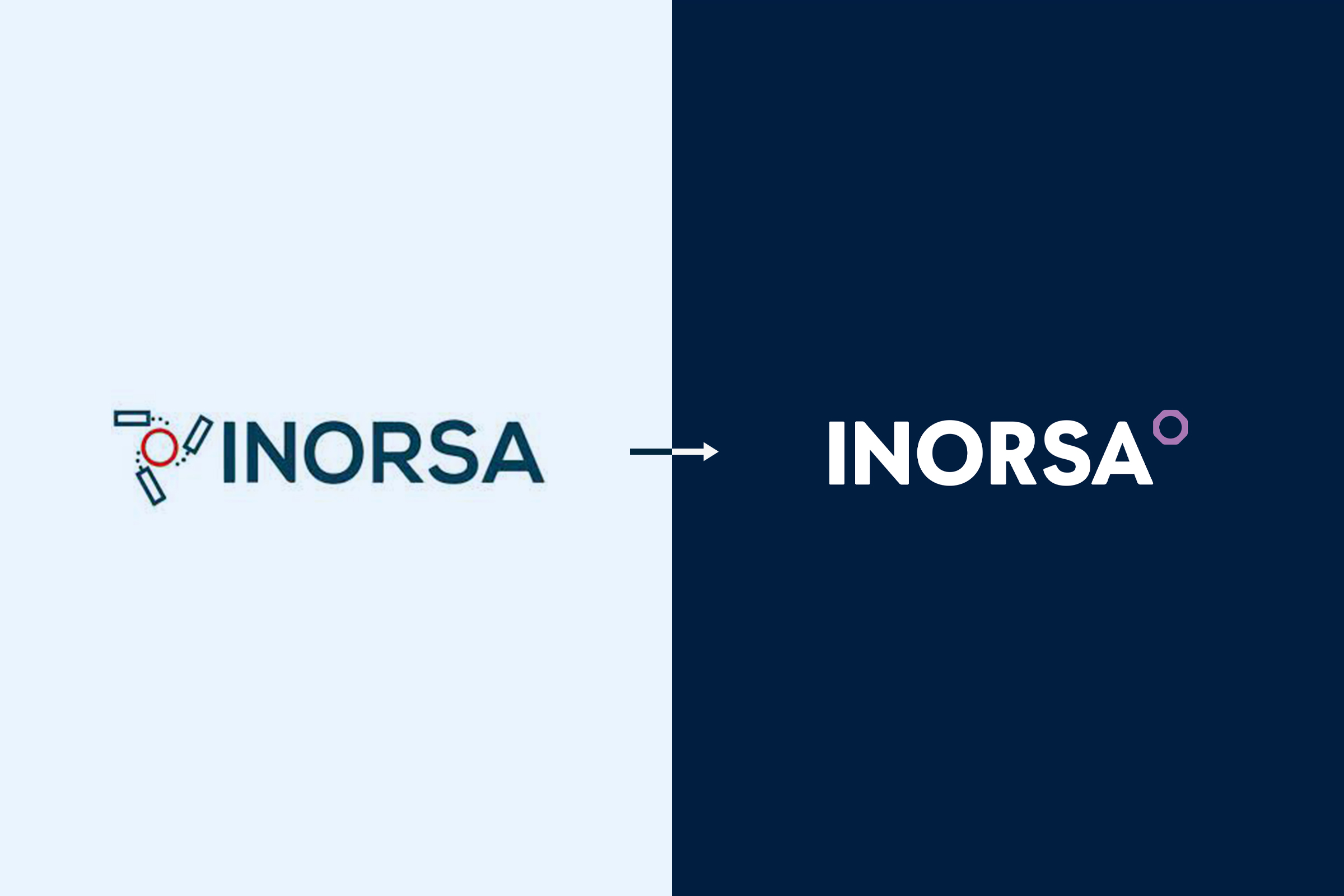
We assembled a sequence of leadership conversations starting with the importance of the brand and what it is envisioned for its future. Then we used that shared knowledge as a launching point for reimagining the new Inorsa brand identity and visuals. Inorsa wanted to expand its service offerings beyond telecommunication. Therefore we needed to suppress any visual language that restricted the brand. We started by replacing the cell tower as the brandmark with the newly molded hexagon grid icon. Then we uplifted the wordmark with a friendly, more confident sanserif type family.
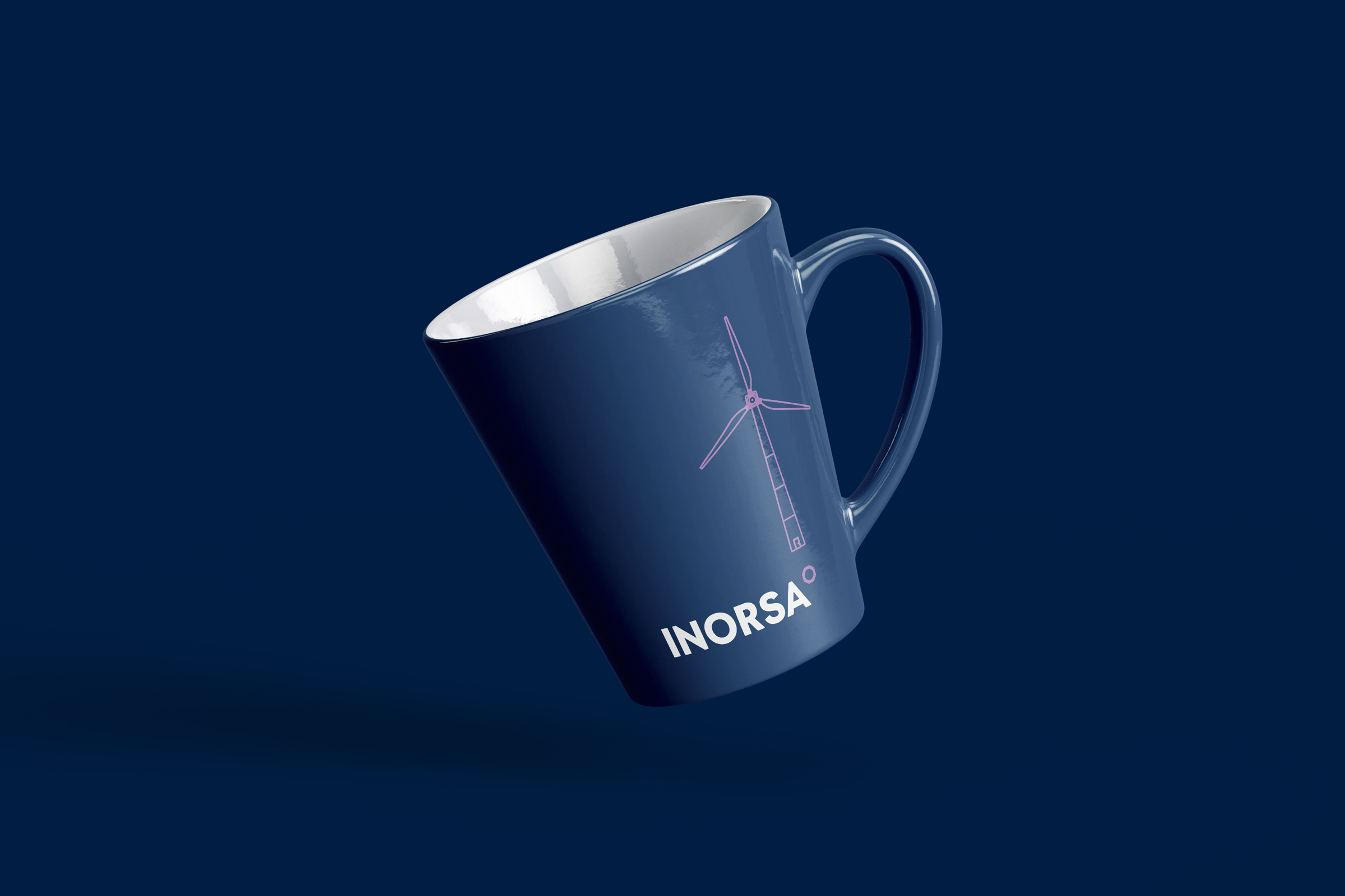
The new identity was impowered with a rich color palette, suggestive of Inorsa’s technology-centric nature. Then we used simple line art compositions with a pop of color from the new corporate color palette. We conceptualized a unique photographic style to enhance relevancy to all industries served by Inorsa. Lastly, we created a website that provides easy access to all service offerings with immense flexibility for future additions.
Client Goals
prepare for service expansion
Increase relevancy
Improve Confidence
Transmit Brand’s Essence
engage New Investors
build brand awareness
spark interest
elevate brand experience


Explore More from OWDT
Each project we undertake is a study in precision — where design, technology, and storytelling converge. Discover more of our work and see how we help institutions, brands, and innovators shape digital experiences that endure.
Have Us Contact You

CLOSE PANEL
Thank You.
Your information has been transmitted successfully and securely.
CLOSE PANEL