
Clear Evaluations
The New-Look
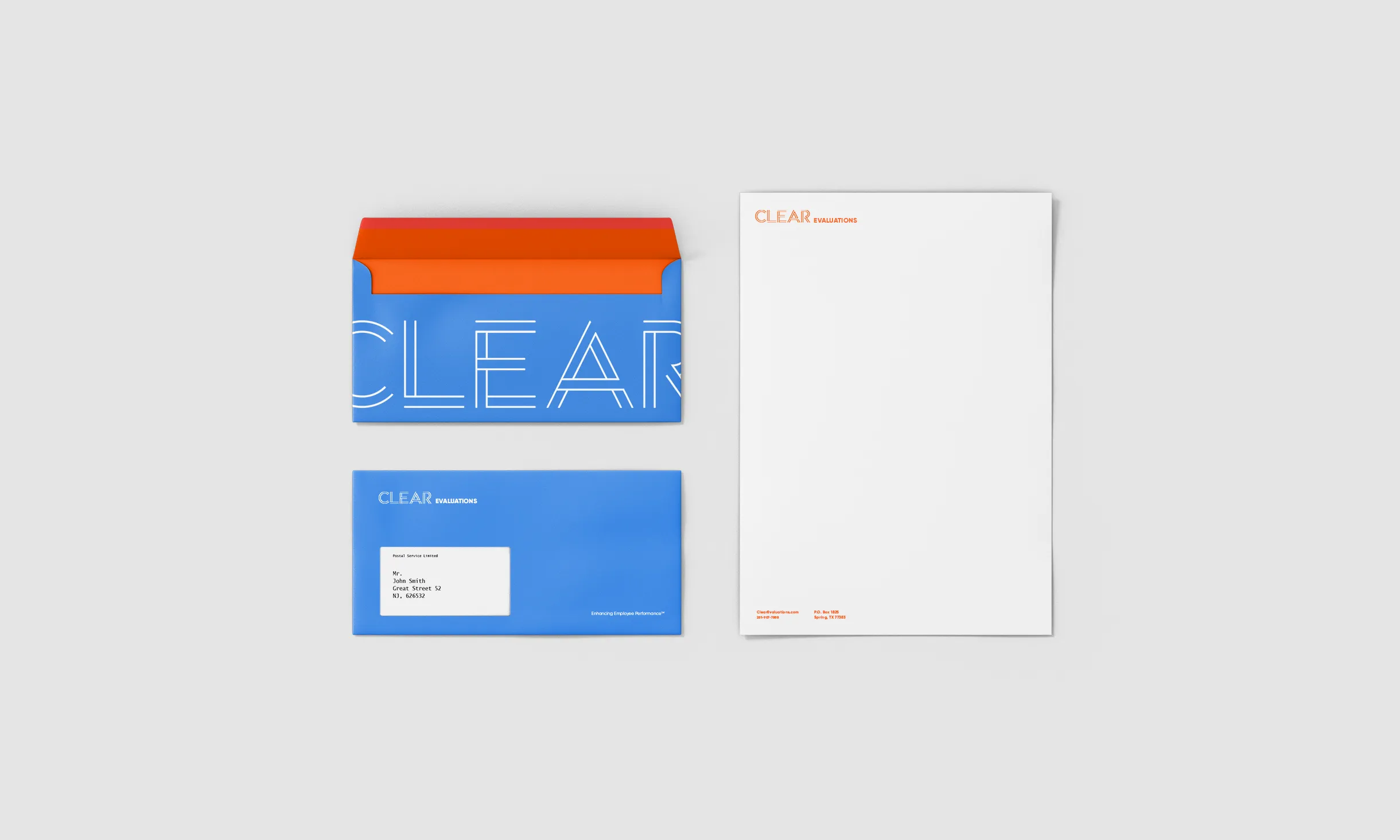
OWDT was retained to reimagine a bold and confident identity in line with CE’s productive approach. OWDT worked closely on the project with leadership at Clear Evaluations and successfully created a typographic system based on the idea of presenting a series of lines and bars, a concept highly connected to the nature of presenting data and evaluations.
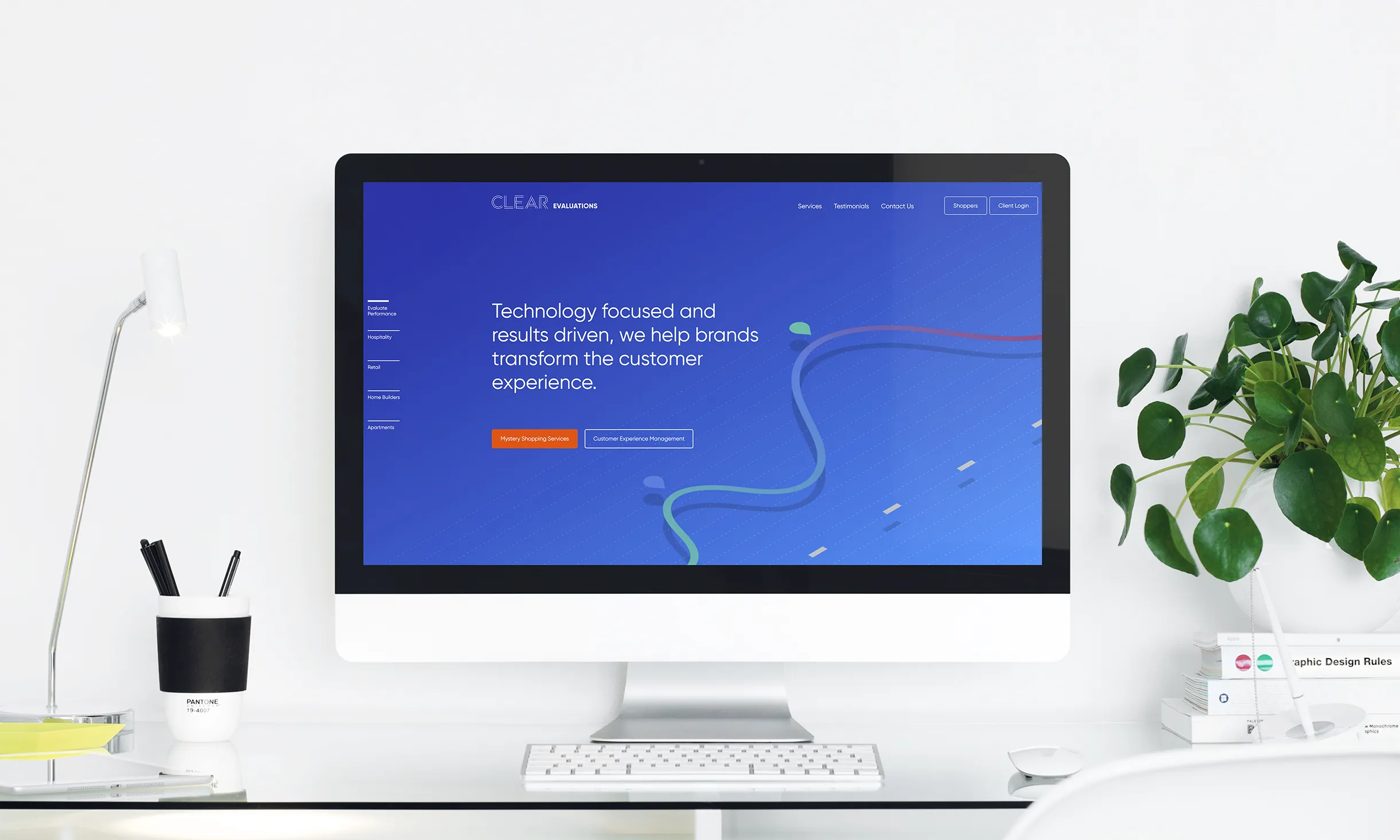
The primary brand color has been selected as deep blue, accented by a palette of the bright, optimistic secondary color of light blue, bright orange, and minimal green that will be residing in images.
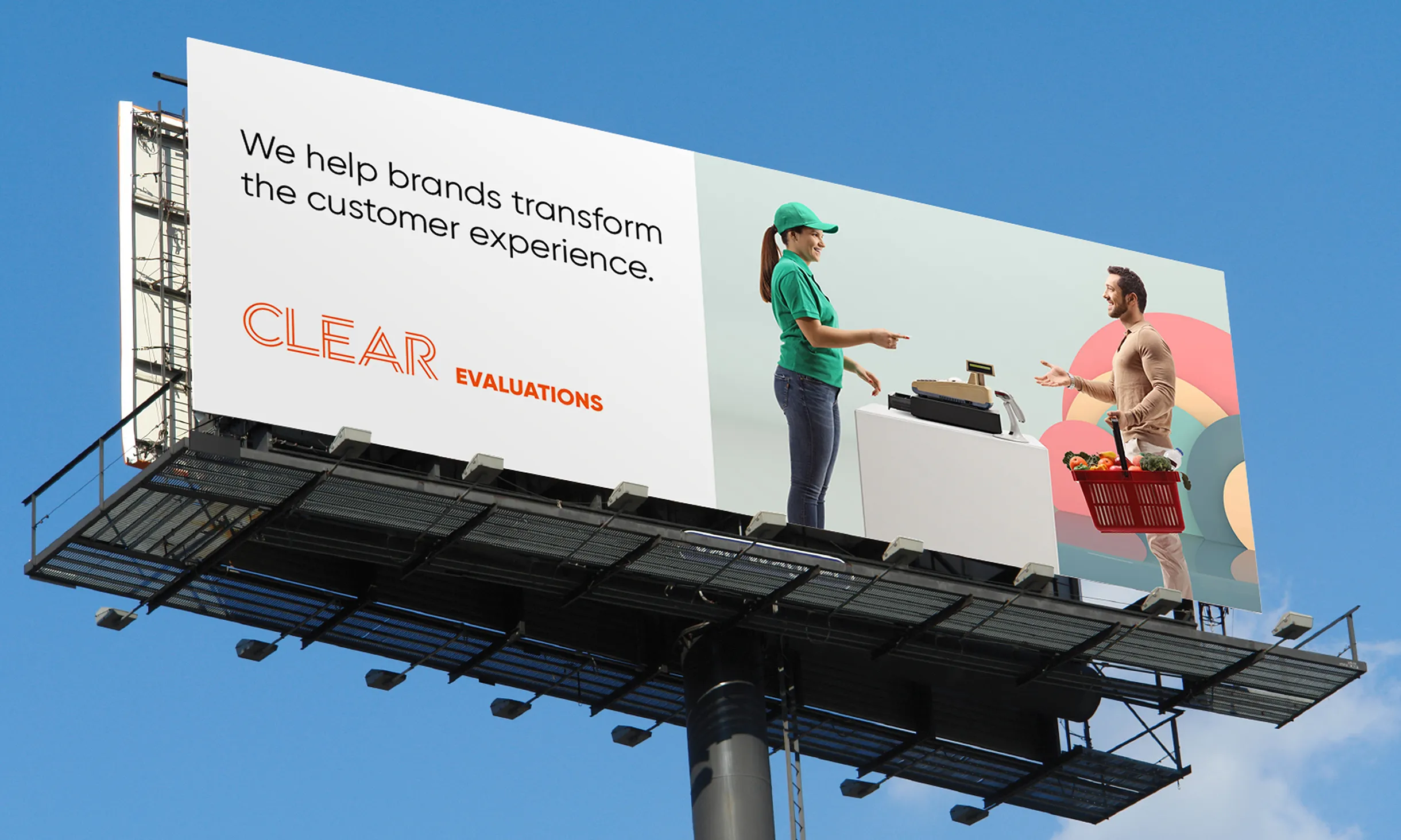
We proposed and developed images that capture the visible manifestation of Clear Evaluations’s work as well as the spirit of the less visible, as seen through the people whose lives are impacted by CE’s performance. We also suggest using illustrations in combination with images to describe the principles of mystery shopping and other service offerings.
Client Goals
Modernize the Visual Identity
Being Bright & Optimistic
Bold & Confident
Transmit Brand’s Essence
Increase Demand for Services
Engage New Clients
Reignite the Organization’s Core Purpose
Inspire Employees & Partner Companies
Build Brand Awareness


Explore More from OWDT
Each project we undertake is a study in precision — where design, technology, and storytelling converge. Discover more of our work and see how we help institutions, brands, and innovators shape digital experiences that endure.
Have Us Contact You

CLOSE PANEL
Thank You.
Your information has been transmitted successfully and securely.
CLOSE PANEL