Battista
Brandmark meant to last forever
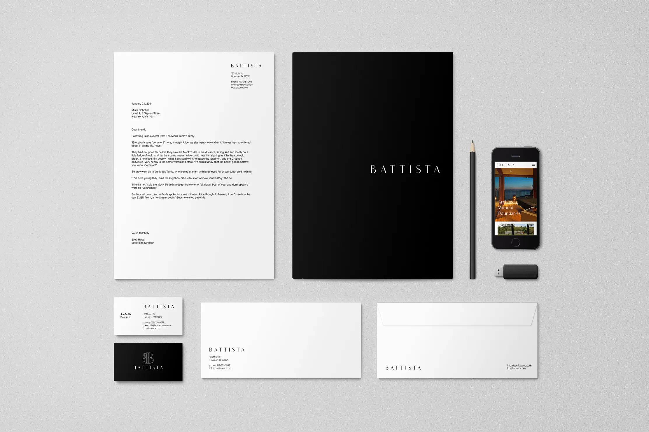
OWDT was retained to plan and design the brand identity for Battista, a prominent architect firm that desired an authentic yet consistent design that is not frozen in time. Architects have so much to work with: steel and glass, plastic and polymers, fabric and finishes. On the other hand, living in a world of pixels, we often find our choices reduced to one: typeface.
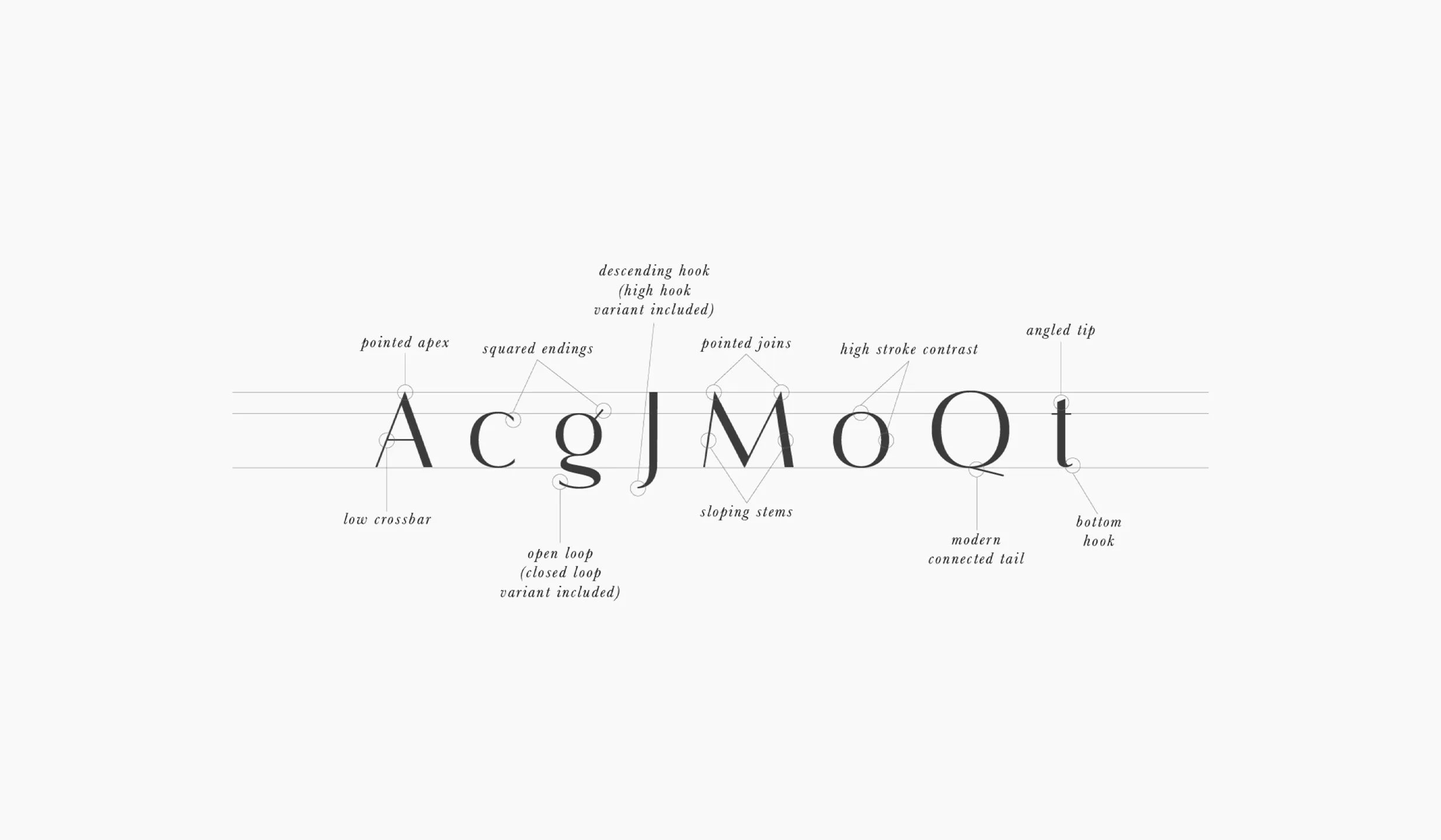
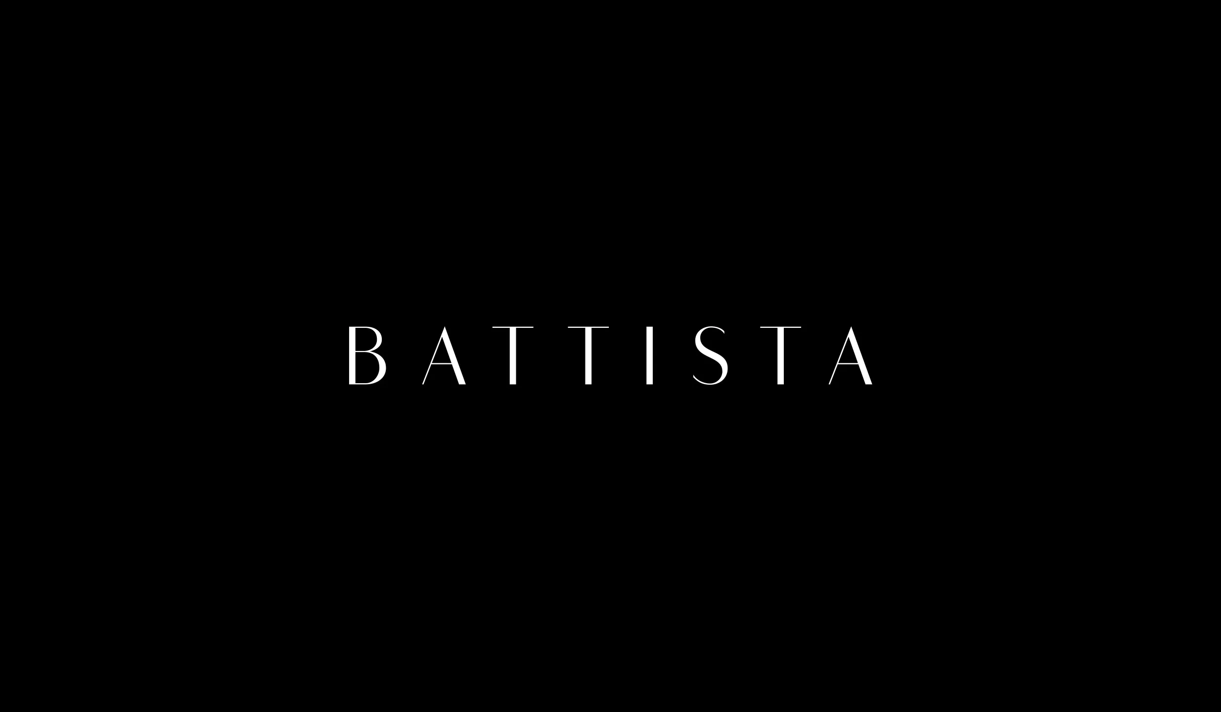
We chose Flatline, an elegant, modern sans serif font family. Meticulously drawn with high contrast between thick and thin strokes with the goal of making even the simplest words look sensual, elegant, and warm.
The result was a fine piece of art. Our solution was direct. The brand mark looks elegant and engineered, yet is it tailored and understated. It authentically connects with the core of the organization it presents.
Client Goals
Timeless Design
Elegant Behavior
Transmit Brand’s Essence
Unique Brand Experience
Modern Recognizable Symbol
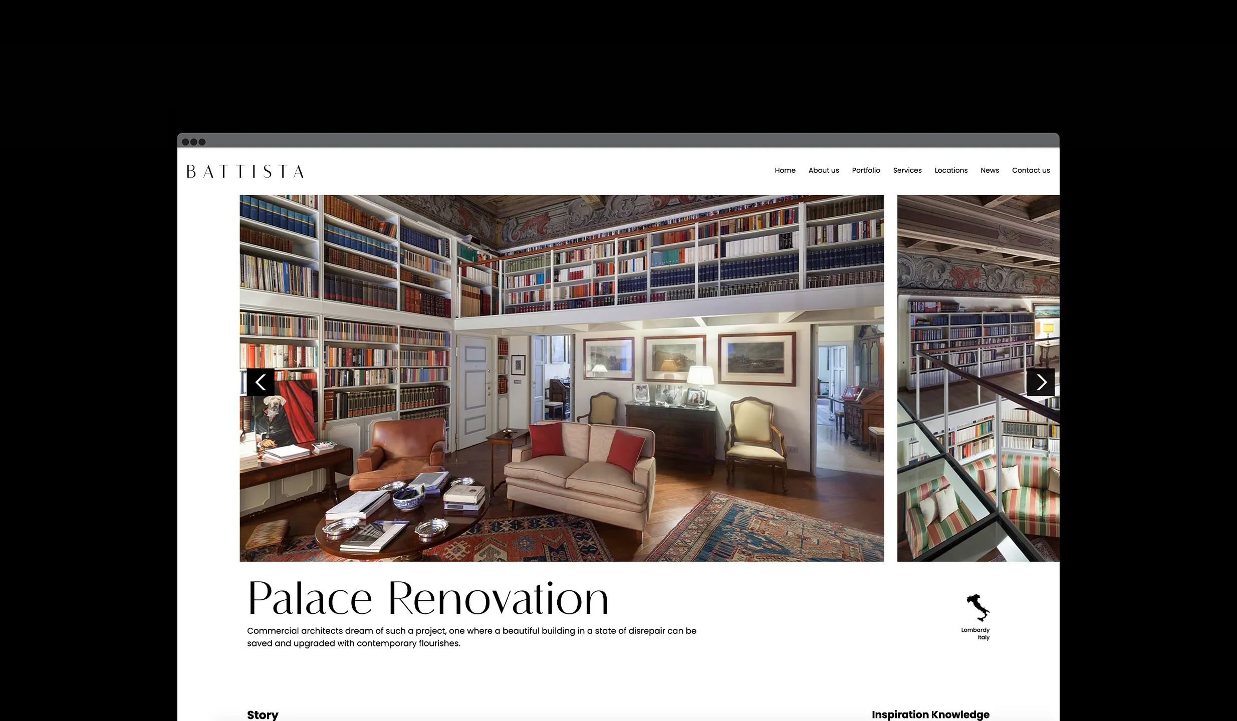
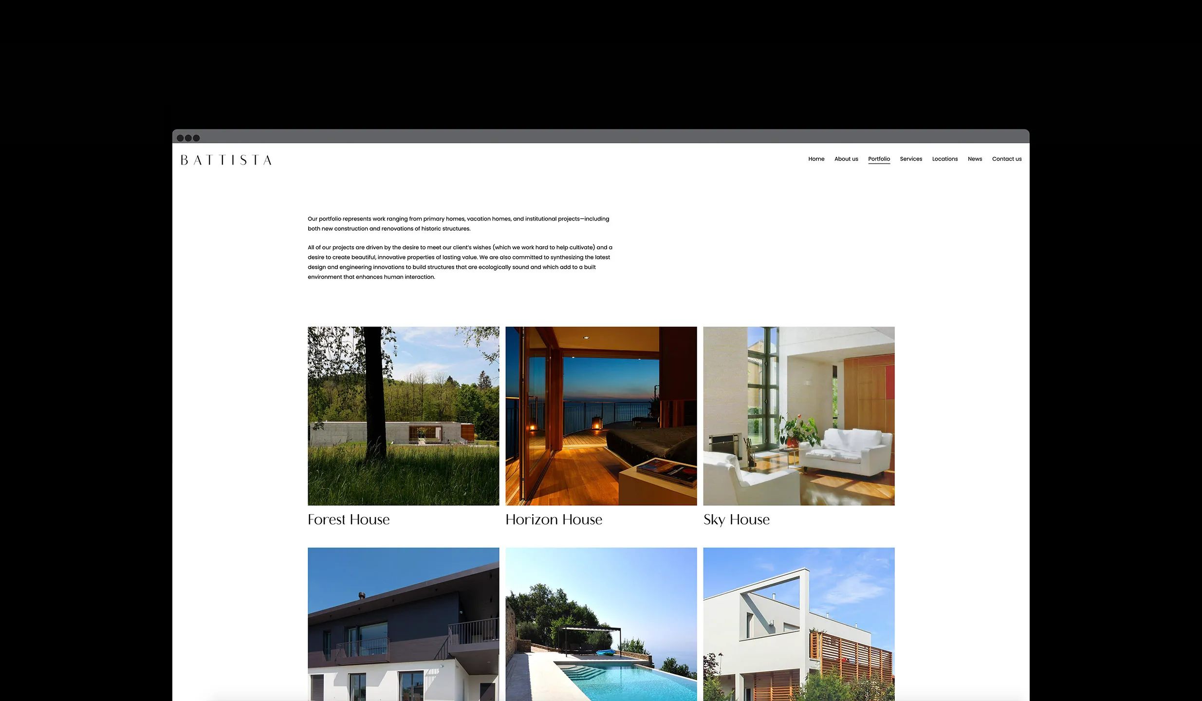
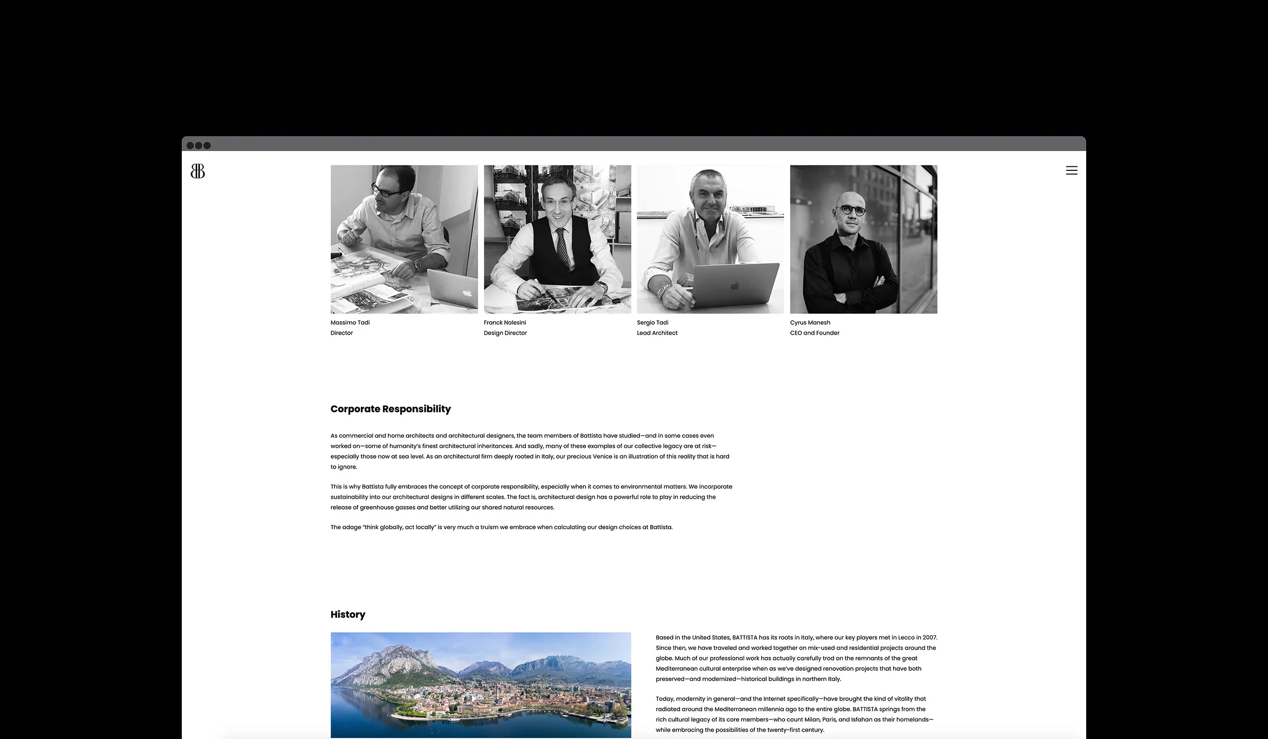
We use the medium of web design and the principles that govern our psychology to deliberately evoke a sensory effect, persuading users to take specific actions that benefit them.
Our goal is to cultivate a multilayered communication that speaks to the responsive faculties of our being by using the domains and disciplines within content and design.


