
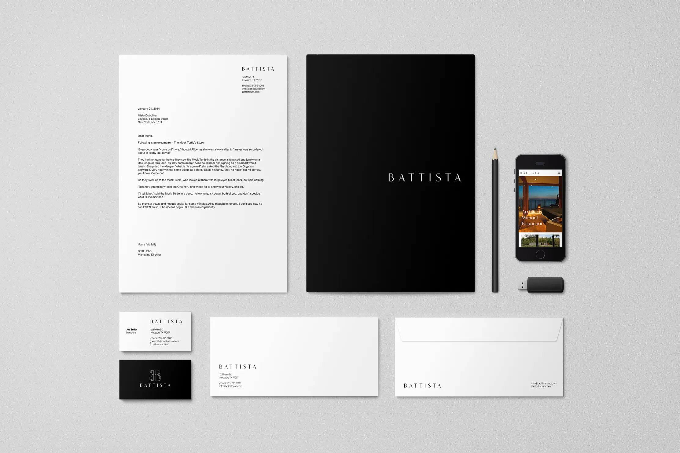
Battista
Brandmark meant to last forever
OWDT was retained to plan and design the brand identity for Battista, a prominent architect firm that desired an authentic yet consistent design that is not frozen in time. Architects have so much to work with: steel and glass, plastic and polymers, fabric and finishes. On the other hand, living in a world of pixels, we often find our choices reduced to one: typeface.
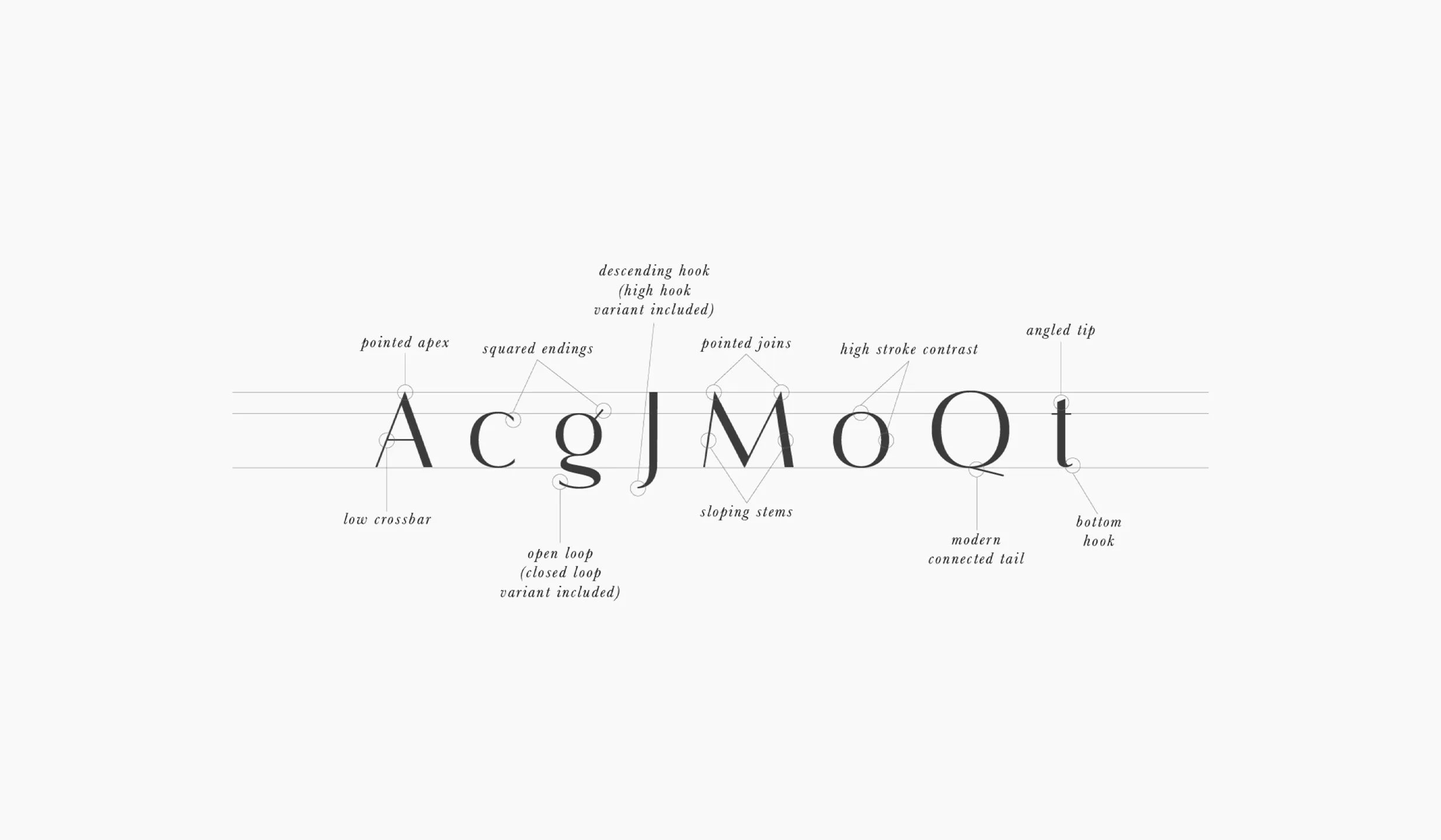
We chose Flatline, an elegant, modern sans serif font family. Meticulously drawn with high contrast between thick and thin strokes with the goal of making even the simplest words look sensual, elegant, and warm.
The result was a fine piece of art. Our solution was direct. The brand mark looks elegant and engineered, yet is it tailored and understated. It authentically connects with the core of the organization it presents.
Client Goals
Timeless Design
Elegant Behavior
Transmit Brand’s Essence
Unique Brand Experience
Modern Recognizable Symbol
Explore More from OWDT
Each project we undertake is a study in precision — where design, technology, and storytelling converge. Discover more of our work and see how we help institutions, brands, and innovators shape digital experiences that endure.
Have Us Contact You

CLOSE PANEL
Thank You.
Your information has been transmitted successfully and securely.
CLOSE PANEL