Arctic
Distinctly Setting Arctic Semiconductor Apart
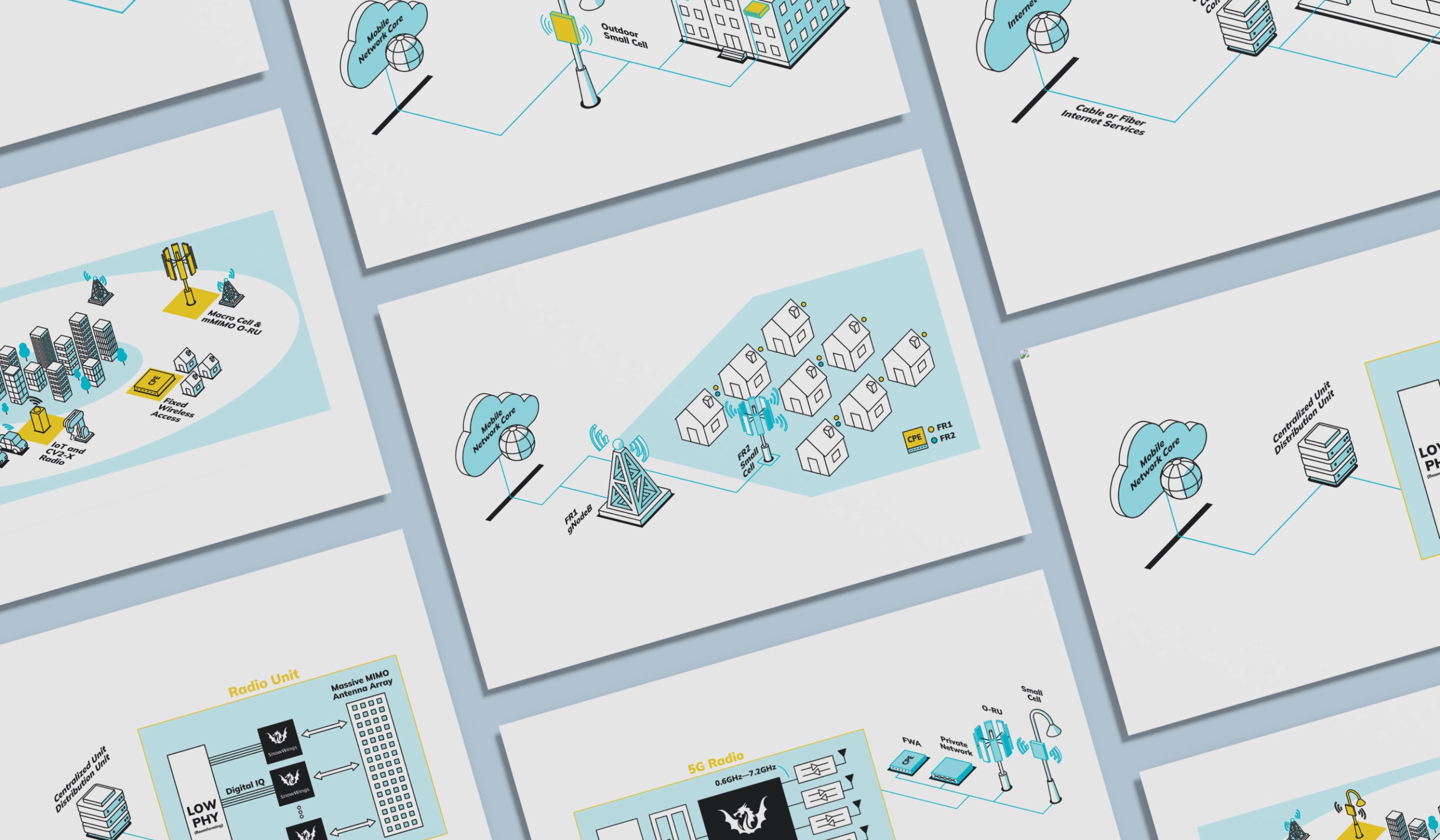
Arctic Semiconductor is a pioneering fabless semiconductor company specializing in the development of advanced Radio Frequency (RF) technologies. Renowned for its innovative approach and commitment to excellence, the company delivers ultra-high-performance, low-power RF transceivers integral to modern cellular infrastructure. By dramatically reducing power consumption and heat generation in their chips, Arctic Semiconductor sets new standards in efficiency and reliability.
OWDT collaborated with Arctic Semiconductor to execute a comprehensive branding, content creation, and web development strategy aimed at encapsulating the company’s innovative spirit and technological prowess. The goal was to craft a cutting-edge design that not only mirrors the advanced nature of the semiconductor field but also distinctly sets Arctic Semiconductor apart from its competitors.
Client Goals
Create cutting-edge design
Differentiate brand identity
Convey precision and reliability
Highlight power efficiency
Develop unique brand mark
Incorporate tech-themed visuals
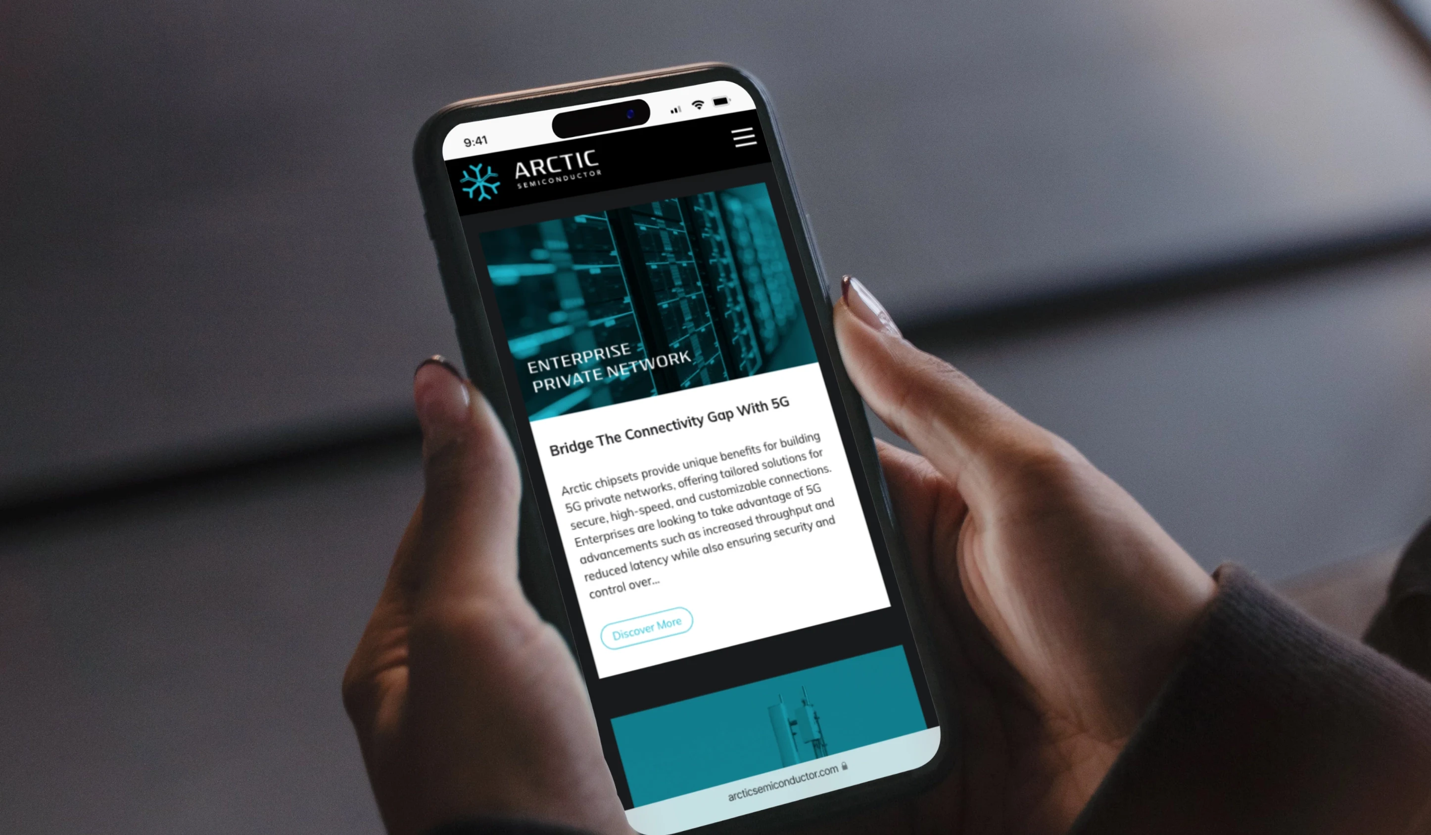
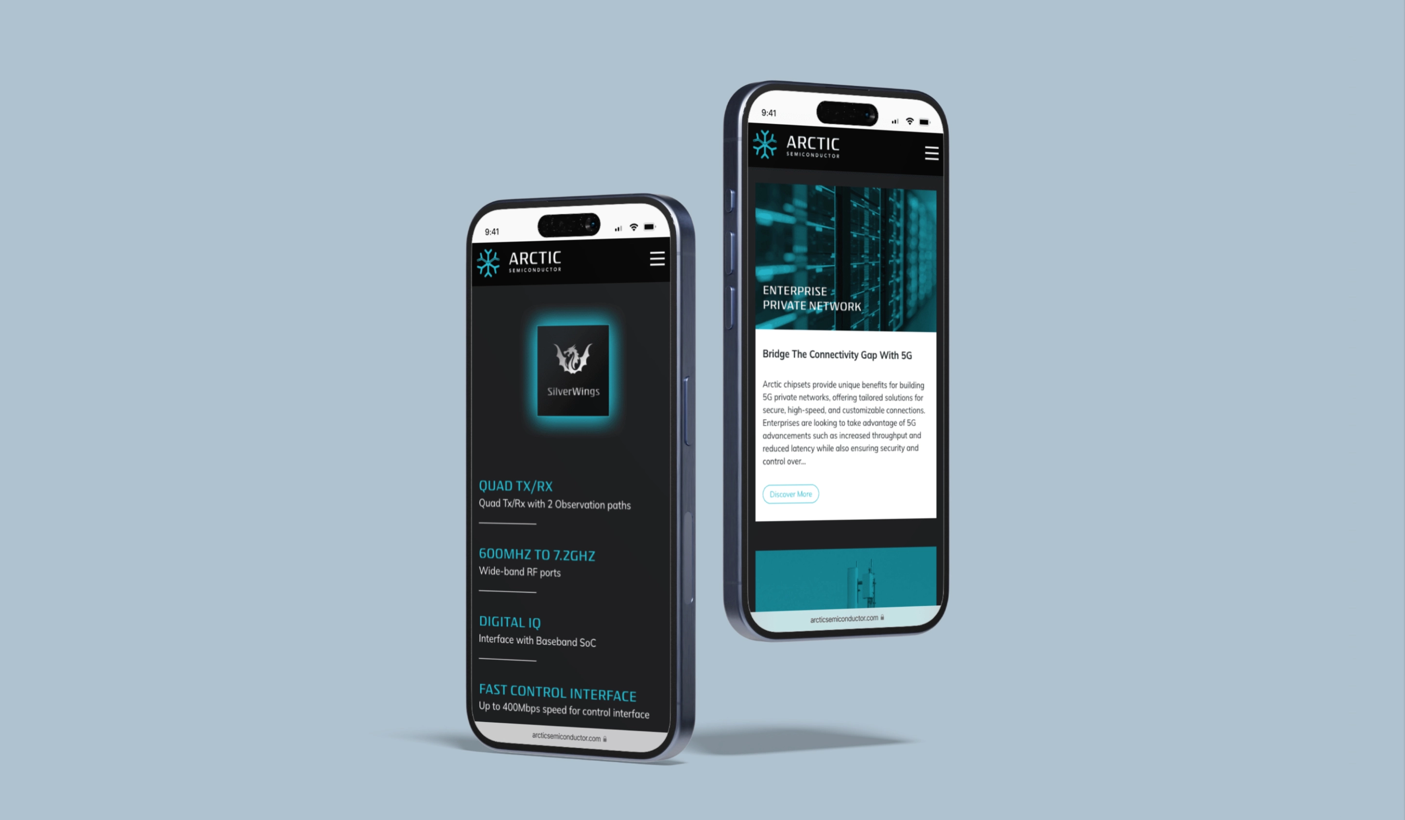
Enhance website user experience
Ensure legibility and clarity
Reflect advanced technology
Establish strong digital presence

Typesystem
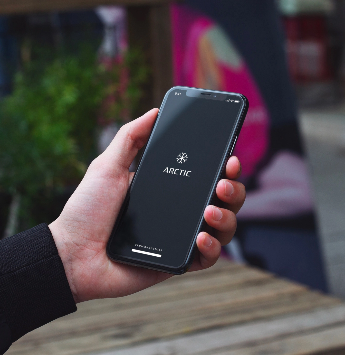
Central to this endeavor was the selection of the Isotope typeface—a style of lettering meticulously crafted to convey precision and reliability, qualities intrinsic to Arctic Semiconductor’s products. This was thoughtfully paired with the Mulish type family, celebrated for its precise design and exceptional legibility, ensuring clarity and coherence across all brand communications.
Color Palette
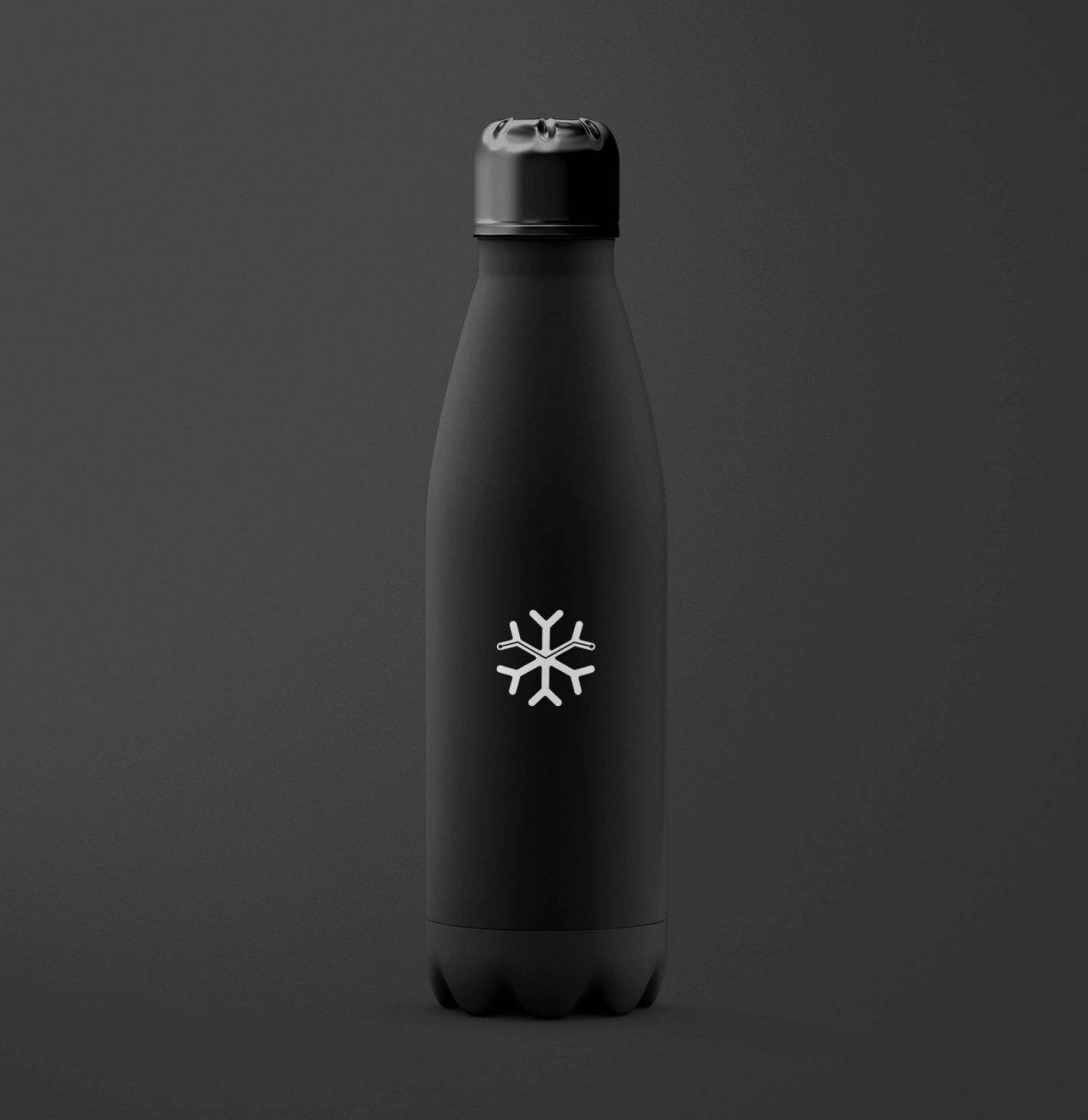
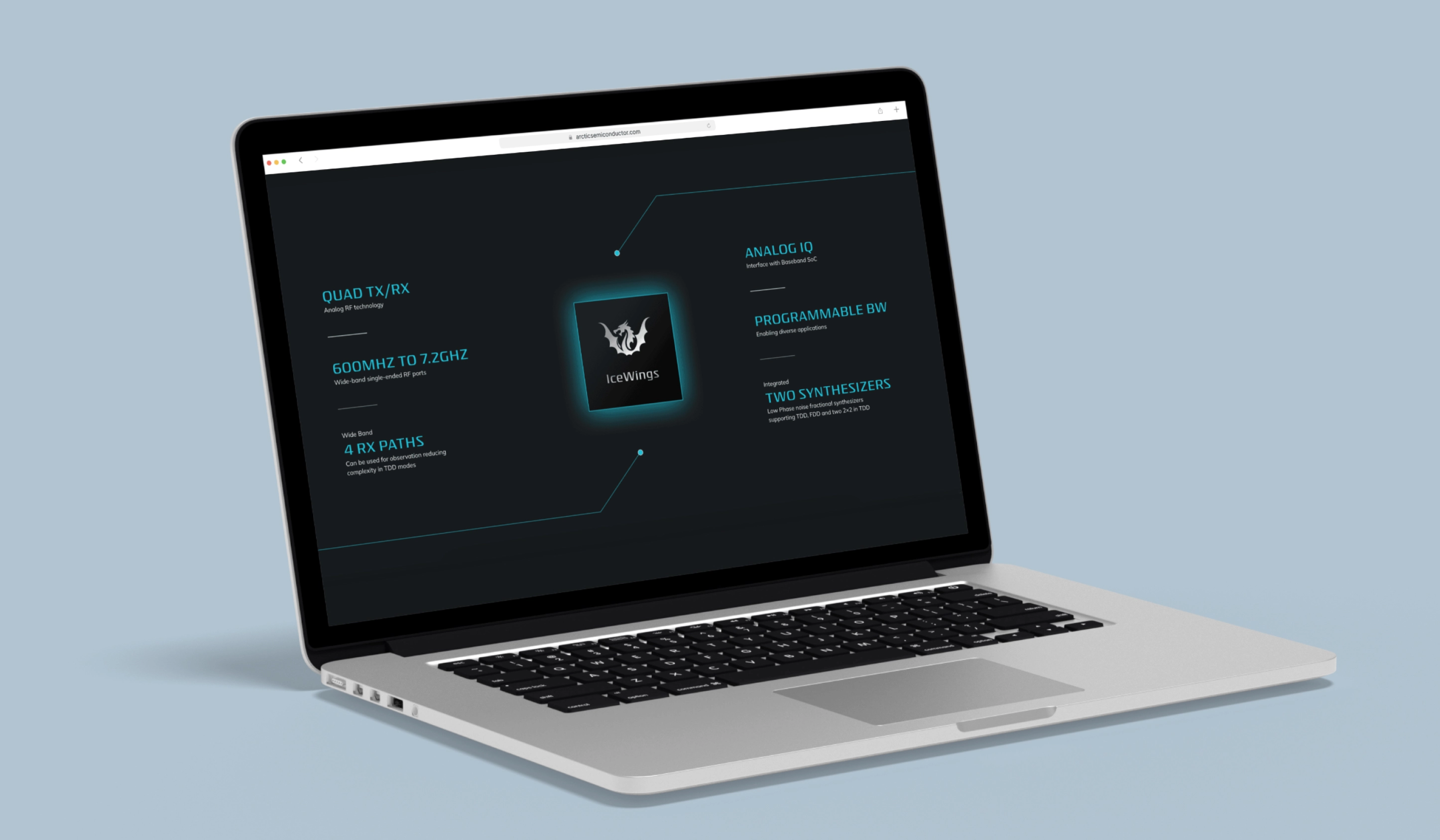
Acknowledging the company’s reputation for power efficiency and significant reduction in chip heat generation—a highly desirable attribute in semiconductor technology—we curated a cool color scheme that resonates with both the technological essence and the Arctic theme of the brand. This palette reinforces the brand’s connection to efficiency, innovation, and a cooler operating profile.


Design Elements & Visual Cohesion
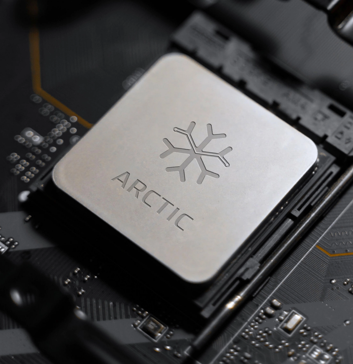
To further enhance the visual identity, a simple yet sophisticated snowflake was illustrated as the brand mark, symbolizing uniqueness, precision, and the cool efficiency of their products. This emblem was intricately decorated with electronic circuit lines, seamlessly blending natural elegance with technological innovation. These circuit lines were also integrated as design elements throughout the website, creating visual cohesion and an engaging user experience that reflects the company’s cutting-edge capabilities.
Explore More from OWDT
Each project we undertake is a study in precision — where design, technology, and storytelling converge. Discover more of our work and see how we help institutions, brands, and innovators shape digital experiences that endure.
Have Us Contact You

CLOSE PANEL
Thank You.
Your information has been transmitted successfully and securely.
CLOSE PANEL