Chiyoda
Business Challenges
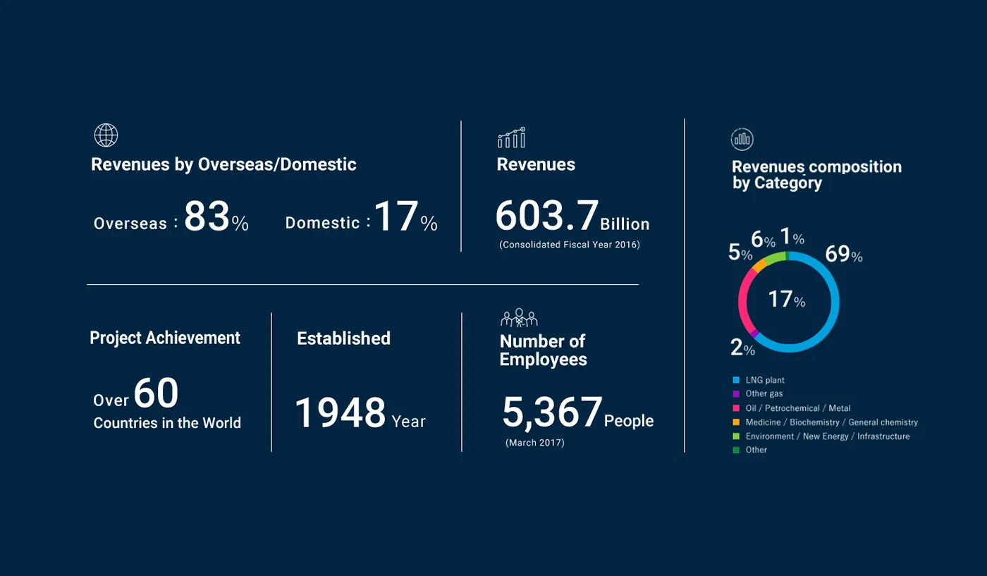
Based in Japan, Chiyoda International Corporation is the largest LNG engineering company in the world. They have a storied history spanning decades of landmark projects, worldwide. They sought to establish themselves in the Americas market. Initially, they opened an office in Houston, as the oil and gas capital of the US. When the physical branch was established, they looked into their digital branch – their website.
Client Goals
Gain Insights into US-Based Client
Tap into Institutional Memory
Foster the North American Culture
Provide Consistent User Experience
Grow Client Base
Build on Brand’s Heritage
Create Relevancy

Americas’ market
OWDT was hired to establish their digital presence and introduce Chiyoda to the Americas’ market and to formulate their strategy to develop their US-facing brand image.
Increasing the visibility of services
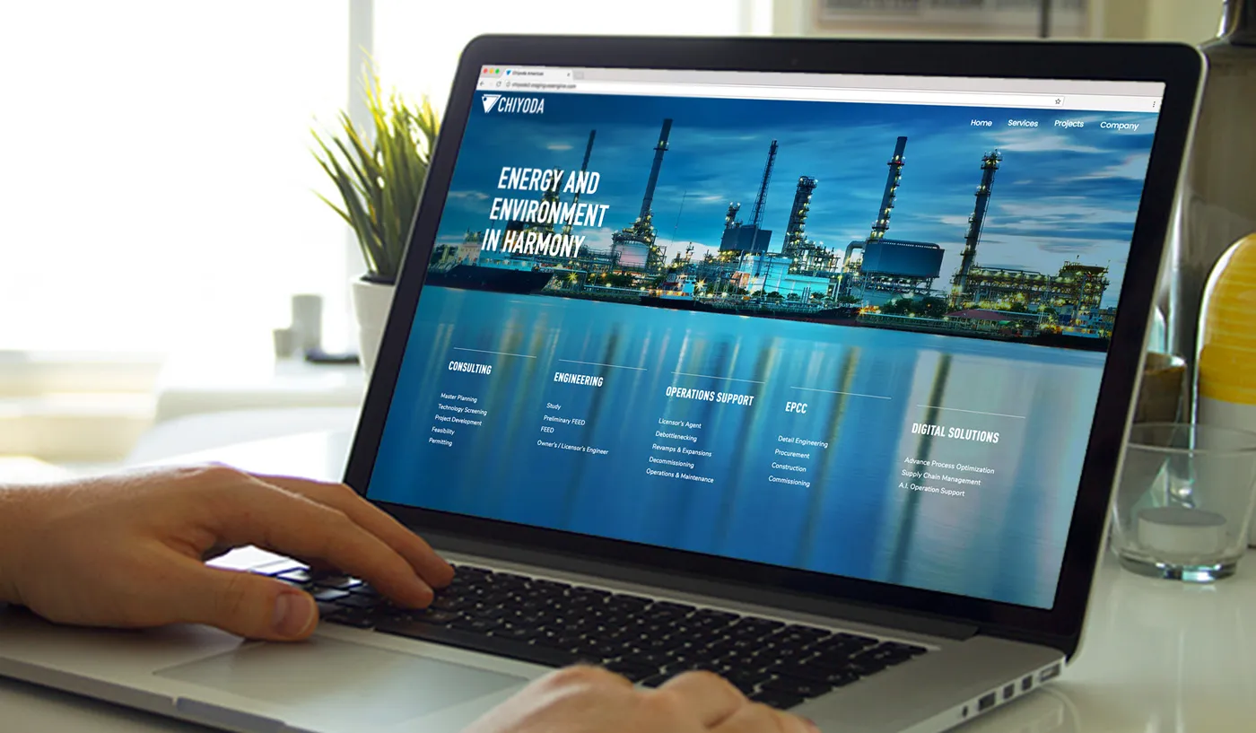
A fundamental factor in the site’s design stemmed from Chiyoda’s pressing need to display the variety of services they offered. Based on their experience, they realized many of their prospective clients were not aware of the abundance of additional expertise they hold in oil, gas, and petrochemicals processes. It was vital for us to increase the visibility of their services.

Insights
With no prior presence established, it was critical to learn about the markets they operate in, understand their business model, and research their target audience to formulate a strategy for the development of the site. Chiyoda’s organization is one that founded on Japanese engineering culture, and they felt compelled to imbue their digital front with this philosophy.
Strategies
Chiyoda is targeting senior professionals within the industry, mainly of male and female demographics between 35 to 60 in age, college-educated, and are considered technophiles by lifestyle. On a macro-level, Chiyoda wanted to increase their procurement of refinery-methanol projects, collaborating with refineries in the Americas, beyond the current 15 firms represented.
The Concept
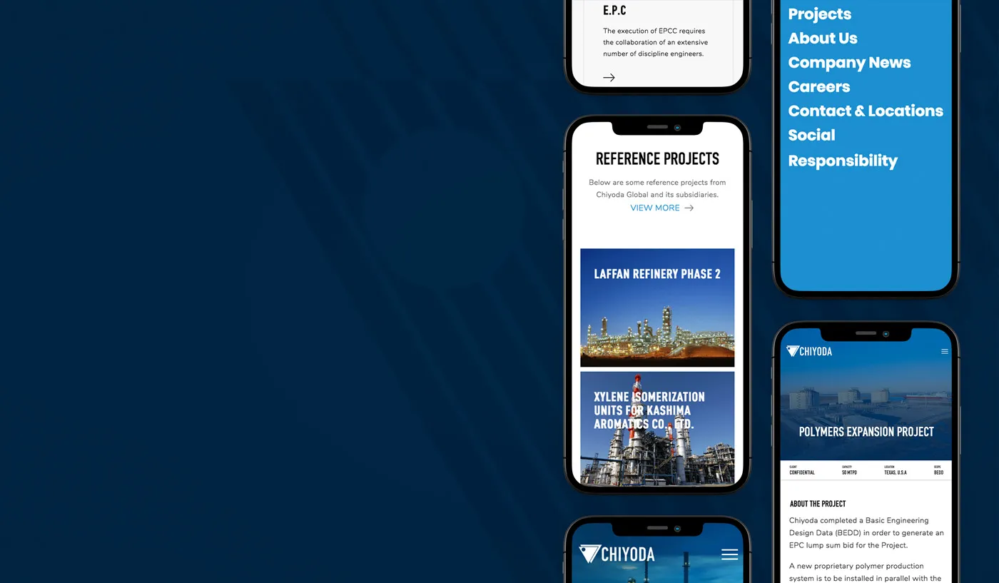
Studying our audience and based on detailed session-recorded analyses, we learned that we needed to find a new way of showcasing the services, without resorting to the usual practices. The idea was to display current services and developed projects through visualized case studies.
The Big idea
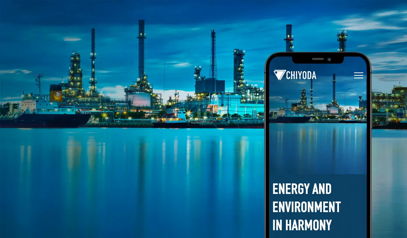
Listing service titles would have sufficed. However, we wanted to offer more substance and value to the user by emphasizing information and the visual experience, differing from web design norms found in their respective industry. At the same time, by developing a more pleasant journey, we were striving to make the website more memorable and more distinguished amongst their competition.

Tactics & Execution
Individual project pages were created listing technical information for those who were interested in learning about the details of the project. We added stunning imagery to keep the page engaging. The visual appointments encouraged users to read through the content and spend more time using the site, which would potentially increase their chances of requesting more information. We also took into consideration the user’s profile and the reality that they had little time to find and absorb the pertinent information they were seeking. So we designed and developed a robust and intuitive navigation system to assist our audience in finding information faster and more accurately. Increasing user satisfaction was key to inviting user interactions and improving conversions.
Results
The site established Chiyoda in a defining way, in a crowded market. It was paramount to develop an online presence that conveyed the prestige and long history of Chiyoda as the world’s largest LNG company. All analytics and statistics pointed to further improvement in Chiyoda’s market share post-site development.
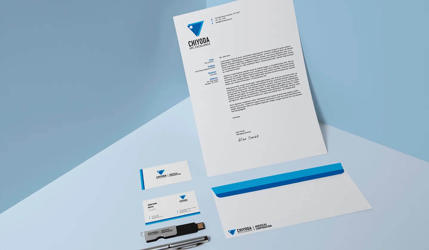

Market Share
The company has since initiated it’s marketing campaigns and outreach programs and are anticipating a significant increase in partnerships and projects. The design of their website played a major role in their public relations efforts and perception management.
Business Building
Due to the absence of an American site, it gave the false impression that Chiyoda was not active this side of the hemisphere, irrespective of its international stature. Having the opportunity to create something new allowed us to develop a very focused, modern, and intuitive user design that promoted interaction with Chiyoda while reversing previous misconceptions. The new site spurred sales and new partnerships with refineries in their new domain. It was a balancing act to create a new expression of a longstanding brand without drifting from their history and organizational principles.
Explore More from OWDT
Each project we undertake is a study in precision — where design, technology, and storytelling converge. Discover more of our work and see how we help institutions, brands, and innovators shape digital experiences that endure.


