Dr Roth
The Story
Dr. Forrest Roth is a renowned, preeminent plastic surgeon with a reputation for excellence. He provides cosmetic and reconstructive surgeries, as well as leading-edge noninvasive procedures. Dr. Roth needed an online presence that would capture the full scope of his impressive skills and exceptional dedication to improving the field of plastic surgery.
Client Goals
Reimagine a Plastic Surgeon’s Website
Simplified Information Architecture
Intuitive & Quick Navigation
Mobile-First Approach
Clean Aesthetic
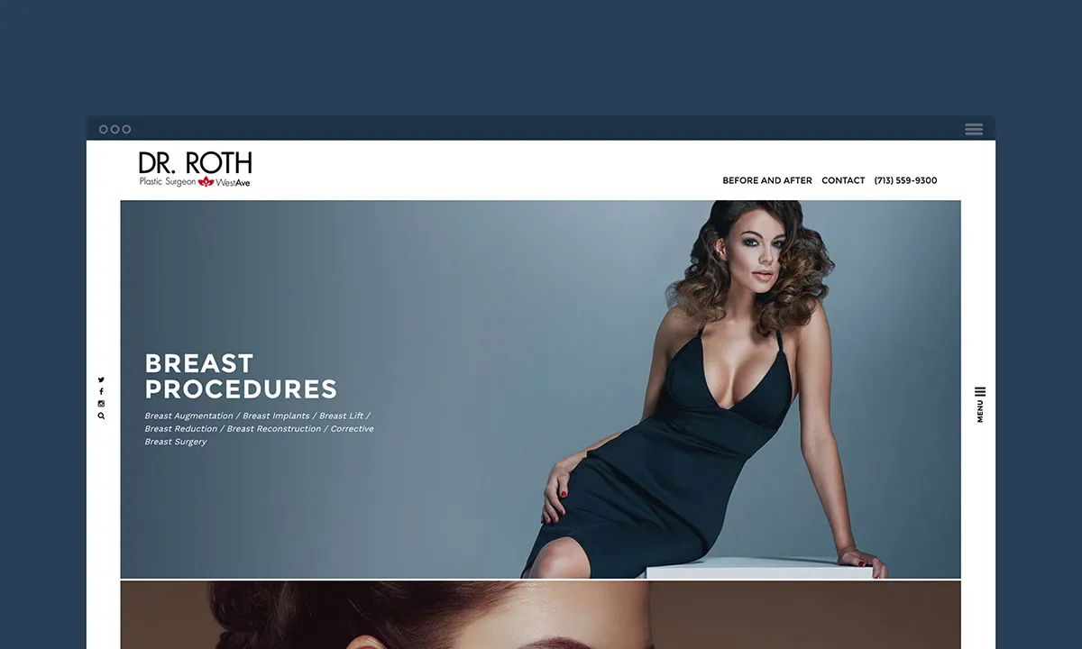
Compelling design and superior site organization
We simplified the information architecture to make navigation quick and intuitive, beginning with an elegant landing page comprised of scrollable photos highlighting specific regions of the body. Each launches a secondary page with links to detailed information about the procedures available for each body area. Our Chief Creative Officer, Kyle Mani has been recognized for his outstanding, innovative art direction, which incorporates stunning images, front and center. His eye-catching, colorful imagery is integrated with a simple flat design, complemented by multi-placement menus.
Out of the box navigation
The ease of navigation on Dr. Roth’s new site is enhanced by easy to locate menus. Most importantly, we innovated a keyword search engine capability that automatically funnels internet searchers to the exact procedure they are looking for on the internet.
New written content
Our Content team contributed original written copy, including extensive editing of earlier text to highlight Dr. Roth’s impressive experience, core values, and leading-edge procedures. According to recent research conducted by Taylor Nelson Sofres (TNS), 72% of web-user satisfaction relates directly to the quality of a website’s written content. We emphasize the importance of this often-underestimated service to our clients.
Functionality across all devices
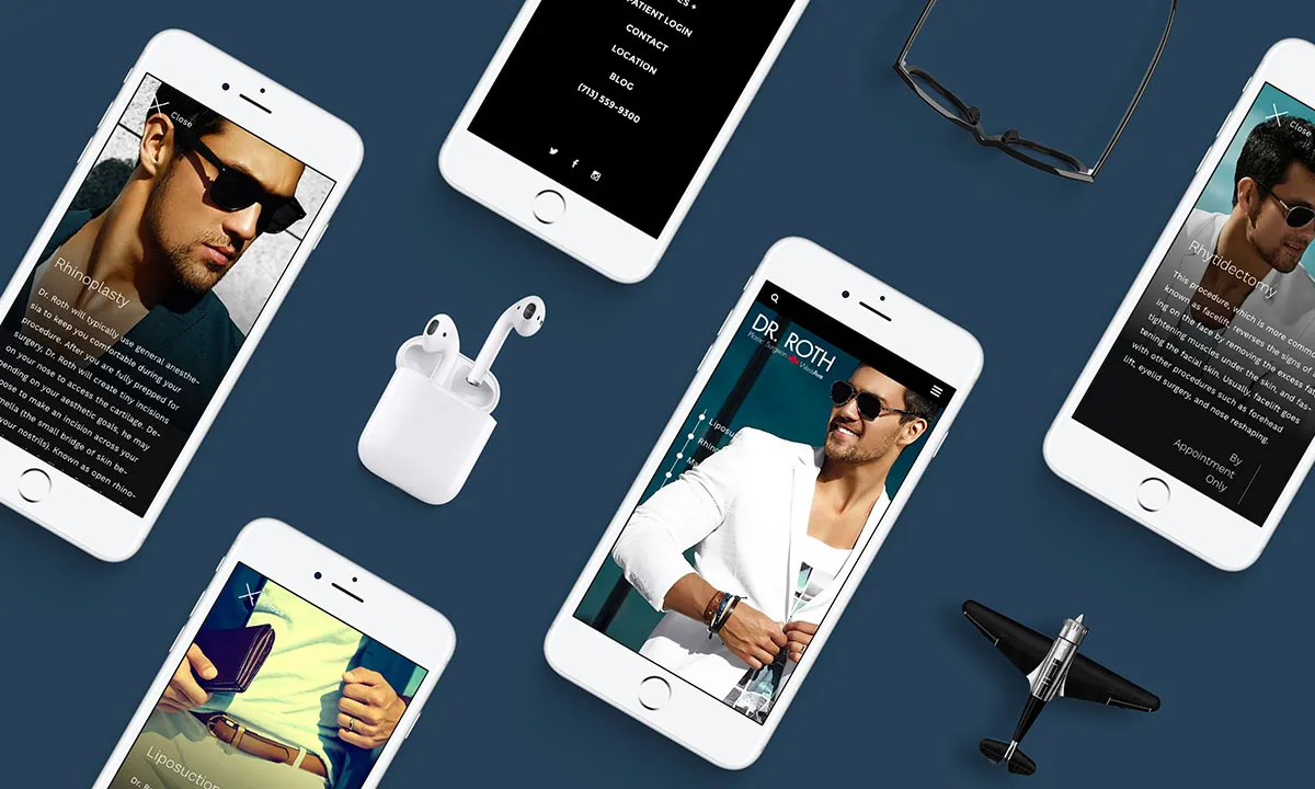
Mobile device internet searches are now the most frequent. So, we created a mobile-optimized website for Dr. Roth that is just as visually crisp and functional as what is available on large screens. This demanded high-level, complex programming that went considerably beyond what most web design companies provide.
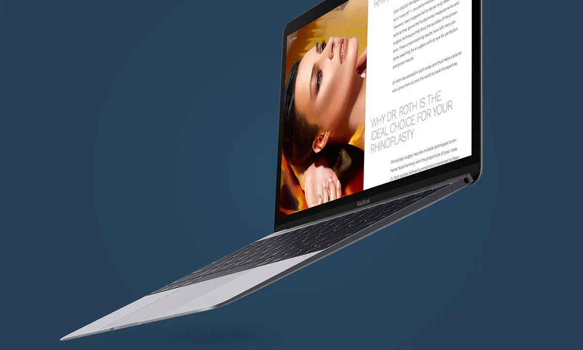
Superior Typography
Our designers selected Work Sans for this project, an elegant typeface family based on early Grotesques, such as those by Stephenson Blake, Miller & Richard and Bauerschen Giesserei. Its high-quality details also make it an excellent choice for print design. We adjusted it so that the fonts closer to the extreme weights can be used both on the web and in print. We further simplified the font’s features to optimize it for different screen resolutions.
Multi-layer user interface
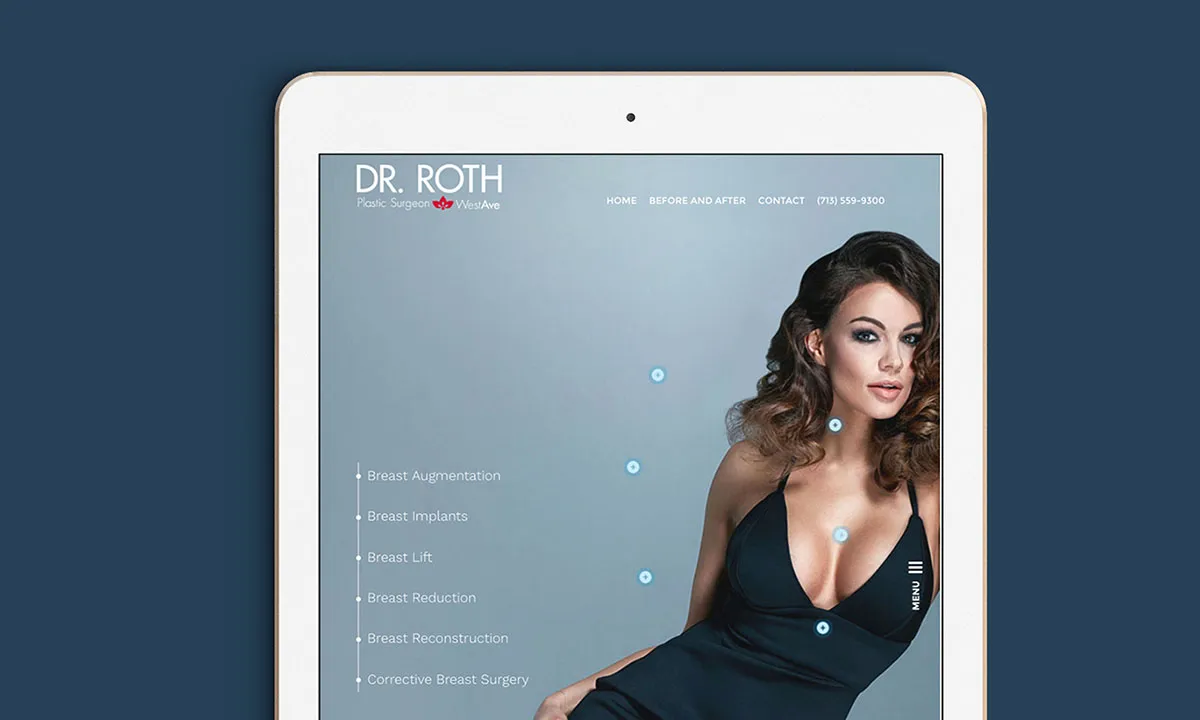
OWDT created a one-of-a-kind content structure that allows very detailed information to be readily available, without cluttering the clean aesthetic of the page. Using the photo of the model as the navigation guide, we placed animated, pulsing hotspots to give a visual clue as to which services are linked. At the same time, the side menu highlights the appropriate title and can be used as a link itself. The full description is always present, but just off-page. This means that when requested, it’s able to slide in quickly and effortlessly, without opening a new, separate page. The user is kept engaged with all relevant services and makes the website experience fast and effortless.
Furthermore, the full description slide-in panels can feature animations that give a brief overview of the described procedure and can then link to other pages if necessary. Of course, on small devices, the layout adjusts itself to allow for the best-possible presentation and interaction.
Explore More from OWDT
Each project we undertake is a study in precision — where design, technology, and storytelling converge. Discover more of our work and see how we help institutions, brands, and innovators shape digital experiences that endure.


