
Vibrantz
Branding for a Specialty Materials Company
In 2022 Prince International Corporation, Ferro Corporation, and Chromaflo Technologies – all leaders in their own right – united to combine their leading positions in various desirable markets. The merger created a company of grander scale with strong material science and technology expertise to innovate faster, serve a broader customer base and have greater operational resilience.
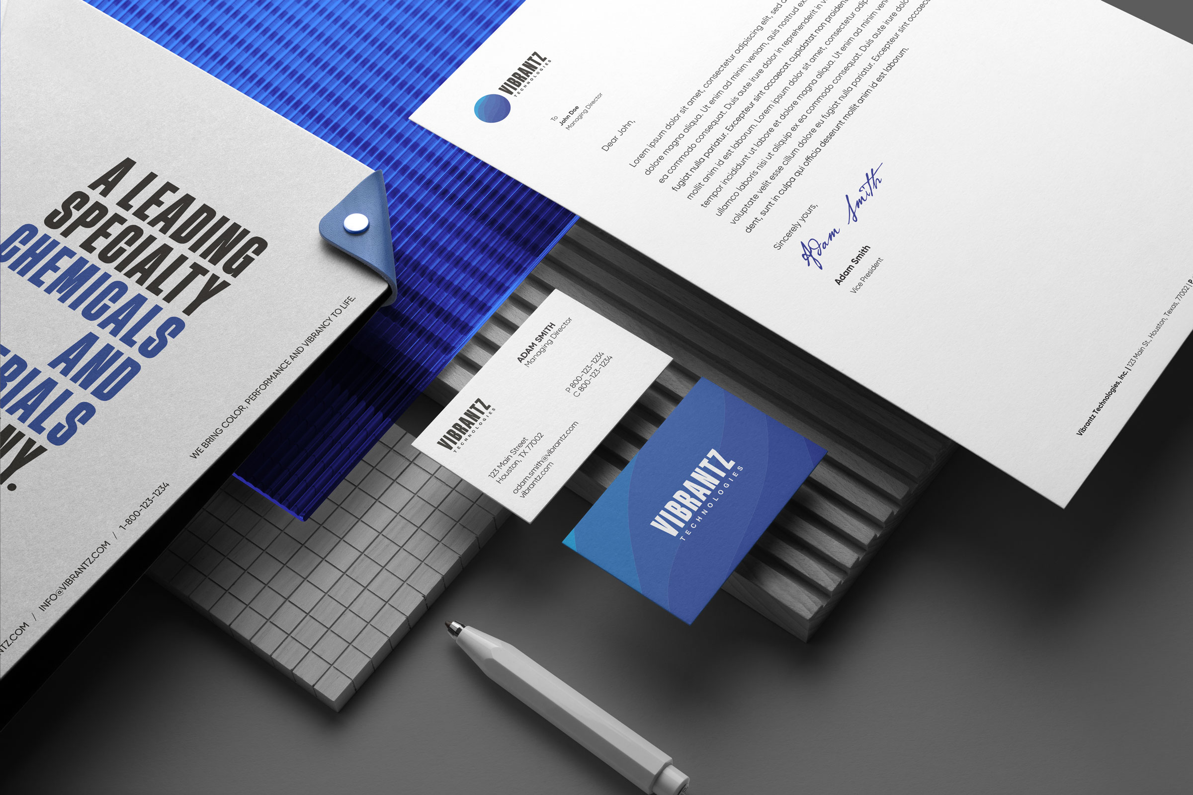
We developed a new brand identity for the new company that would position it as a leading entity in the domain. The project included a new brand strategy, naming, visual identity development, and announcement materials.
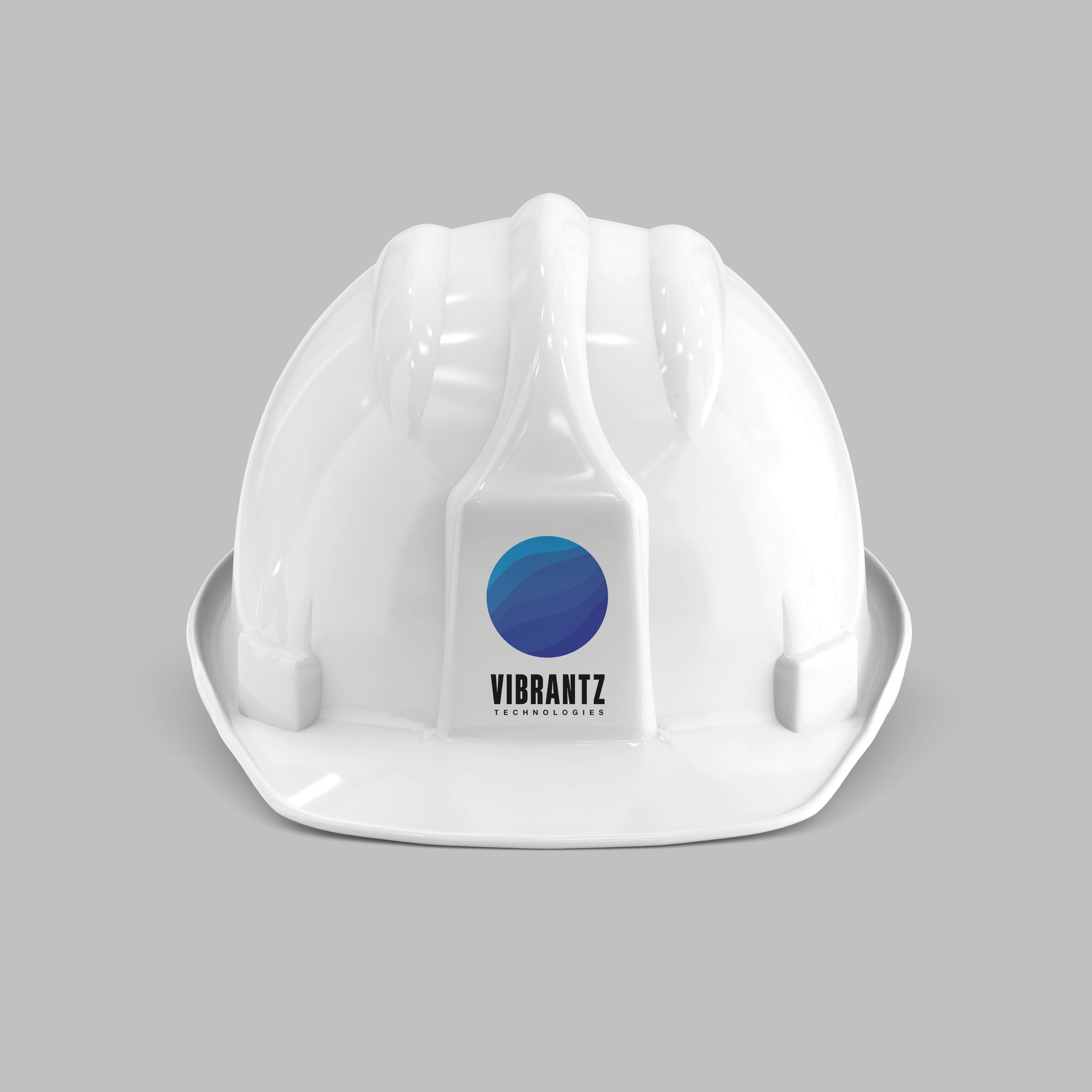
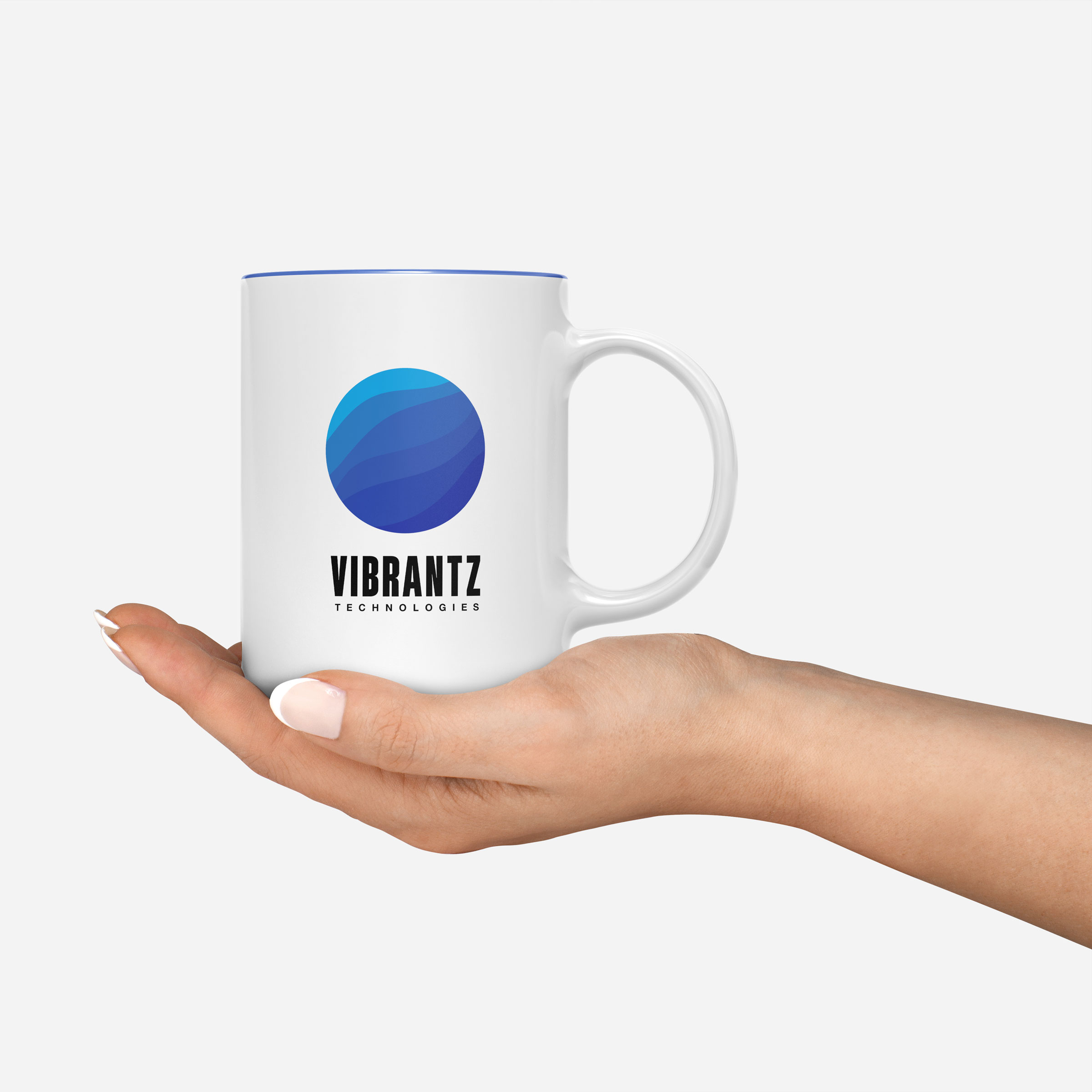
We selected magnesium blue, carbon gray, and white as the primary color palette. The secondary color palette features four complementary shades of blue and a more substitutional colorful palette with burgundy and green to represent the individual core company. The bold condensed logotype signifies Vibrantz new global identity: strong, bold, and confident, celebrating its strong roots around the globe.
The branding of Vibrantz represented a significant step in the history of all three companies, and the stakeholders’ aspiration to be the global specialty chemicals and materials company informed the composition of the globe in the brand mark.
Client Goals
transmit authority innovation
rally employees around the brand
immediately recognized symbol
create visual toolkit
unique brand experience
dynamic behavior
merger and acquisition inclusive
delighting customers
engaging employees
organizing the verbal and visual order


Explore More from OWDT
Each project we undertake is a study in precision — where design, technology, and storytelling converge. Discover more of our work and see how we help institutions, brands, and innovators shape digital experiences that endure.
Have Us Contact You

CLOSE PANEL
Thank You.
Your information has been transmitted successfully and securely.
CLOSE PANEL