Trident
Reassuring brand coverage
OWDT created a spirited brand identity for Trident, helping it stand out in a crowded marketplace while reassuring brand coverage.
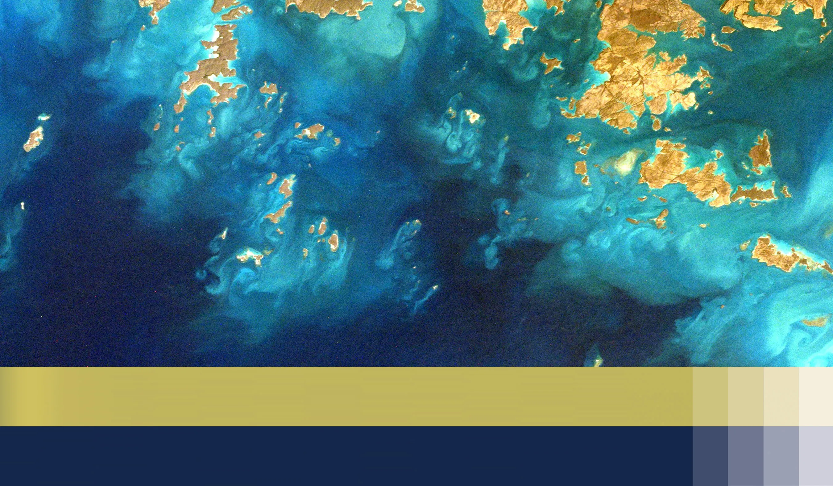
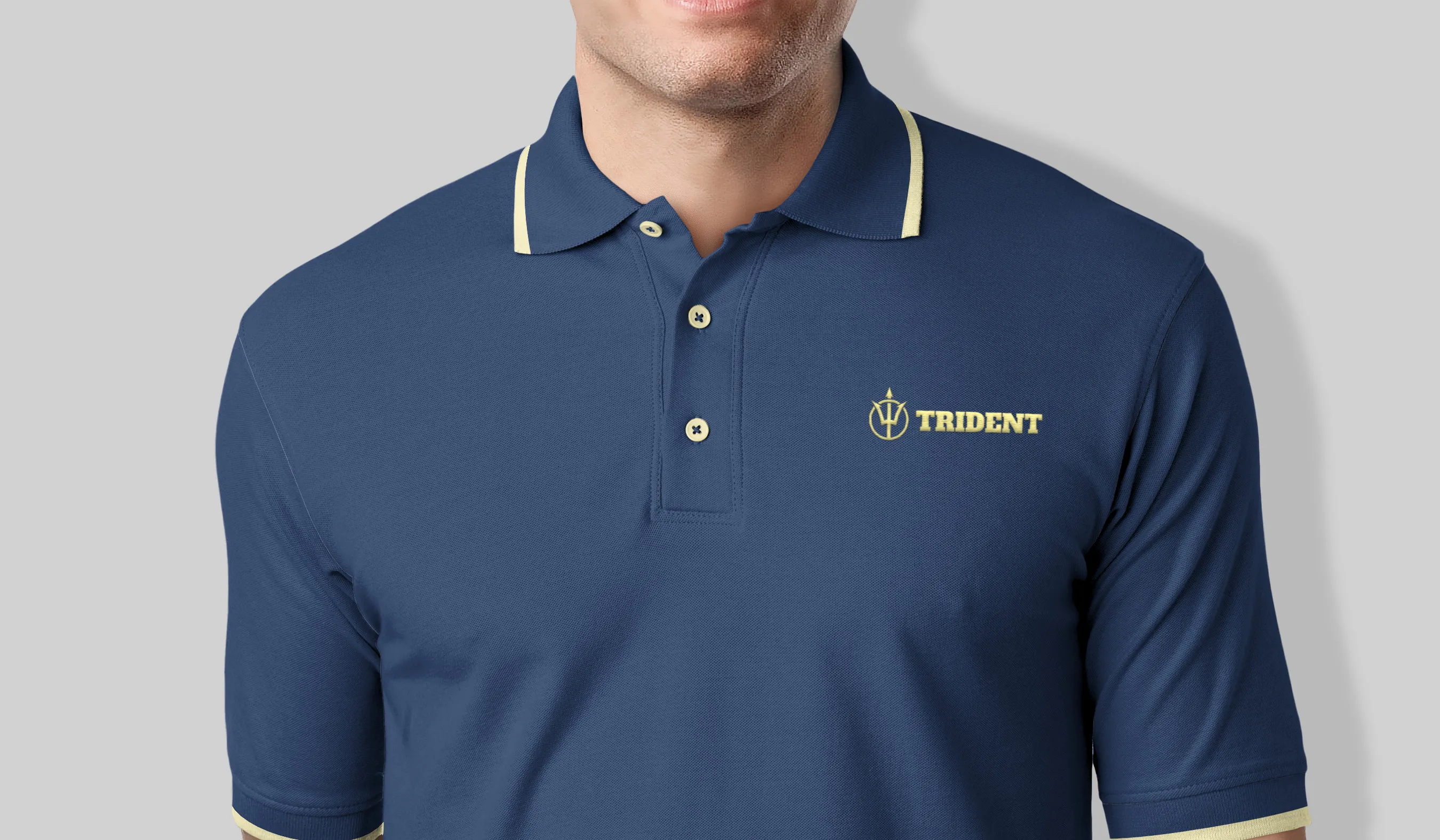
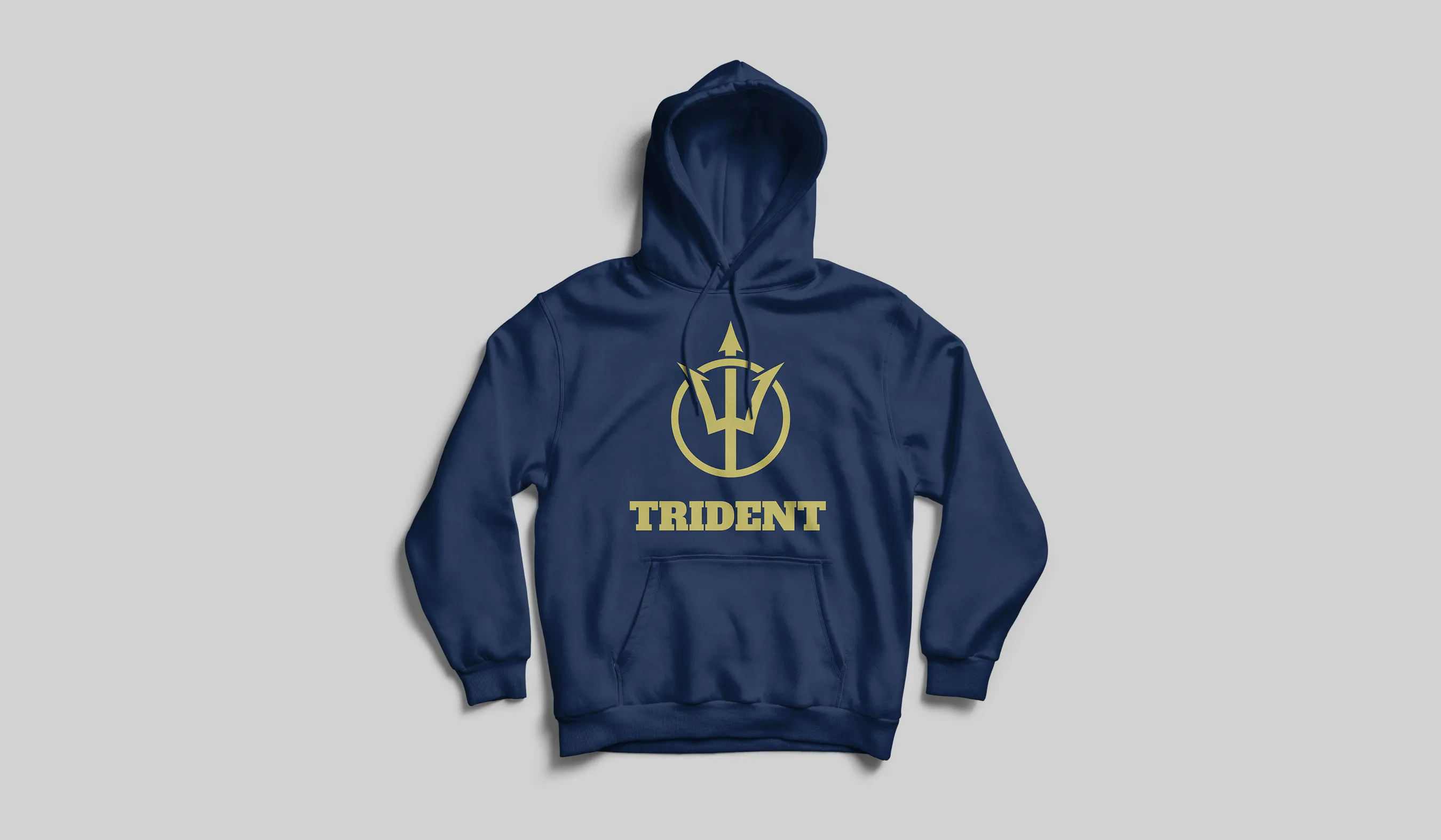
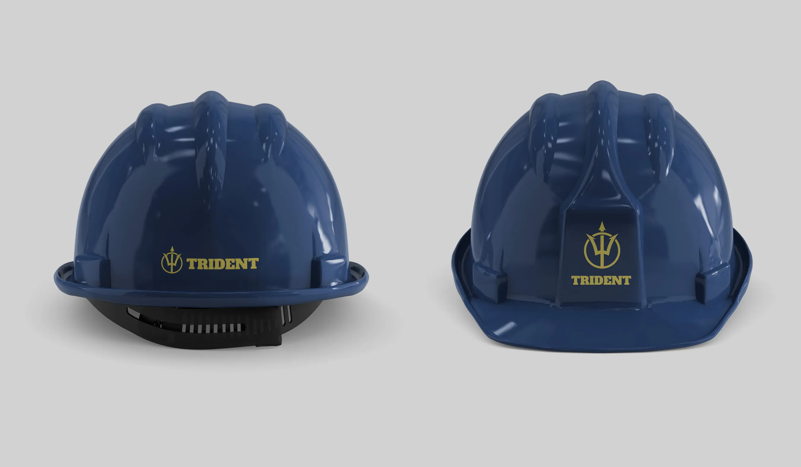
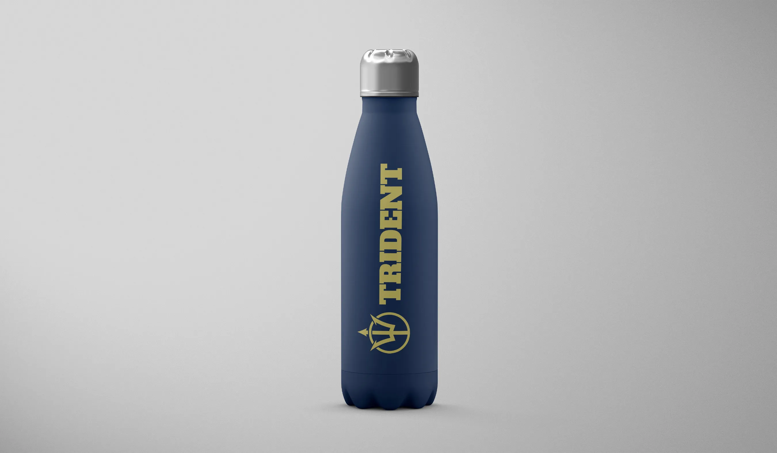
The first goal was to work on the trident iconic figure but calibrate the design to extract a unique expression that can separate itself from other brands that hold a similar visual presentation. For that, we selected a unique and confident typeface to feature the wordmark. Furthermore, we chose the bold color palette of navy blue and gold, a selection inspired by the thirty thousand feet view of uninterrupted seashores. Using the aforementioned color rationale, we enabled Trident to imply the high coverage level of its EPC services.
Services Utilized
Client Goals
Stand Out in a Crowded Marketplace
Unique Expression
Imply Confidence
Increase Conversion
Covering Capacity
Bold Impression
Explore More from OWDT
Each project we undertake is a study in precision — where design, technology, and storytelling converge. Discover more of our work and see how we help institutions, brands, and innovators shape digital experiences that endure.
Have Us Contact You

CLOSE PANEL
Thank You.
Your information has been transmitted successfully and securely.
CLOSE PANEL