Texas Oiltech Laboratories
The Story
For over 30 years, Texas OilTech Laboratories (TOL) has been recognized as a world-class, independent laboratory for petroleum, petrochemical products, as well as oil and gas upstream services. Their comprehensive, customized in-house and on-site testing products are reliable and accurate with quick turnaround times for test results. TOL has a global reach, with laboratories in North America, South America, the Middle East, and Europe. Their petrochemical chemists are innovative problem solvers, highly skilled in the use of state-of-the-art instrumentation and procedures.
Client Goals
Prepare Brand for Expansion
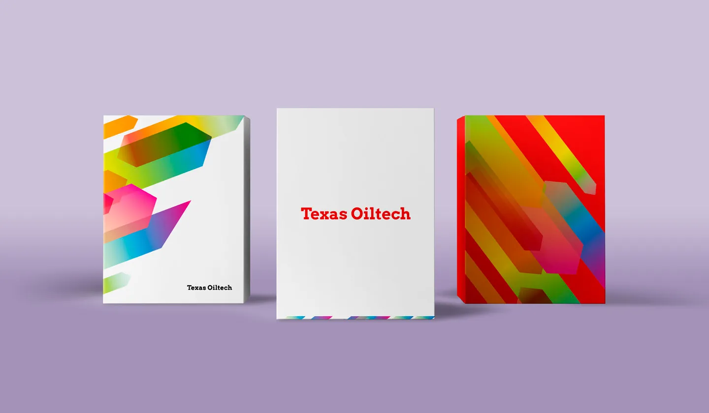
Create a New Impactful Look
Transmit Brand’s Essence
Revitalize the Navigation
Create a User-Friendly Experience
The challenge
TOL’s previous website was disorganized, visually flat and missing most of the information on their over 700 different testing products. Also, their previous site’s navigation was confusing and frustrating for potential customers who frequently lost patience and would then log off to access one of their competitors’ websites.
Impeccable design
Our design process integrates proven principles of art as with mathematics-based concepts of ideal proportionality and scientific findings on human perception. This results in a design that is intuitive and easy to absorb at a glance. In addition, after gaining feedback from the client about their preferences, we tailor an organization’s website to the aesthetic preferences of their particular audience. At the same time, we incorporate the requisite functionality and sophistication to appeal to higher-level decision makers. We knew that TOL professionals had engineering and other applied technology backgrounds, most of whom prefer a darker color palette, simple design elements as with textbook font styles that are consistent with what they see on work documents. After selecting the right fonts (Arvo & Open Sans), we then established optimal, ideally proportional distances between the lines and letters to maximize ease of reading.
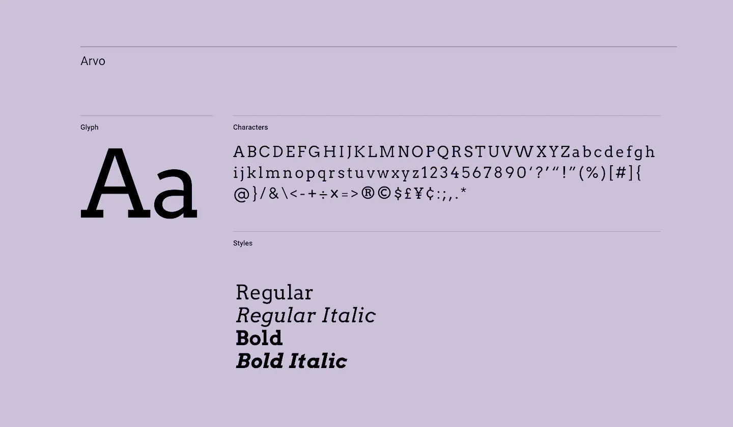
Used typefaces
Arvo is a slab-serif typeface suited for both screen and print and designed to increase legibility.Open Sans was designed with an upright stress, open forms and a neutral, yet friendly appearance. It was optimized for print, web, and mobile interfaces, and has excellent legibility characteristics in its letterforms. If you visit the site, you’ll see how we brought these themes together in an innovative way with several curvilinear elements and a sliding, right side red menu that contrasts beautifully with the primary brown/honey background. By applying these and other scientific principles of perception, we created an interactive design that immediately engages the viewer, encouraging them to explore the site at depth.
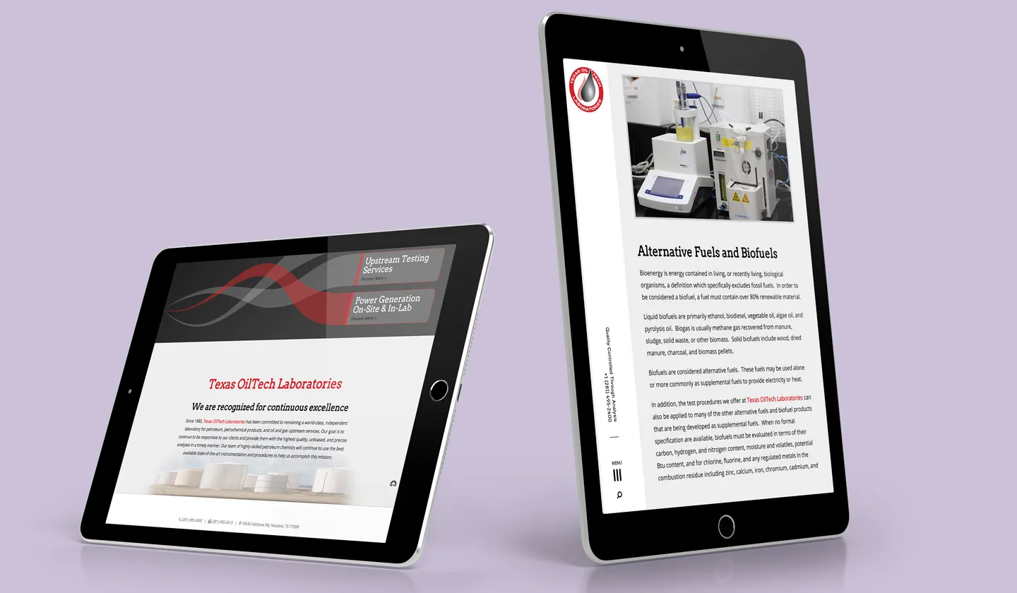
Seamless organization and navigation
We interviewed TOL stakeholders and employees in focus groups to understand what they wanted on their website and how best to arrange that information. The new website had to make complete sense to them and their customers.Our solution was to create a Homepage with three gateway links with a pop-out upper right side menu that supplements and reinforces those links. In other words, the site funnels viewers to exactly where they want to go. For example, they gain immediate access to all test product descriptions (alphabetically arranged) deeper within the site.
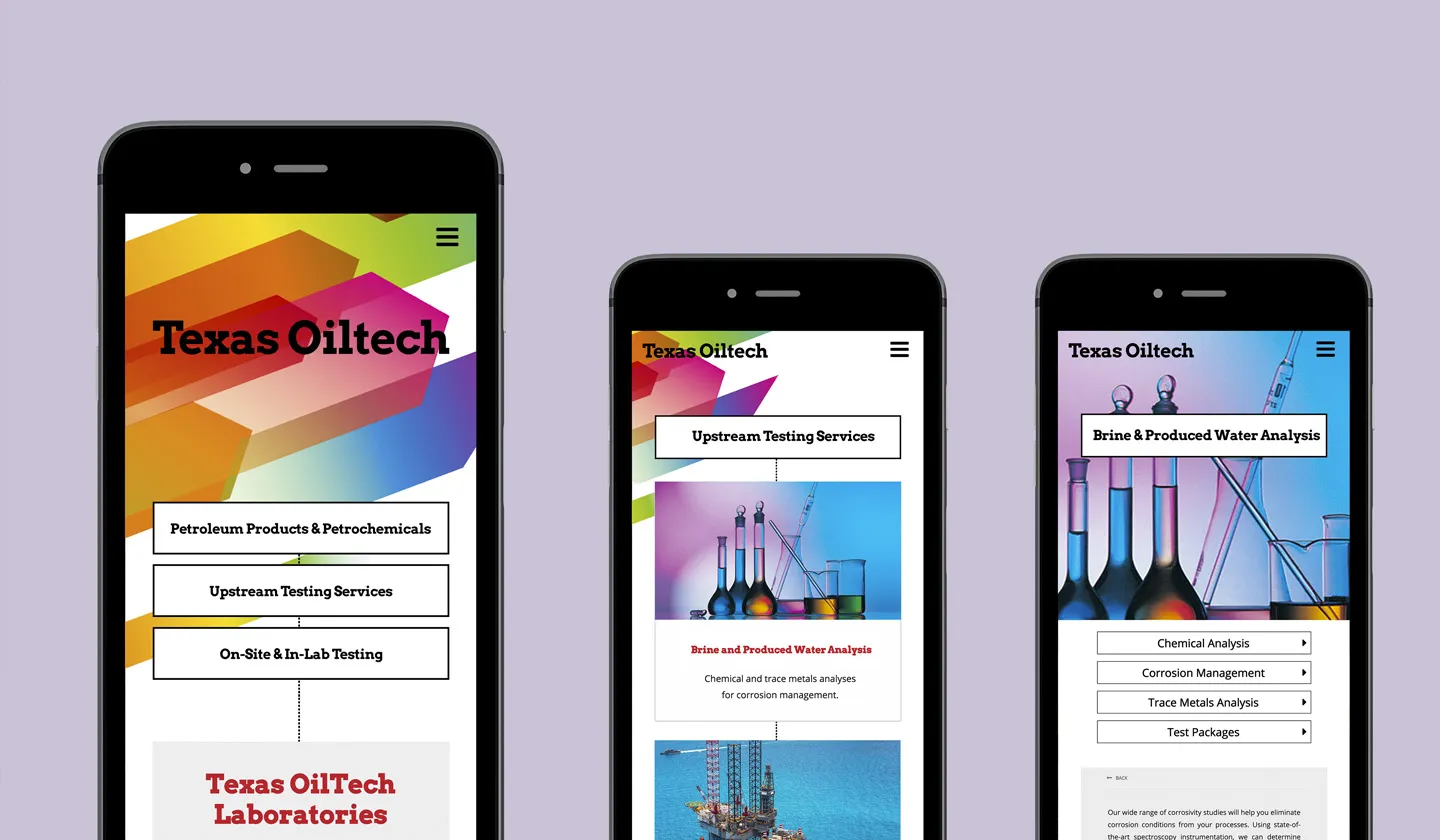
Functionality across all devices
Our research showed that over 50% of TOL customers used mobile devices in accessing their website. So, the mobile device website version had to look just as visually crisp and functional as it does on large screens. Behind all our work is high-level, complex programming that makes the user experience pleasurable and effortless. We worked hard to create a mobile device website version for TOL that achieved those objectives.
Explore More from OWDT
Each project we undertake is a study in precision — where design, technology, and storytelling converge. Discover more of our work and see how we help institutions, brands, and innovators shape digital experiences that endure.
Have Us Contact You

CLOSE PANEL
Thank You.
Your information has been transmitted successfully and securely.
CLOSE PANEL