
JD Tactical
Penetrating a Competitive Landscape
OWDT has developed a new brand identity for JD TACTICAL that reflects its culture, long history, and wide range of products. The new identity needed to provide JDT with a brand that reflected its ambitions; to increase the impact and improve relevance aimed at a saturated market segment.
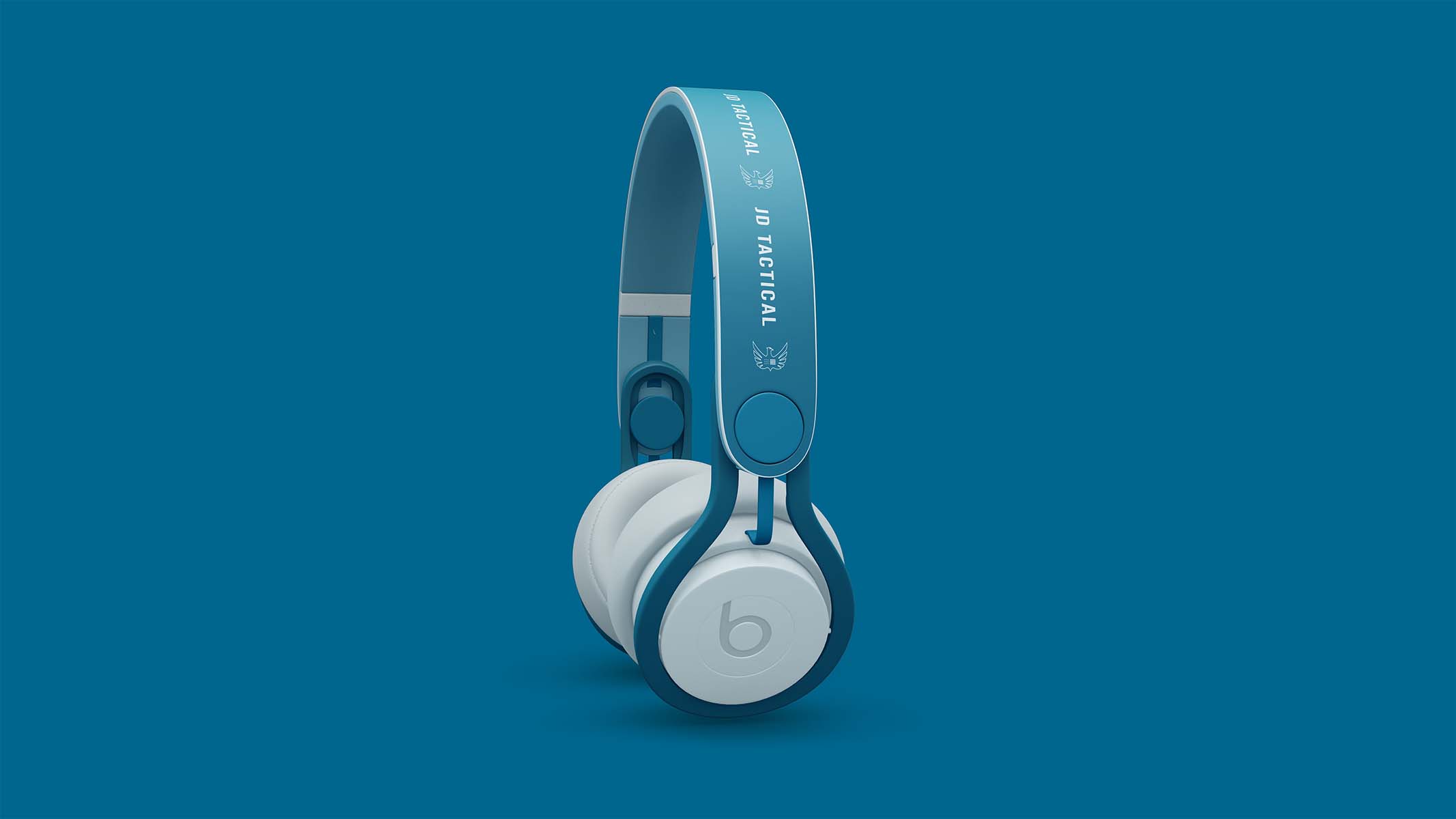
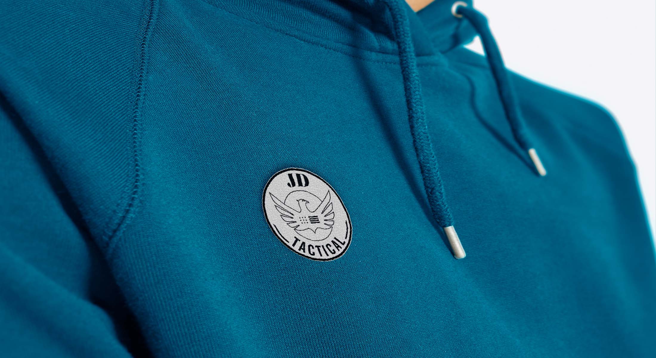
The new logo’s simple line art allows it to be used effortlessly over busy backgrounds as well as more challenging applications such as die-cutting and embossing. When used at scale, the logo has impact and clarity over complex backgrounds such as the store window and yet can look incredibly simple.
The confident color palette uses teal blue alongside black and white. We chose a vibrant color palette to distinguish JDT from its competitors. We used the primary color throughout and paid careful attention to ensure the final colors were politically neutral.
Services Utilized
Client Goals
Reflected its Ambitions
Increase the Impact
Improve Relevance
Revitalize the Brand
Modernizing the Brand Identity
Cover Waider Range of Products


Explore More from OWDT
Each project we undertake is a study in precision — where design, technology, and storytelling converge. Discover more of our work and see how we help institutions, brands, and innovators shape digital experiences that endure.
Have Us Contact You

CLOSE PANEL
Thank You.
Your information has been transmitted successfully and securely.
CLOSE PANEL