Atlanta Spanish Immersion
Reframing language as lived culture
Atlanta Spanish Immersion (ASI) is not simply a language school. It is a cultural bridge. Founded to help adults and children acquire Spanish through immersion, ASI positions language as a lived experience rather than an academic exercise. Native Spanish-speaking instructors, community exchanges, and human-centered teaching form the core of its philosophy. The brand exists at the intersection of education, culture, and connection, where learning Spanish is as much about belonging as it is about fluency.
The Challenge: An experience misaligned with its mission
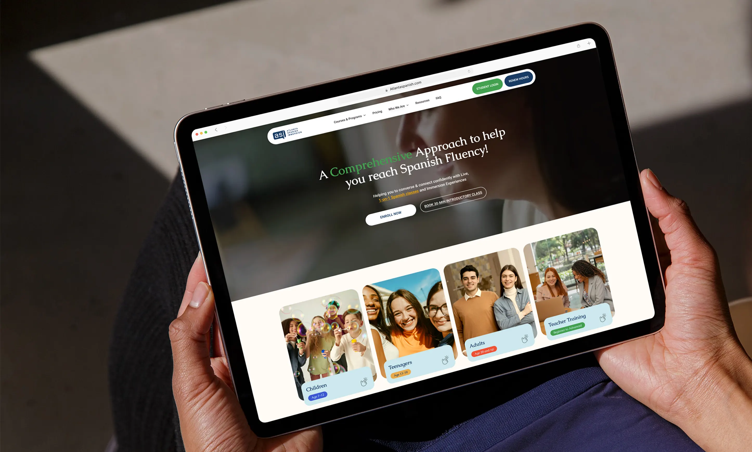
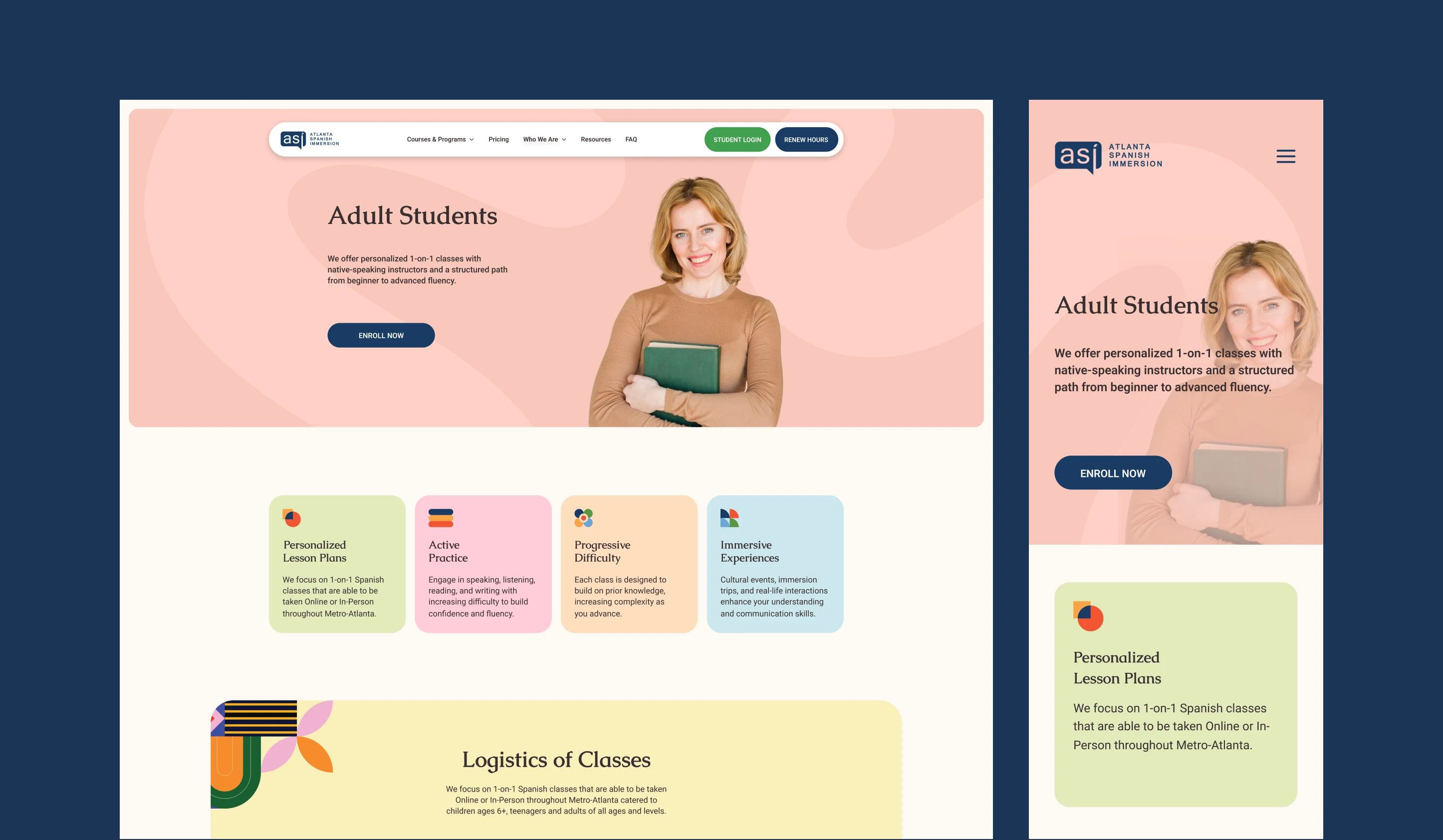
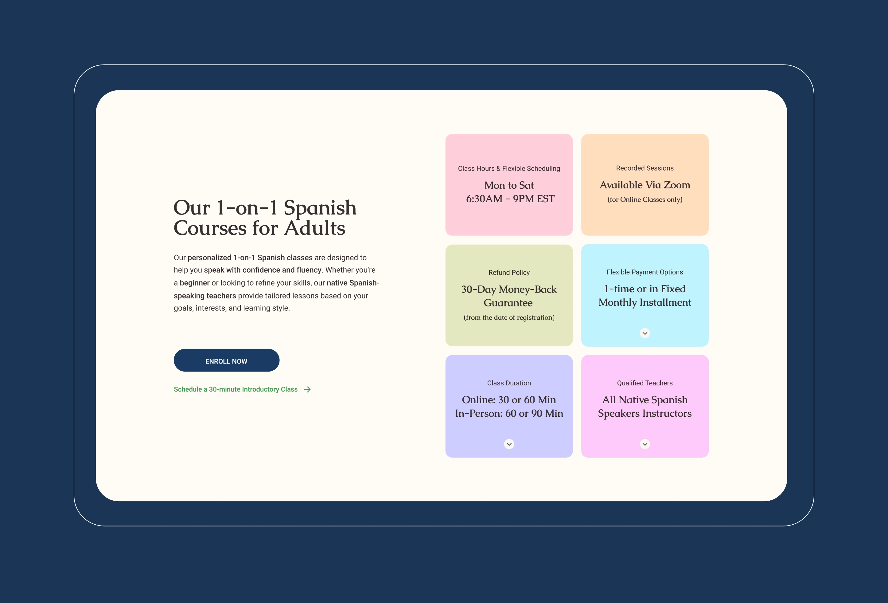
Despite a strong educational foundation and a loyal community, ASI’s digital presence no longer reflected the depth or warmth of its offering. The outdated design relied on fragmented layouts, inconsistent typography, and unclear calls to action. Critical user journeys such as enrollment, payment, and program discovery felt transactional rather than immersive.
Most importantly, the website failed to express ASI’s cultural authenticity.
The vibrancy, hospitality, and rhythm of Hispanic culture were absent, replaced by a utilitarian interface that underrepresented the emotional value of the brand.
Services Utilized
Brand strategy
UX design
UI design
Visual identity
Typography system
Color strategy
Information architecture
Interaction design
Web development
SEO
Client Goals
Increase enrollment
Improve user clarity
Build cultural trust
Modernize brand presence
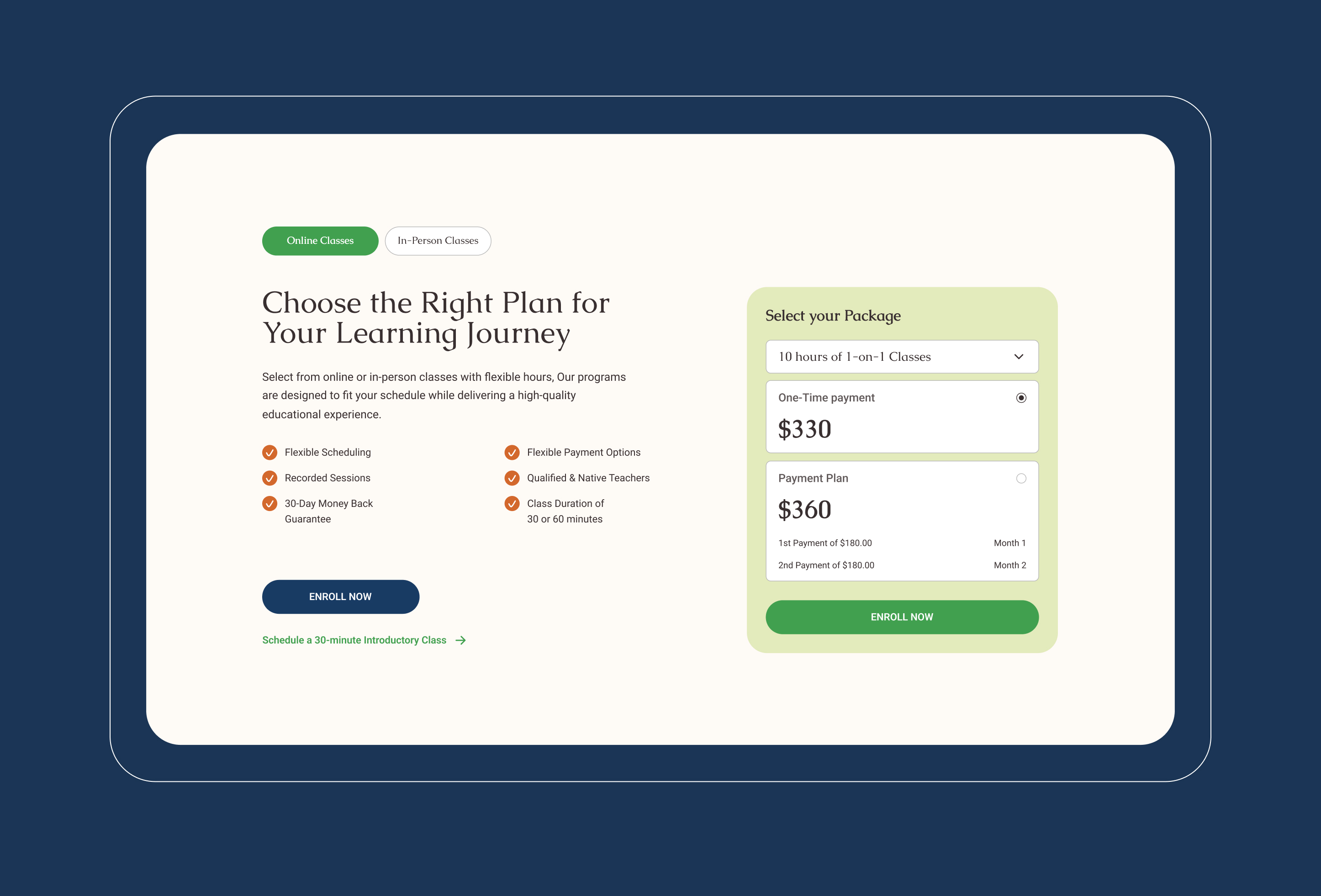
Simplify payments
Highlight native instructors
Strengthen credibility
Enhance user engagement
Reflect Hispanic culture
Support scalable growth
Designing through culture, clarity, & trust
Our strategy was to translate cultural immersion into a cohesive digital system.
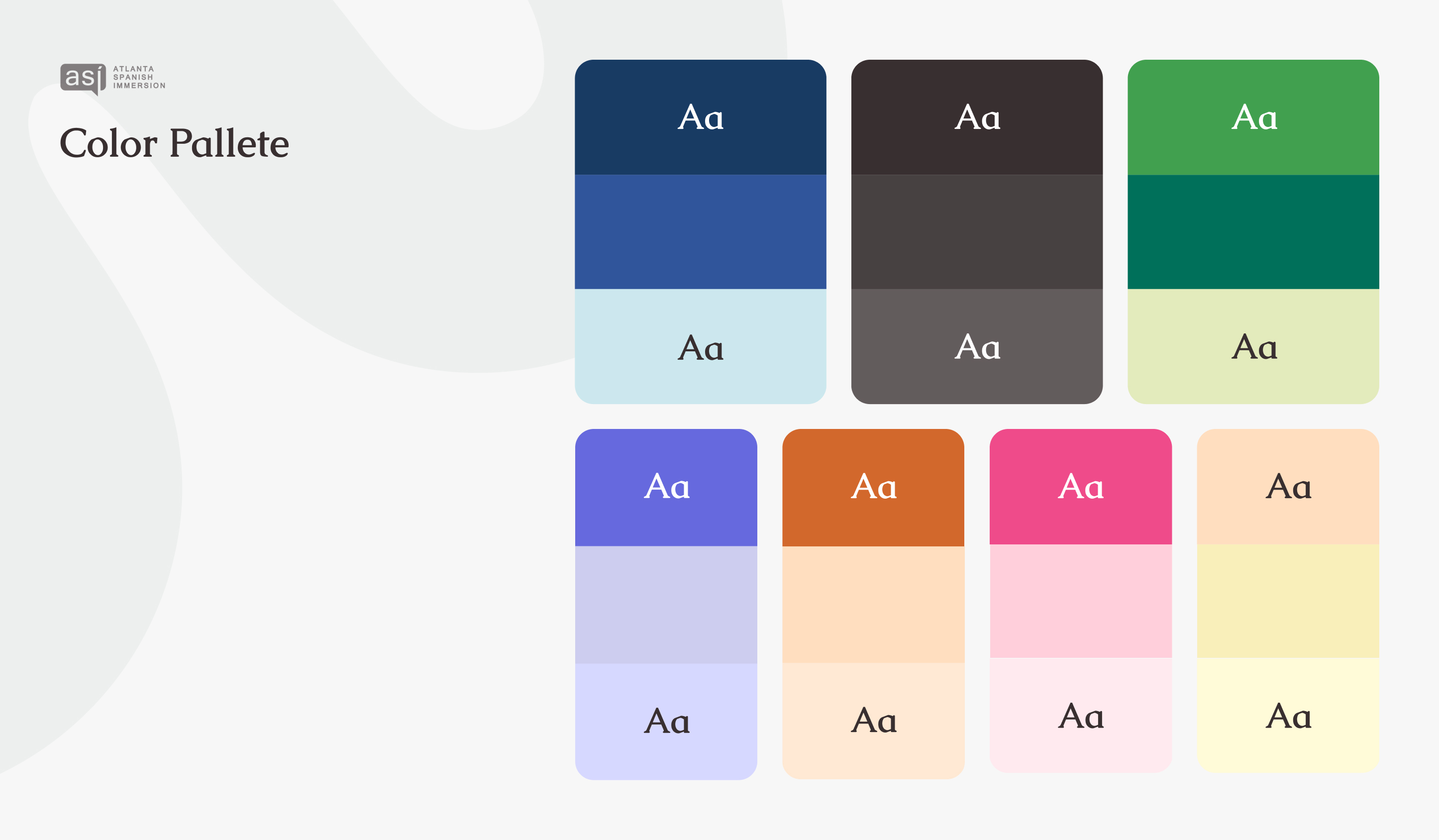
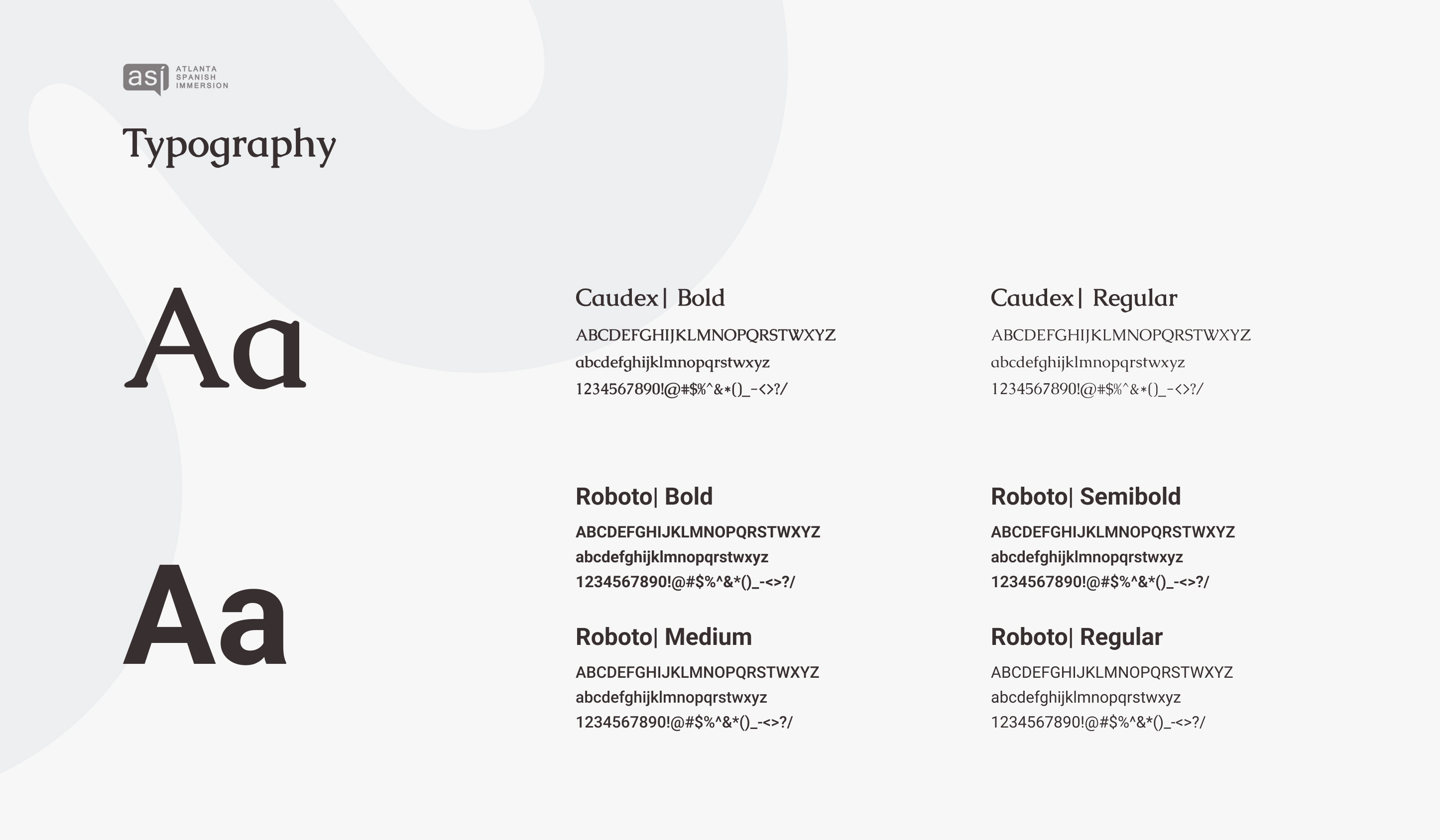
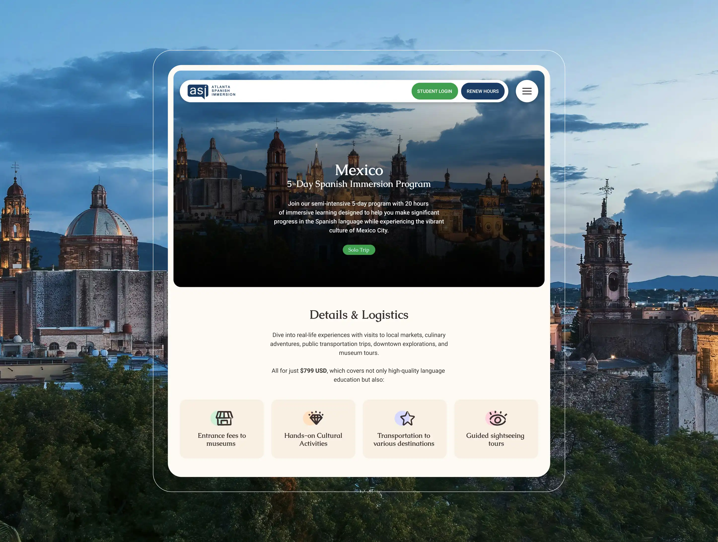
We grounded the visual language in human warmth and cultural nuance, drawing inspiration from Hispanic color traditions such as deep blues, warm neutrals, expressive greens, and celebratory accents, all balanced with restraint and clarity. Typography paired Caudex, a serif with literary warmth and heritage, with Roboto, a modern and highly legible sans serif optimized for digital clarity. This combination reflects ASI’s dual identity of cultural depth and practical learning.
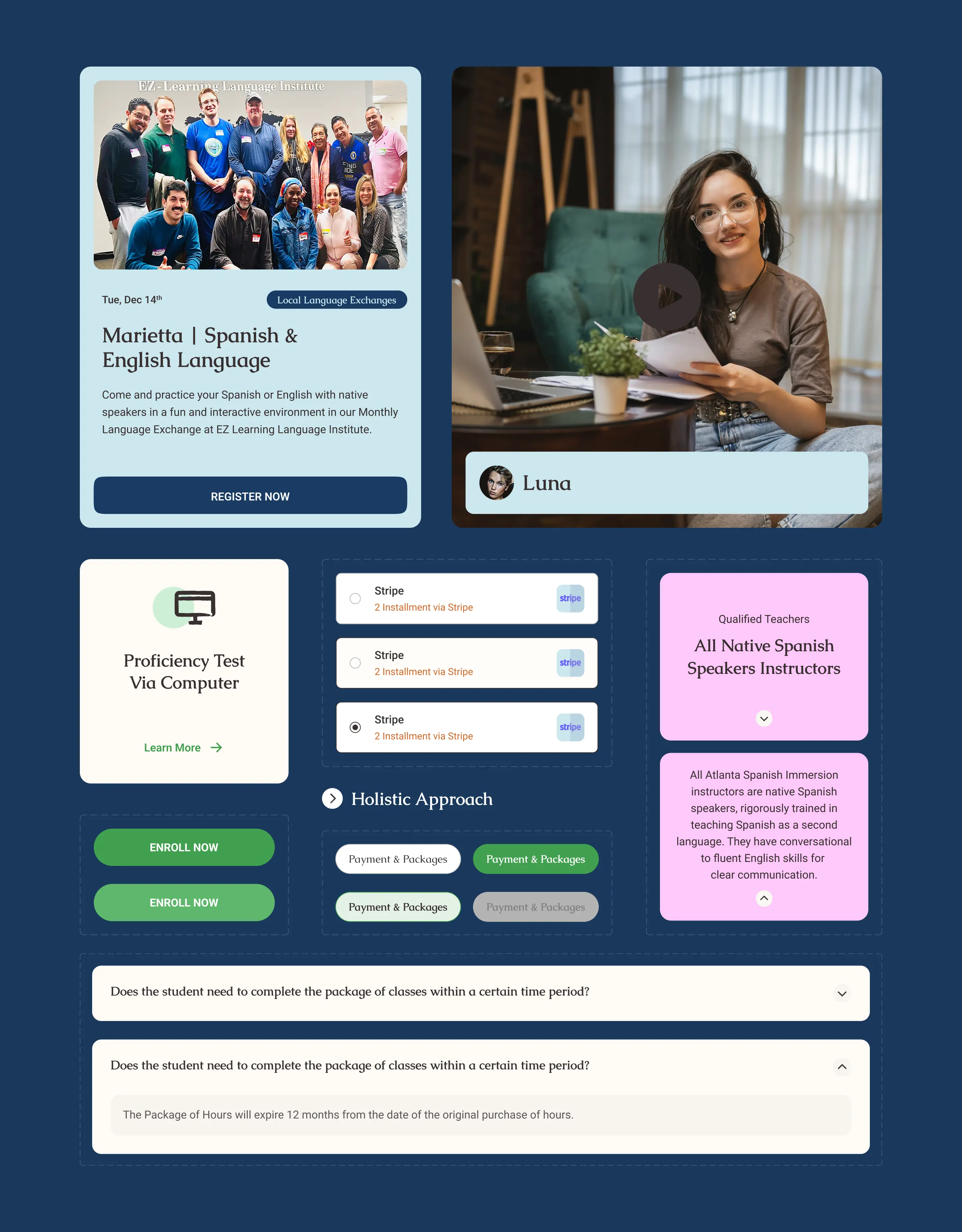
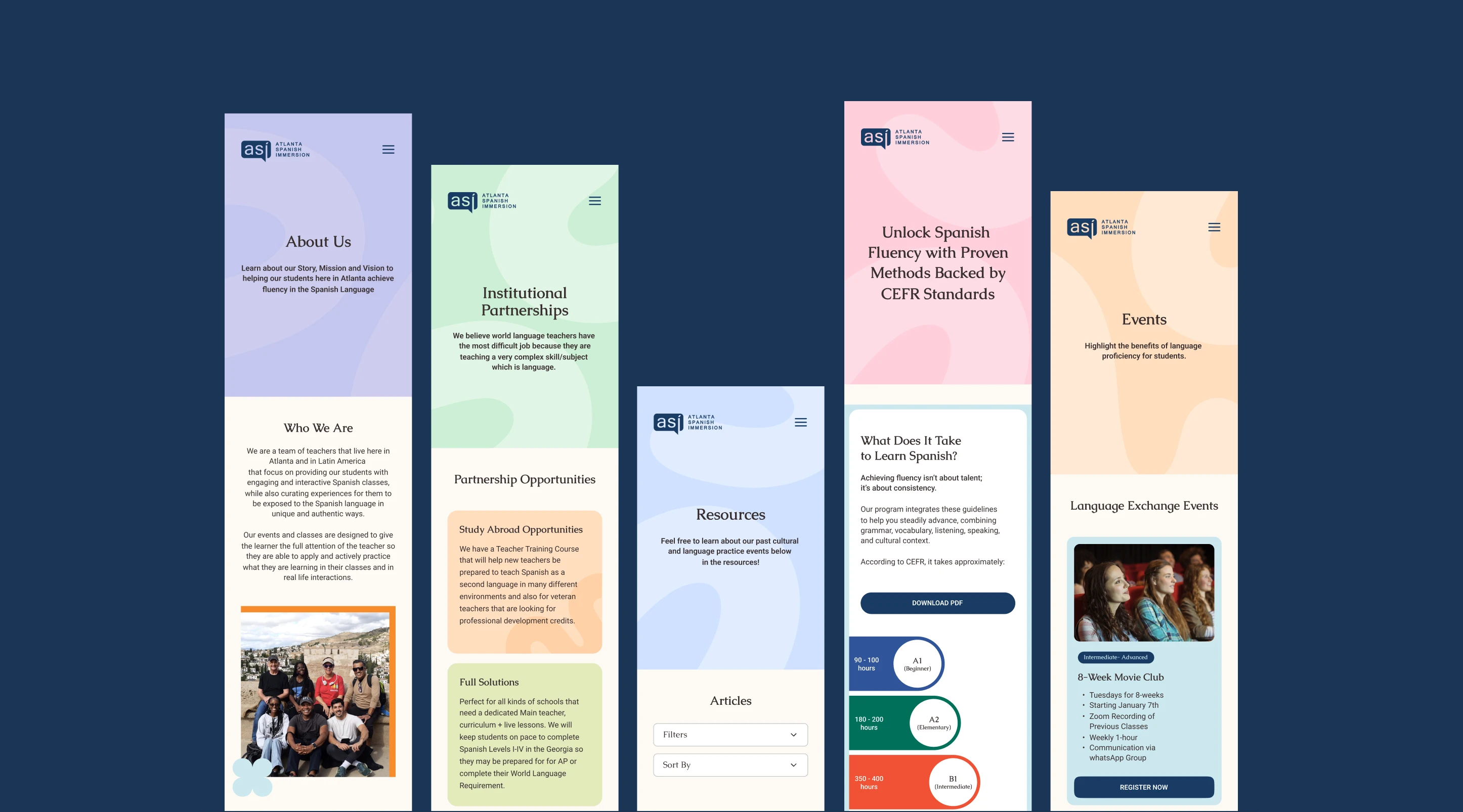
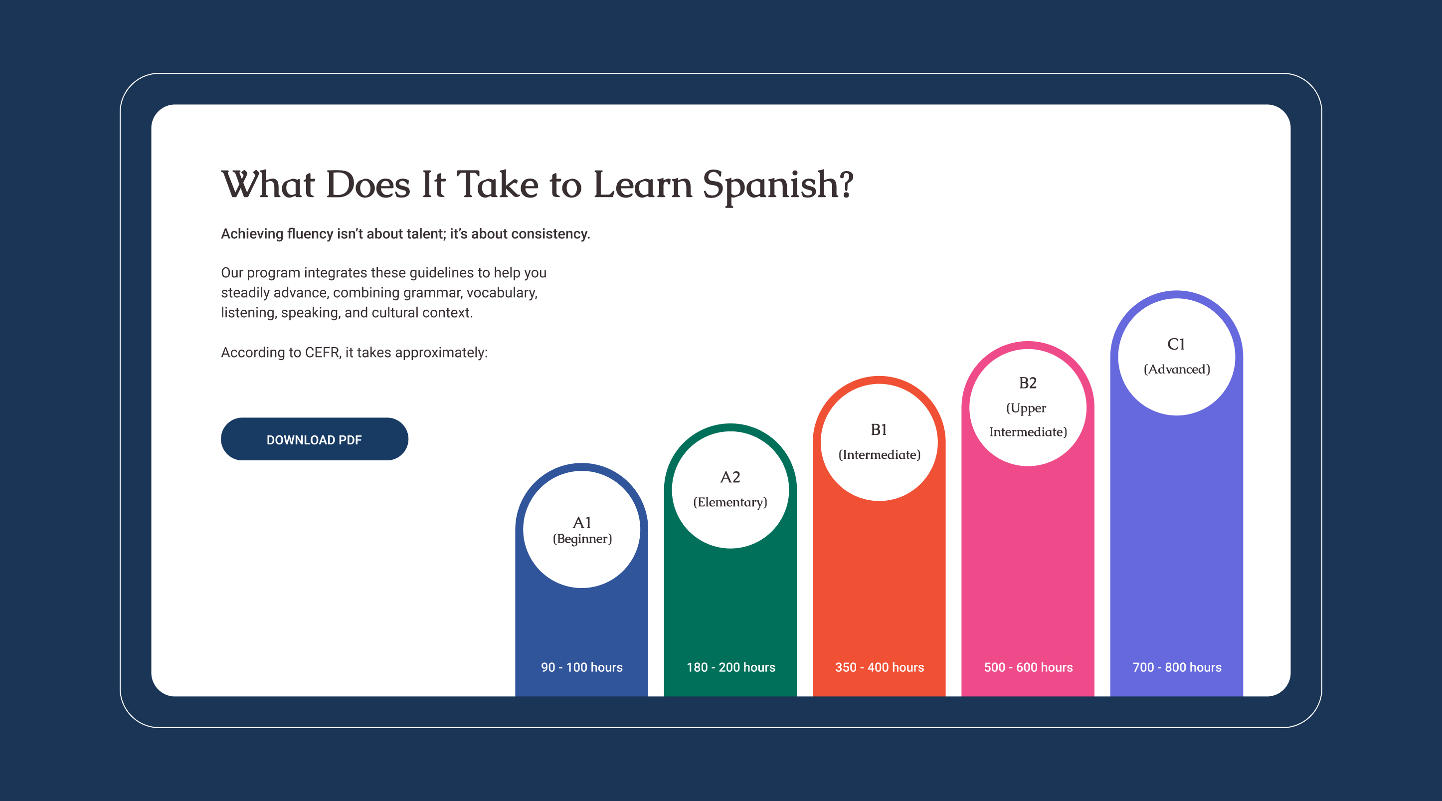
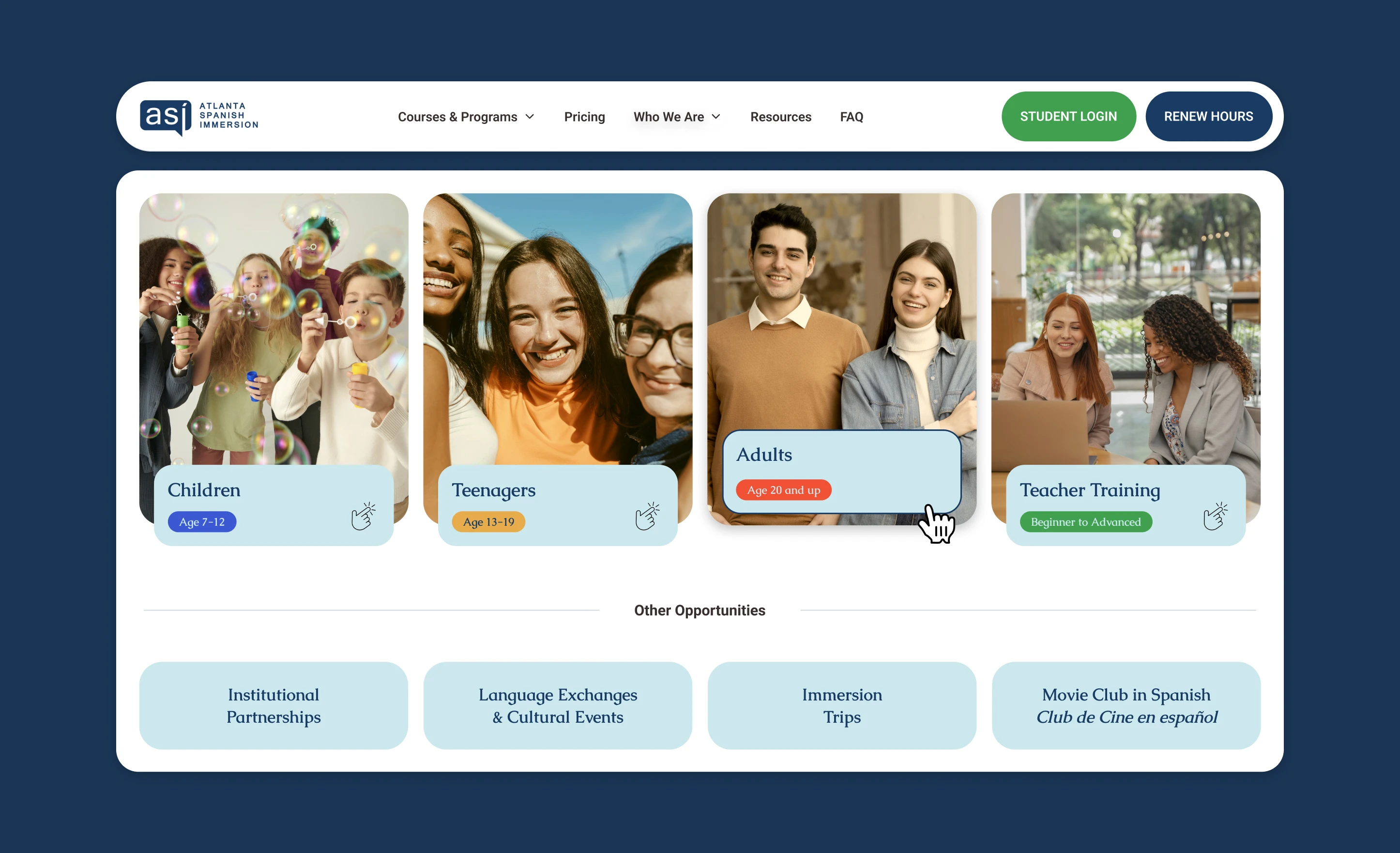
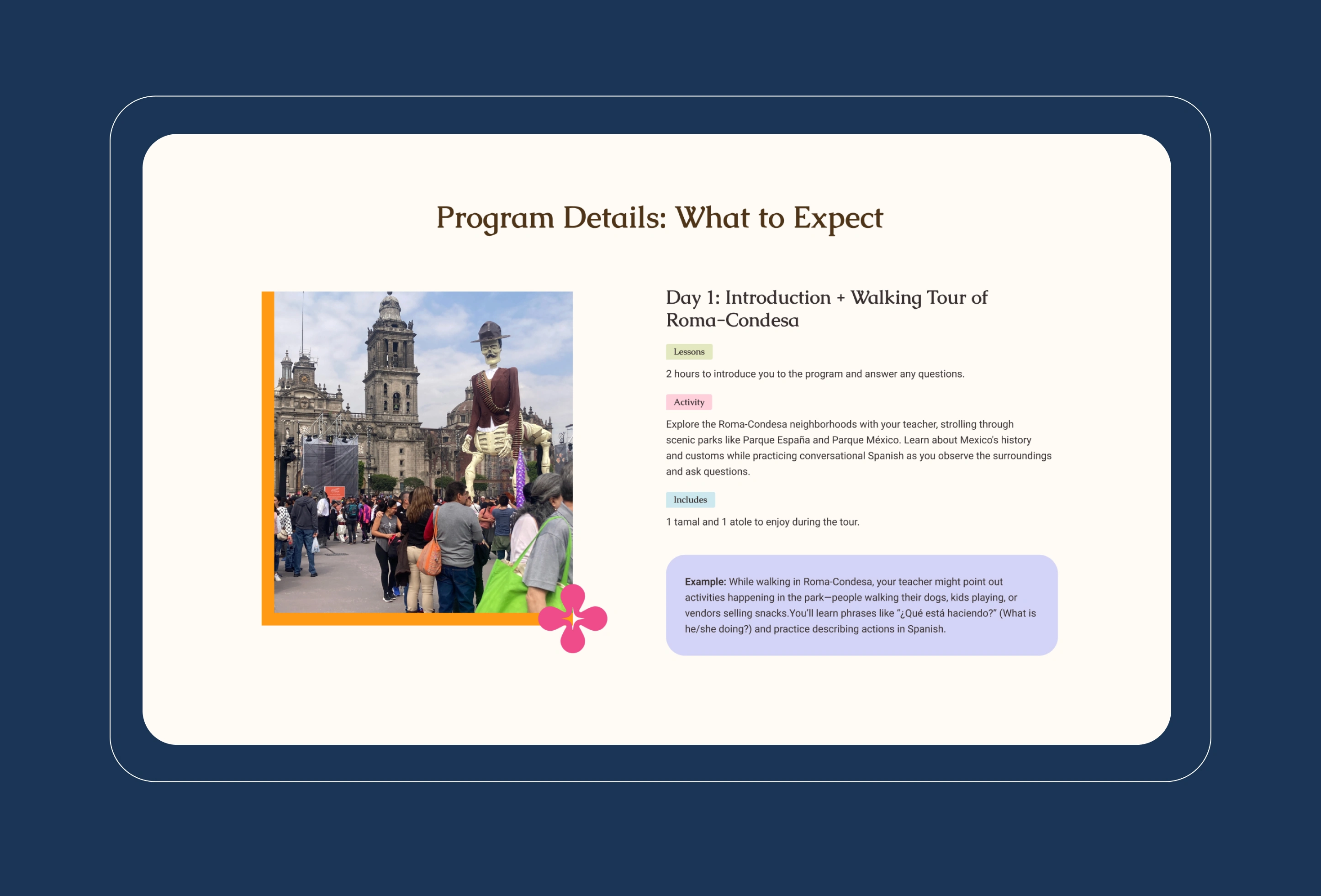
The experience was restructured around confidence and ease. Clear enrollment pathways, transparent payment options, modular components, and human storytelling through photography and instructor profiles work together to create an interface that feels welcoming yet professional. The system mirrors how ASI teaches language, structured but alive.
The Outcome: A platform that speaks fluently
The redesigned experience repositioned Atlanta Spanish Immersion as a contemporary, culturally grounded brand. Engagement increased as users were able to quickly understand offerings, trust instructors, and commit to programs without friction.
More than a visual refresh, the project delivered a scalable digital system that grows alongside its community. One that honors Hispanic culture, elevates education, and turns learning into participation. The result is a digital presence that does not just teach Spanish. It embodies it.
Explore More from OWDT
Each project we undertake is a study in precision — where design, technology, and storytelling converge. Discover more of our work and see how we help institutions, brands, and innovators shape digital experiences that endure.
Have Us Contact You

CLOSE PANEL
Thank You.
Your information has been transmitted successfully and securely.
CLOSE PANEL