Table of Contents
In the realm of website design, the most captivating websites draw their strength from time-honored artistic foundations. Just as painters and sculptors begin with elemental components, lines that guide the gaze, shapes that define form, and colors that convey mood, website designers, too, marshal these basic units to craft compelling digital experiences. Equally vital are the principles, balance that lends harmony, contrast that commands attention, and unity that weaves diverse parts into a seamless whole.
When employed thoughtfully, these elements and principles of art transform a mere collection of pixels into an intuitive, aesthetically pleasing interface. A judicious stroke of color can elevate a call-to-action; a well‑measured use of white space can guide users effortlessly from one section to the next. Typography, too, benefits from these guiding tenets: font choices and hierarchies emerge from an understanding of scale, value, and emphasis, ensuring that text not only informs but resonates.
This article digs deeply into each foundational element and principle, illustrating how they translate into effective choices in typography, layout, and user interface design. By anchoring modern website projects in these enduring concepts, designers create websites that are not only visually coherent but also deeply engaging, striking the perfect balance between digital art and functionality.
Key visual elements in web design
When we talk about website design, the seven fundamental elements of art line, shape, form, color, value, texture, and space serve as the essential building blocks from which every compelling interface is constructed.
Though originally conceived for traditional media, these principles translate seamlessly into the digital domain, guiding the creation of layouts that are both visually arresting and intuitively navigable. Below, we explore each element in depth and illustrate its application to modern web interfaces.
1. Line
A line, at its most literal, connects two points; yet in digital design, its function extends far beyond simple demarcation.
Whether rendered as a thin horizontal rule beneath a header, a slender border around a card, or the invisible alignment that orders text and images, lines direct the viewer’s gaze and impose structure. Curved lines can soften a composition, lending a friendly, organic feel, while angular lines project precision and dynamism.
In user interfaces, well-placed lines establish hierarchy, separating navigation menus from content, delineating form fields, or guiding the eye along a logical reading path.
2. Shape & form
Shapes, flat, two-dimensional silhouettes such as circles, squares, and triangles form the visual vocabulary of a website’s interface.
Buttons often take the familiar form of rounded rectangles, inviting clicks with both their predictability and comfort. Icons may rely on simple geometric shapes to convey meaning at a glance, while card-based layouts organize disparate pieces of information into neatly bounded boxes.
When depth or volume is desired, designers introduce shadows, gradients, or subtle bevels to suggest three-dimensional form. Dialogue windows, for instance, float above their backdrop thanks to a faint drop shadow, making them unmistakably interactive.
3. Color

Color is, perhaps, the most emotionally resonant element in website design. A carefully chosen palette reinforces brand identity, evokes mood, and highlights calls to action. Warm hues, reds, oranges, yellows, can stir excitement or urgency, while cool tones, blues, greens, purples, convey calm or trustworthiness.
Beyond mere aesthetics, color carries functional weight: a vivid accent color on a “Subscribe” button naturally draws attention, and a muted background hue ensures that text remains legible. Accessibility considerations mandate sufficient contrast between foreground and background, ensuring that all users, even those with visual impairments, can engage with the content comfortably.
Thoughtfully applying color to enhance emotion, usability, and brand cohesion is essential, especially when strategically optimizing color in digital design to guide attention and improve user experience.
4. Value (lightness and darkness)
Value refers to the relative lightness or darkness of a color, independent of its hue. By manipulating value, designers create contrast that sharpens readability and guides visual hierarchy. Dark text on a pale background remains the most legible combination for lengthy passages, whereas lighter text on a deep backdrop may be reserved for brief headlines or decorative elements.
Gradients, smooth transitions between values, can simulate subtle lighting effects, imparting a sense of depth or motion. A gradient header, for example, can gently usher the eye from navigation toward principal content, while value shifts within icons can imply a directional flow.
5. Texture
Although digital screens cannot transmit physical sensation, they can convincingly suggest texture through visual cues. A faint paper grain, a delicate linen weave, or a soft noise overlay imprints a tactile quality onto otherwise flat surfaces.
Texture enriches a website’s character, anchoring thematic content: a culinary blog might employ a parchment-like background, while an outdoor gear retailer could echo rugged terrains with a faint rock-like pattern.
Contemporary “flat” design trends often eschew heavy textures, but subtle applications like the whisper of a fabric pattern behind a hero image or a slight embossing on a card imbue interfaces with warmth and personality without overwhelming clarity.
6. Space (white or negative space)
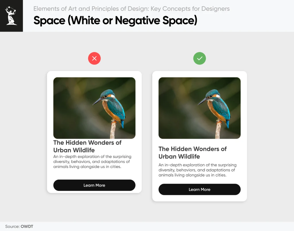
Space, often referred to as negative or white space, is the canvas upon which all other elements rest. It is the intentional breathing room that separates paragraphs, pads images, and cushions interactive components.
Far from being mere emptiness, effective use of space clarifies relationships between elements, reduces cognitive load, and elevates perceived quality. Generous margins and consistent padding around images and text blocks create a sense of luxury and focus, while strategic gaps between navigation items can guide users toward primary actions.
In responsive design principles, adaptive spacing ensures that content reflows elegantly across devices, preserving the harmony of the layout whether on a desktop monitor or a smartphone screen.
Take Action
Learn more about our web design service and options available to you, or contact our specialists to discuss how we can realize your vision.
Fundamental design principles for web interfaces
In the field of digital design, principles serve as the invisible architecture that shapes every user’s journey. While the raw elements of art provide the materials, lines, shapes, and colors, principles of design in art of web design determine how those materials are orchestrated into a cohesive, intuitive whole.
Below, we explore seven core principles: balance, contrast, emphasis, movement, pattern, rhythm, and unity, and illustrate how each informs the creation of effective, engaging web interfaces.
1. Balance: Achieving visual equilibrium
Balance refers to the distribution of visual weight across a page. In website design, a symmetrical layout where elements are mirrored or evenly grouped around a central axis imparts a sense of order and stability, often used in corporate or institutional sites seeking a formal tone.
Asymmetrical balance, by contrast, pairs dissimilar elements such as a large hero image on one side and smaller text blocks on the other, offset by generous whitespace or complementary colors. When executed well, asymmetry feels dynamic yet harmonious, guiding the visitor’s attention without imposing rigidity.
2. Contrast: Directing focus through difference
Contrast relies on perceptible differences of color, size, shape, or texture to make key elements stand out. A stark white call-to-action button against a deep charcoal background becomes an instant focal point, signaling where a user should click.
Beyond color, typographic contrast pairing a bold headline font with a light-body copy establishes hierarchy and improves readability. Importantly, sufficient contrast also underpins accessibility: ensuring text and interactive components meet contrast standards guarantees legibility for all users, including those with visual impairments.
3. Emphasis: Crafting a clear focal point
Emphasis is the art of deciding what a user should see first. Whether it is a striking headline, a promotional banner, or a “Buy Now” button, emphasis leverages scale, color, and placement to elevate one element above all others.
Consider a landing page where the hero image spans full width, yet a brightly colored button occupies the exact center; the eye naturally gravitates to that button, encouraging interaction. By creating a clear visual hierarchy, emphasis ensures that critical messages are not lost in the noise.
4. Movement: Guiding the user’s journey
Movement describes the path a visitor’s gaze follows across a page. Web users typically scan in recognizable patterns, F-shaped on text-heavy pages, Z-shaped on more visual layouts, but designers can refine these patterns through directional cues.
Subtle arrows, slanted imagery, or staggered content blocks can lead the eye from headline to body text to call-to-action in a deliberate sequence. Thoughtful movement keeps users engaged longer and increases the likelihood they will reach conversion points.
5. Pattern: Establishing familiarity and consistency
Pattern emerges from repetition: repeating visual elements, navigation bars, button styles, and iconography creates a sense of unity and predictability. When every page of a website employs the same header structure and link styling, visitors feel at ease, knowing exactly where to find what they need.
Consistent patterns also streamline the design process, allowing teams to reuse components and maintain brand cohesion across complex web applications.
6. Rhythm: Cultivating visual cadence
Rhythm builds on pattern by introducing deliberate variations in repetition. Just as musical rhythm relies on beats of differing lengths, visual rhythm alternates element sizes, colors, or spacing to create a dynamic yet ordered flow.
Imagine a blog homepage featuring a large featured article card followed by two smaller cards, then another large card. This alternation of scale imbues the layout with energy, encouraging the eye to dance down the page rather than drift aimlessly.
7. Unity: Weaving cohesion across the interface
Unity, sometimes called harmony, is the principle that ensures all parts of a design feel like they belong together. A unified website uses a restricted color palette, consistent typography, and aligned grids to present its content as a singular, coherent experience.
Whether a visitor lingers on the homepage or explores deep within the website, the shared design language, matching icon shapes, recurring background motifs, and uniform spacing reinforce a strong brand identity and prevent the interface from fracturing into disjointed parts.
Design in practice: Elevating typography, layout, and user experience
Translating fundamental visual concepts into tangible, high‑performance websites demands a deliberate fusion of artistry and technical rigour. In practice, designers harness typography, grid‑based layouts, intuitive navigation, and unwavering clarity to craft interfaces that not only captivate the eye but also streamline the user’s journey.
Below, we delve into each of these practical applications, illustrating how the principles of balance, contrast, unity, and rhythm coalesce to produce digital experiences of lasting impact.
Typography & visual hierarchy
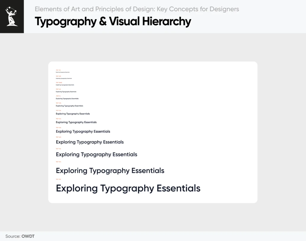
At the core of effective content presentation lies the mastery of typography. Beyond merely choosing attractive typefaces, designers orchestrate a hierarchy through judicious variations in size, weight, and hue, each adjustment guiding the reader’s eye in a precise sequence. A commanding headline, set in a substantial point size and darker tone, telegraphs its primacy at first glance; subordinate text then adopts lighter weights and subtler tints, signaling secondary importance without vanishing into the background.
Consistency across pages reinforces this hierarchy. Employing a standardized typographic scale, say, 32px for H1, 24px for H2, and 16px for body copy ensures that every heading, subheading, and paragraph adheres to an intuitive structure. Patterned use of fonts bolsters brand cohesion: if your website’s body text consistently appears in a humanist sans‑serif at 1.5 line height, users learn to anticipate readability and flow, strengthening their comfort and trust in the content.
Whitespace is equally pivotal. Adequate leading (line spacing) and paragraph margins prevent text from crowding, making large bodies of information easier to navigate. For instance, an article formatted with 2em spacing between paragraphs and 1.5em line height transforms a potentially daunting wall of text into approachable, scannable segments. This rhythm of pause and progression invites readers to linger, absorb key messages, and respond to calls to action.
Layout & grid systems
Underpinning every harmonious website is a thoughtfully implemented grid. Far from a restrictive cage, a grid provides a flexible scaffold upon which elements align, balance, and adapt. A twelve‑column grid, for example, allows for myriad layouts: a full‑width hero image might span all twelve columns on desktop, then shrink to six columns alongside a text block; on mobile, both stack vertically, each spanning the screen’s full width. Through this predictable reflow, unity and balance endure across devices.
Card‑based designs exemplify the grid’s power. Equally sized cards, spaced uniformly within the grid’s gutters, establish a rhythmic pattern that communicates stability. Should a featured card deviate in size, perhaps twice the width, it draws emphasis while the surrounding cards maintain the overall equilibrium. Such calibrated variance leverages asymmetrical balance, offering visual interest without sacrificing harmony.
Navigation & consistency
An effective navigation system is the hallmark of a user‑centric and functional web design. By repeating core elements, logo placement, menu style, and call‑to‑action buttons across every page, designers cultivate an environment of predictability. Users need not relearn site mechanics; they instinctively know where to click or tap.
Consider the persistent header: by affixing the website logo to the top‑left corner and the main menu to its right on every page, you create a stable reference point. A uniform button style, rounded corners, consistent hover animation, and a signature accent color signal interactivity and reinforce brand identity. When the “Contact Us” button appears in the same place, styled identically, users gain confidence that their interaction will yield the expected response. This pattern reduces cognitive load and fosters intuitive exploration.
Accessibility & clarity
Design excellence extends beyond aesthetics to encompass inclusivity. Contrast and spacing, often deemed purely visual concerns, are vital website accessibility considerations. Adhering to WCAG guidelines for color contrast, aiming for a minimum 4.5:1 ratio between text and background ensures legibility for readers with low vision or color deficiencies.
Whitespace also undergirds clarity. Generous padding around clickable elements prevents mis‑taps on touch devices, while distinct separation between sections helps sighted users parse content swiftly. Grouping related items through proximity and alignment, such as pairing form labels with their fields or clustering product information, draws on principles of unity and rhythm. This logical organization allows users to process complex pages with minimal effort, elevating the overall user experience.
Synthesis: Crafting cohesive experiences
When typography establishes hierarchy, the grid imposes order, navigation builds familiarity, and accessibility safeguards clarity, the result is a website that feels at once polished and effortless. Each design decision, be it a 28px bold heading, a six‑column card layout, or a repeated accent‑color button, serves a dual purpose: aesthetic appeal and functional guidepost.
By thoughtfully integrating these practices, designers create environments where information flows logically, interactions feel intuitive, and visual harmony underpins every click. In doing so, they transform digital canvases into living ecosystem spaces that welcome, inform, and delight every visitor.
Take Action
Learn more about our digital agency and options available to you, or contact our specialists to discuss how we can realize your vision.
Where web design meets fine art: OWDT’s signature approach
At OWDT web design company in Houston, we believe that exceptional web design is not just built, it is composed, much like a fine work of art. The artful interplay of foundational elements, line, shape, color, value, texture, and space, paired with design principles such as balance, contrast, and unity, elevates digital experiences from static code to dynamic storytelling. These elements of art and principles of design are more than abstract concepts; they’re the framework we use to craft impactful digital environments.
Whether we are building a vibrant, color-driven landing page or structuring a complex content portal, our Houston-based team combines aesthetic sensibility with rigorous technical standards. Every pixel, from the thickness of a headline to the rhythm of navigation spacing, is chosen with intention to inform, delight, and convert.
By anchoring every project in this timeless design language, OWDT ensures your website not only looks stunning across all devices but also performs with purpose. As part of our holistic digital solutions, we also offer SEO services to enhance visibility and drive meaningful engagement. Our close client collaboration allows us to transform brand visions into immersive, intuitive interfaces. Embracing these principles is more than a strategy, it is a promise.
With OWDT, you gain a partner committed to crafting digital spaces where form meets function and where elements of art and principles of design work in concert to deliver unforgettable user experiences.