
ACSOM
Web Design | ACSOM
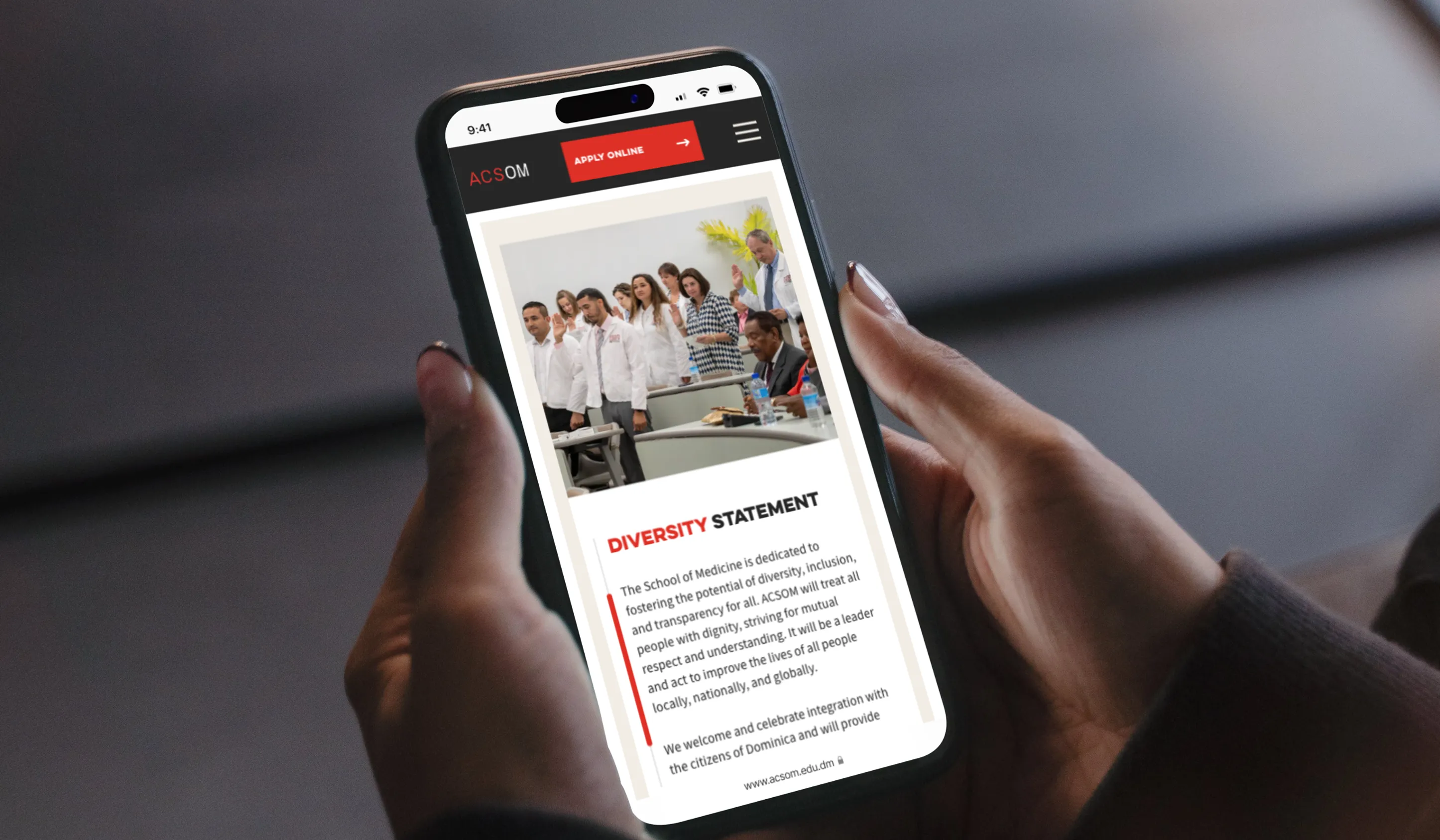
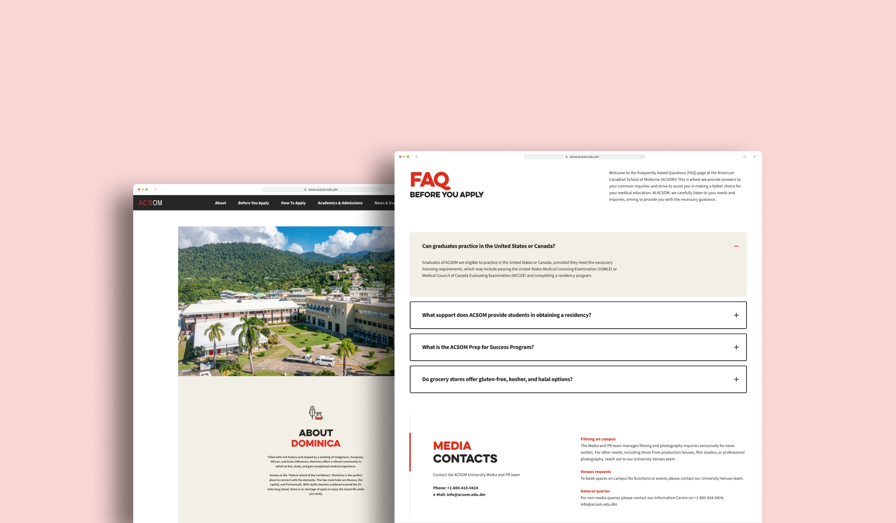
The American Canadian School of Medicine (ACSOM) website offers a polished, professional, and user-friendly digital experience that effectively conveys the school’s dedication to high-quality medical education. From the moment visitors land on the homepage, the site clearly communicates ACSOM’s core values—such as its non-profit status, small-group learning model, and clinically integrated curriculum—through thoughtfully crafted messaging and compelling visuals. The use of high-resolution images showcasing the modern campus facilities and engaged students helps to build credibility and trust with prospective students and their families.
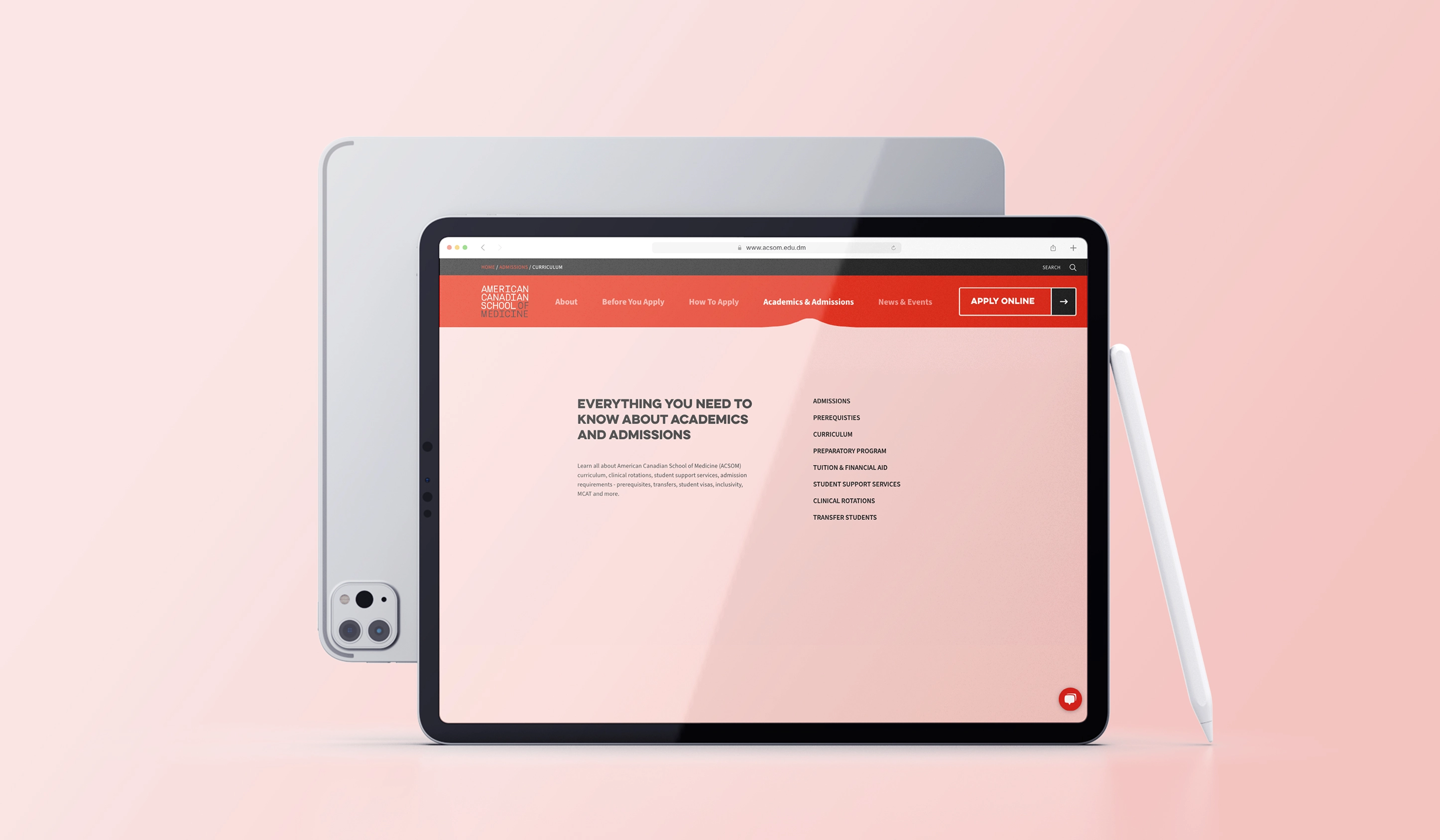
The website’s intuitive navigation structure allows users to quickly find essential information about admissions, curriculum, student support, and financial aid, reducing barriers for prospective applicants. Additionally, responsive design ensures the site performs seamlessly on a wide range of devices—from desktops to smartphones—making it accessible to the diverse, global audience ACSOM serves. Throughout the site, a balanced color palette and clean typography reinforce the institution’s professional yet welcoming atmosphere. Overall, the design thoughtfully supports ACSOM’s mission by creating an inviting, informative, and trustworthy online presence that appeals to prospective medical students from the U.S., Canada, and beyond.
Client Goals
highlight non-profit status
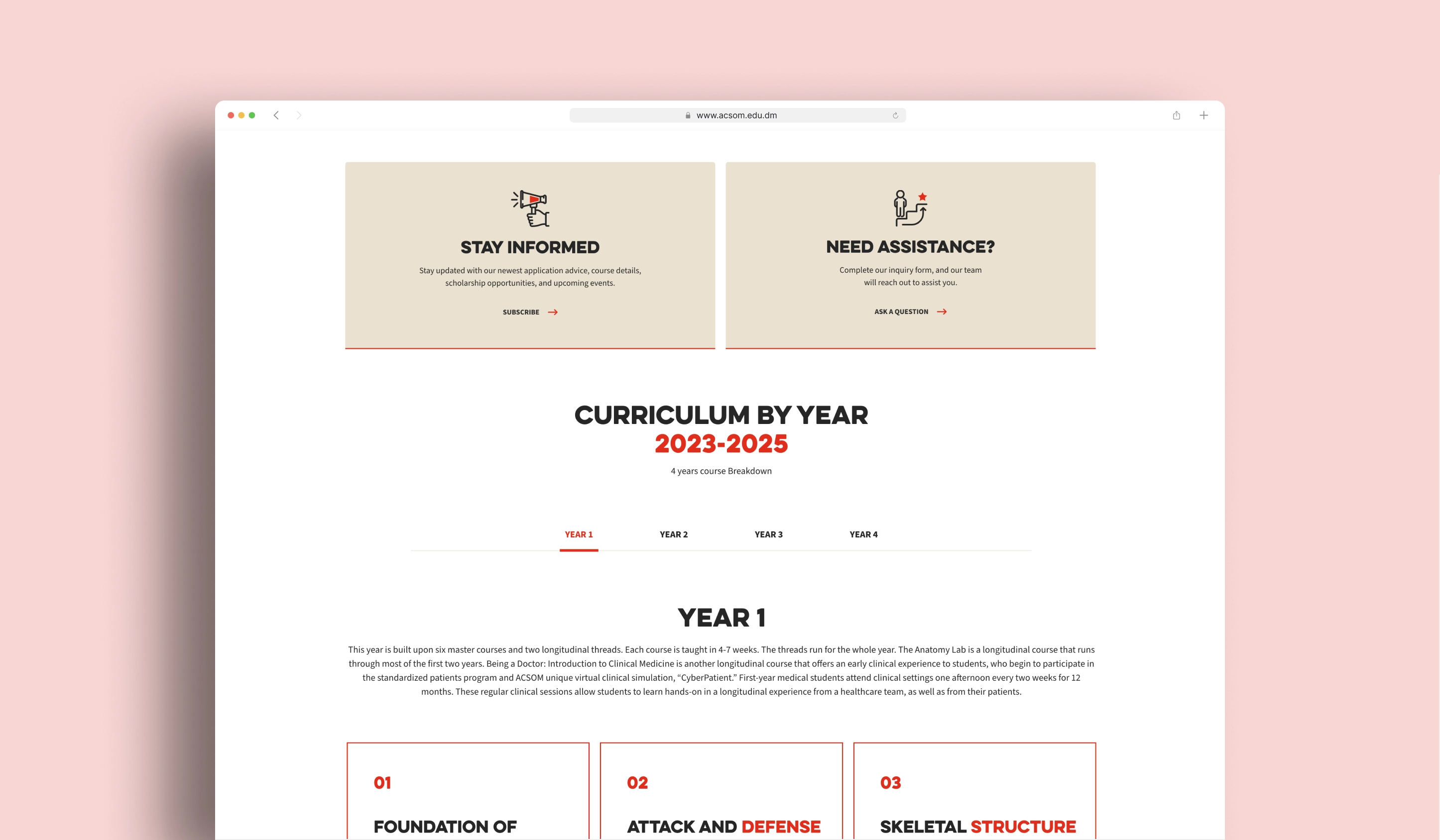
showcase small-group learning
promote clinical integration
provide clear admissions information
enhance user experience
build trust and credibility
facilitate easy access to information
support international students
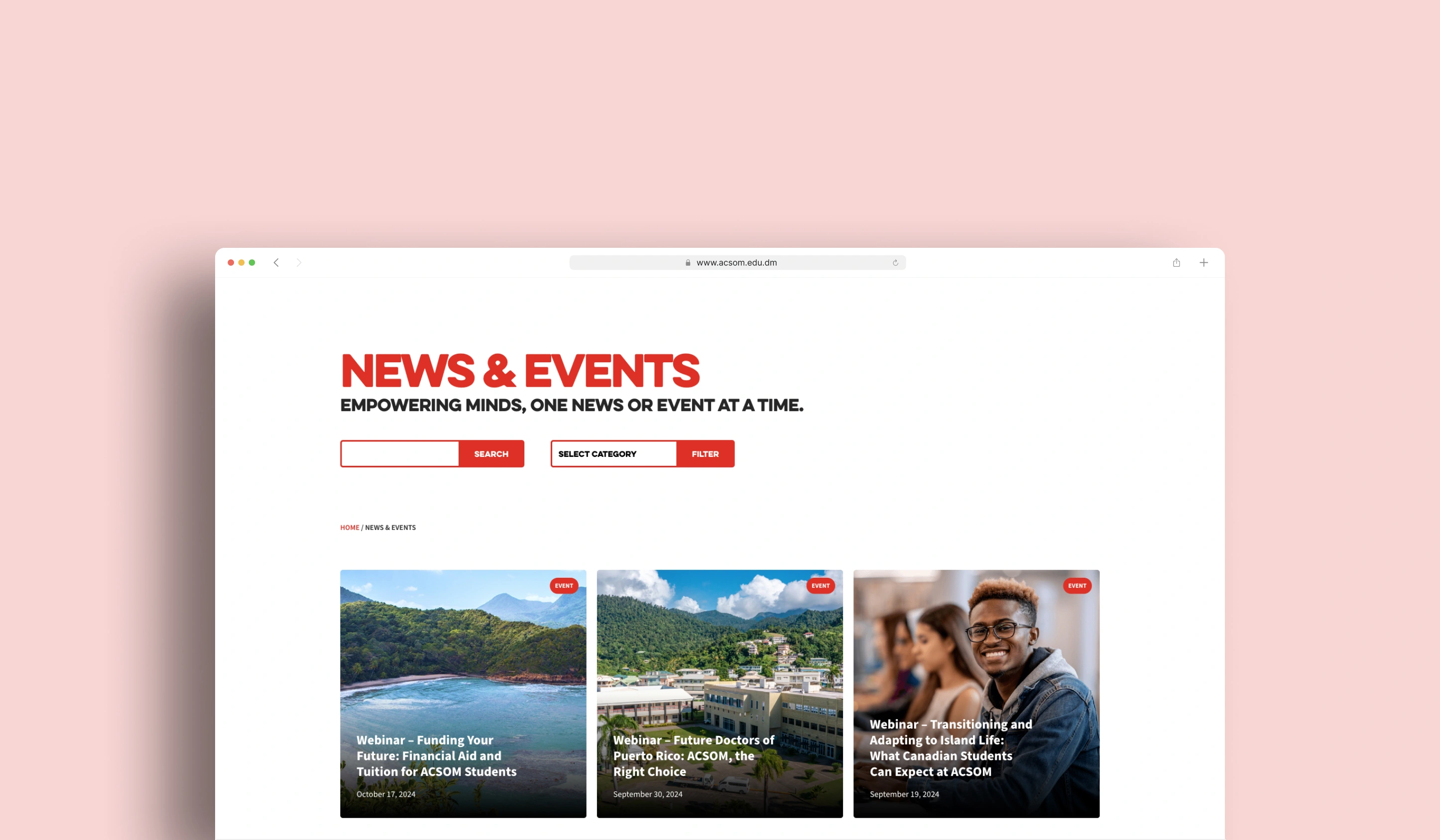
showcase campus life
align with brand identity


The color palette
The color palette for the medical university website blends light brown beach sand, coral pink, and red to harmonize warmth, professionalism, and urgency—key themes for a healthcare education platform. Dominating the base, the light brown beach sand evokes stability and a grounded academic foundation, reminiscent of natural earth tones that foster trust and approachability. Coral pink accents in the main navigation and secondary elements introduce a nurturing, welcoming energy, subtly reflecting the compassionate care central to medical practice.
Strategic pops of red emphasize critical calls-to-action, such as alerts or application deadlines, leveraging its boldness to signify urgency and vitality—a nod to the life-saving focus of healthcare. Neutral off-whites and deep charcoals ensure high-contrast readability for text and tables, prioritizing accessibility. This palette balances warmth with authority, avoiding clinical sterility while maintaining professionalism. The earthy and vibrant tones together mirror the institution’s mission: bridging tradition with innovation in medical education, all within an inclusive, user-centric digital space.
Enhancing Usability & Visual Storytelling
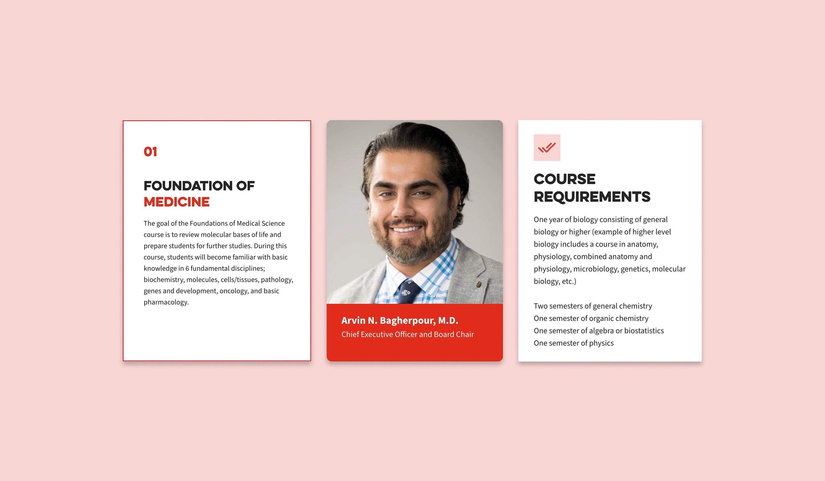
The custom iconography developed for the ACSOM website plays a crucial role in enhancing both usability and visual storytelling. Each icon was thoughtfully crafted to represent key concepts such as admissions, curriculum, student support, and campus life, providing users with clear, instantly recognizable visual cues. This tailored icon set not only reinforces the brand’s unique identity but also improves navigation by helping visitors quickly locate important information.
By integrating these custom icons consistently throughout the site, the design achieves a cohesive, polished look that supports ACSOM’s mission of delivering a modern, accessible, and student-centered medical education experience.
Explore More from OWDT
Each project we undertake is a study in precision — where design, technology, and storytelling converge. Discover more of our work and see how we help institutions, brands, and innovators shape digital experiences that endure.
Have Us Contact You

CLOSE PANEL
Thank You.
Your information has been transmitted successfully and securely.
CLOSE PANEL