Table of Contents
- What is a luxury color palette?
- Why luxury colors matter in web design
- How to build a luxury color palette from scratch
- Key elements of a luxury color palette
- Luxury color palette example: The Artisan Center case study
- Tips to apply luxury colors in web design
- Tools and methods for choosing and testing color palettes
- OWDT: Where luxury design meets performance
Choosing the right color palette can make or break a website. Colors shape how visitors feel, how they interact, and how long they stay. When used well, a luxury color palette not just looks good, it also builds trust, creates mood, and strengthens the brand. In this article, we will break down how to use a luxury color palette for website design, the impact it has on UX, and how to pick the best one for your brand.
What is a luxury color palette?
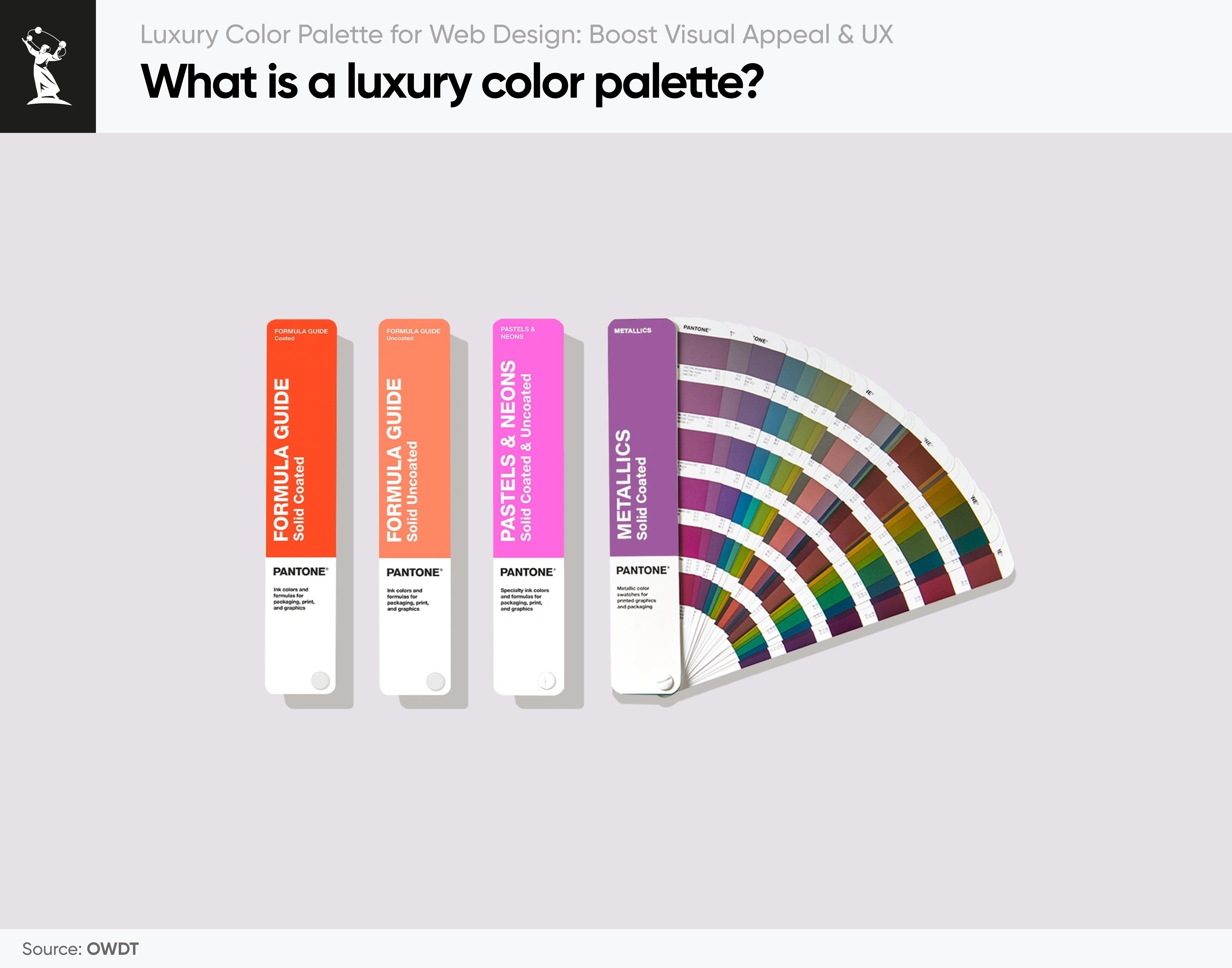
A luxury color palette brings together hues that feel rich, refined, and timeless. Rather than relying on loud or trendy colors, these palettes lean on deep tones, soft neutrals, and carefully placed metallics such as gold or silver. What truly sets them apart is not just the colors themselves; it is the balance, contrast, and emotional resonance they create.
I have found that luxury palettes are particularly effective in industries where perception matters most: fashion, beauty, real estate, hospitality, and high-end professional services. Increasingly, web designers are also turning to these palettes to elevate digital brands, signaling exclusivity and trust from the very first interaction.
A true luxury palette does not shout, it whispers and guides the eye with quiet confidence rather than overwhelming it. When used thoughtfully, these colors in digital design make a website feel sophisticated, elegant, and worth exploring, an experience that builds both visual appeal and user trust.
Why luxury colors matter in web design
Colors do more than just decorate a page; they send messages without words. A luxury color palette for a website can help set the right tone from the first interaction.
Key reasons to use a luxury palette:
- Trust: Deep tones create a sense of stability and professionalism
- Elegance: Subtle and rich colors feel intentional and upscale
- User focus: When everything works together visually, users focus better
- Consistency with Brand: High-end brands demand high-end visuals
Take Action
Learn more about our web design service and options available to you, or contact our specialists to discuss how we can realize your vision.
How to build a luxury color palette from scratch
Crafting a luxury color palette from scratch is less about chasing web design trends and more about creating timeless harmony. Here are tips on how to structure and approach to ensure both elegance and usability:
- Pick a Rich Base Color
Start with one strong foundation color that sets the mood and anchors the brand’s identity. Deep navy, emerald green, wine red, or chocolate brown are classic choices because they project authority and refinement. For example, in a law firm website design I led, navy became the anchor.” - Add a Secondary Color
This supports the base color and provides depth, often used in backgrounds or content blocks. Think soft beige, muted blues, or taupe. In the same project, muted neutrals softened the intensity of navy, making the design more inviting. - Choose an Accent Color
An accent provides the visual spark that guides user attention. Metallics like gold, copper, or rose gold work beautifully, as do bold jewel tones or fresh greens. For example, in a medical website, a calming green accented the trustworthy blue, while the law firm design relied on subtle gold highlights to elevate key calls-to-action. - Include Neutral Tones
Creams, whites, or light grays bring balance and give the design room to breathe. Neutrals prevent the palette from feeling crowded and allow the dominant and accent colors to shine. - Use a Tool for Balance
Digital tools such as Coolors, Color Hunt, or Adobe Color help test pairings, refine proportions, and check accessibility. They are invaluable for ensuring the palette feels cohesive before it is applied. - Preview on Real Layouts
A palette may look perfect in isolation but fail in practice. Always test the colors in actual website sections, headers, buttons, text blocks, and footers. Refine the shades at this stage to ensure optimal readability, contrast, and harmony.
Key elements of a luxury color palette
Crafting a luxury color palette goes beyond selecting beautiful shades; it’s about achieving perfect balance and harmony. You can explore the key elements and principles of a luxury design below.
The 60–30–10 color rule
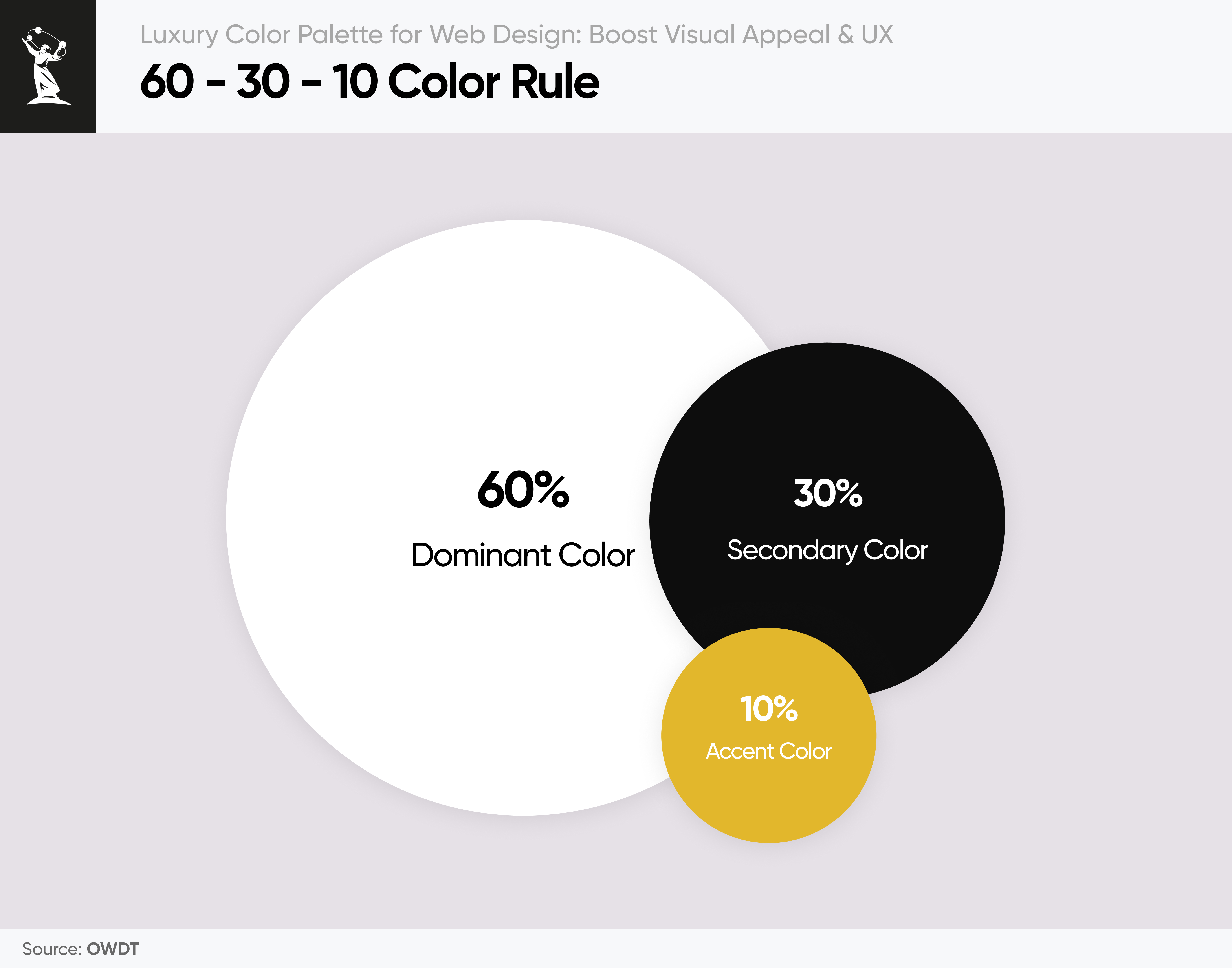
Together, these elements form the foundation of a luxury color palette. But balance matters just as much as the colors themselves. That is where the 60–30–10 color rule comes in.
- 60% Dominant Color (rich base tone) – Creates the mood and overall identity of the site.
- 30% Secondary Color (soft neutral) – Provides contrast and keeps the design elegant yet functional.
- 10% Accent Color (shimmer or standout) – Guides attention to key actions and elevates the brand’s sense of luxury.
I often apply this structure when designing for premium brands. The dominant tone builds authority, the neutral ensures clarity and balance, and the accent delivers that final spark of sophistication. The result is a digital presence that feels elegant, trustworthy, and memorable.
Balancing elegance with contrast and accessibility
A luxury color palette should never sacrifice readability for style. In fact, true elegance in web design comes from making sure every user, regardless of ability, can interact comfortably with the site. Contrast and accessibility are essential to achieving this balance.
Key practices include:
- Check text readability with tools like WebAIM’s Contrast Checker. This ensures that text always meets or exceeds WCAG standards for legibility.
- Use colorblind simulators to confirm that navigation, buttons, and calls-to-action remain clear for users with visual impairments.
- Maintain a strong contrast between background and foreground elements. Low contrast may look minimalistic, but it risks excluding users and reducing engagement.
I have seen firsthand how poor contrast can undermine an otherwise beautiful design. A site may look visually stunning, but if visitors struggle to read text or identify buttons, they will leave frustrated. On the other hand, when website accessibility is prioritized, the design feels both premium and welcoming, proof that luxury does not have to come at the expense of usability.
Using white space to create a luxury look
Luxury design is not about filling every corner with visuals. It is about restraint, clarity, and allowing colors to breathe. White space, also called negative space, plays a crucial role in making a luxury design refined and intentional.
- Gives colors room to shine. Without adequate spacing, even the most elegant palette can feel cramped or overwhelming.
- Improves readability and focus. White space separates content into digestible sections, guiding the user’s attention naturally.
- Enhances perception of luxury. Clean, uncluttered layouts are often associated with premium brands because they communicate confidence and simplicity.
Luxury color palette example: The Artisan Center case study
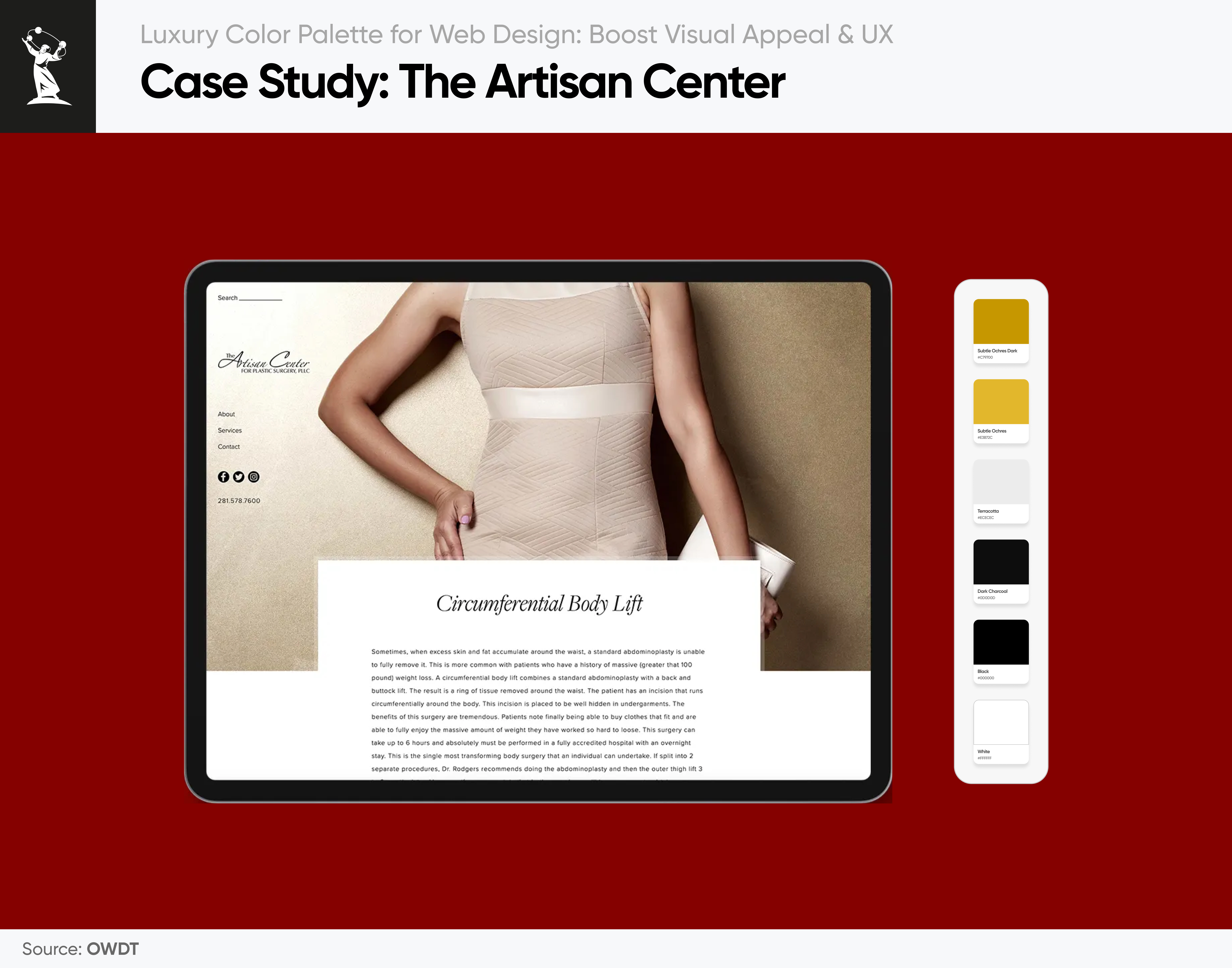
One of my favorite projects was for The Artisan Center. Their design called for an elegant, handcrafted feel. The palette we developed is warm, muted, and refined, think soft creams, gentle terracottas, subtle ochres, and accents of slate or charcoal for contrast.
Here is why it worked so well:
- Warm earthy tones reflected craftsmanship and authenticity-qualities central to The Artisan Center’s brand.
- Soft neutrals provided a welcoming backdrop and improved readability.
- Slate accents added depth and balance, guiding the eye toward important calls to action.
What that meant in UX and interaction:
- The Home page header uses a cream background with a terracotta accent on buttons and headlines. It sets a welcoming tone.
- I used darker tones (slate/charcoal) for body text, ensuring readability, especially where warm backgrounds might reduce clarity.
- Hover states and interactive elements used slightly darker shades of the accents so the changes feel noticeable but natural.
- Users gave feedback that they felt the site looked artisanal and grounded, something that matches what Artisan Center does (handmade, quality). The warm palette made them stay on pages longer, explore the gallery, and generally feel more connected.
The result was a website that felt both artisanal and luxurious. Visitors described it as inviting and grounded. The warm palette encouraged them to linger longer, explore galleries, and connect with the brand’s story of quality and creativity. This project reminded me how carefully chosen colors can communicate heritage and trust without overwhelming the senses.
Elegant color palettes example: Millennium PetroCapital case study
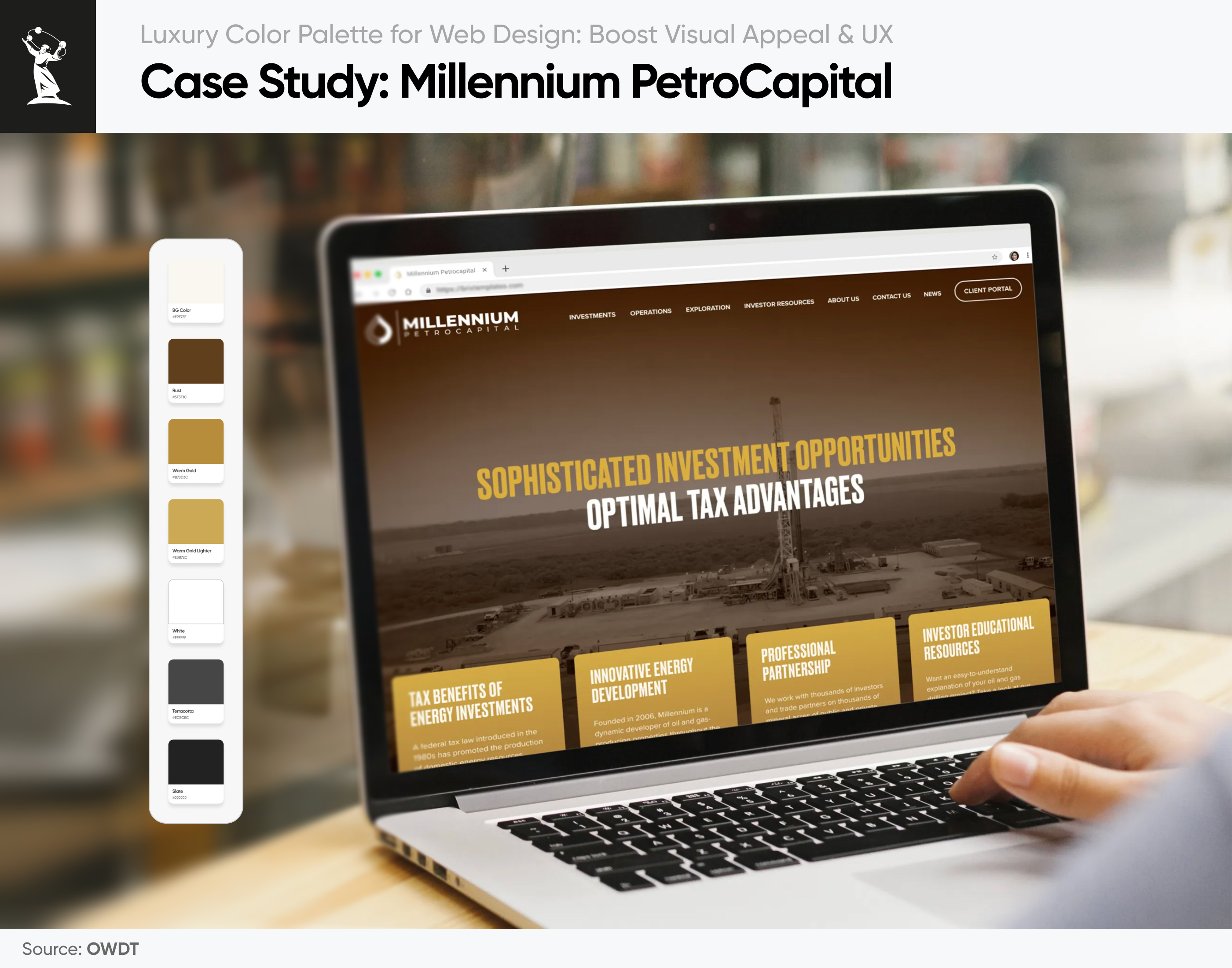
Another project I worked on was for Millennium PetroCapital. They needed a look that conveys strength, reliability, and authority. We built the foundation around deep charcoal and dark slate tones, supported by warm accents of rust and muted gold.
Why this color palette worked:
- Charcoal and dark slate project seriousness and stability, perfect for an investment and energy-focused brand.
- Rust and warm gold accents bring energy and highlight key calls to action without feeling flashy.
- Soft neutrals balance the strong palette, ensuring content remains easy to read and visually comfortable.
The interplay of dark foundations with warm highlights gave the website a commanding yet approachable presence. Buttons and CTAs in the rust-gold family drew immediate attention, boosting engagement. Feedback from users and the client confirmed that the site felt “serious and professional but not cold,” exactly the impression Millennium PetroCapital wanted to leave.
Tips to apply luxury colors in web design
Creating the palette is only half the work; applying it properly matters just as much. Here is what you need to focus on during implementation:
- Keep contrast in mind: Make sure text is always easy to read
- Be consistent: Use the palette across all pages and components
- Highlight the right things: Use accents to draw attention, not just for decoration
- Pair with clean visuals and modern fonts: A luxury palette shines when everything else is sleek and modern
Common pitfalls to avoid when using elegant color palettes
Here are the things you should avoid:
- Using too many colors: More than five colors can make the design chaotic
- Ignoring color psychology: Every color sends a message (be intentional)
- Not testing readability: Some color combos may look nice, but are hard to read
- Overusing bright tones: Bright shades can damage the refined feel
Tools and methods for choosing and testing color palettes
Designing with a high-end color palette is not just about choosing colors that look good together. They need to perform consistently across screens, with text, and on different devices. That is why every palette should be tested thoroughly before it is finalized.
Here is a proven workflow:
1. Start with color pairing tools
Once a base color is selected, online tools like Adobe Color and Coolors make it easier to explore complementary tones and test harmony.
- Adobe Color allows palettes to be built using rules such as analogous, triad, and complementary
- Coolors speeds up experimentation by shuffling options and locking in promising combinations
Explore our guide on the best AI tools for web design to refine your creative process, elevate user experience, and achieve modern precision in every detail.
2. Check contrast and accessibility
Elegant design should never come at the expense of readability. Contrast tests confirm that text remains clear, especially in critical areas such as buttons, forms, and hero sections.
- WebAIM Contrast Checker verifies text-to-background color ratios against WCAG standards
- Stark (Figma plugin) checks real-time contrast ratios and simulates color blindness directly in the design workflow
3. Test the palette in context
Colors that look appealing in isolation may behave differently in real layouts. Creating 2–3 sample screens helps evaluate palettes across:
- Headings and body text
- Buttons and calls-to-action
- Backgrounds, footers, and overlays
- Icons and hover effects
Gold, for instance, may feel refined in a small accent but overwhelming on a large background. Contextual testing ensures balance and usability.
4. Gather feedback
Fresh eyes often reveal issues designers may miss. Sharing mockups with non-designers can highlight areas where readability is difficult or a color feels too aggressive. Listening to this feedback ensures the palette creates an experience that feels natural and effortless for every user.
How color choices directly impact UX
A website’s visual identity directly shapes how users feel and behave. This is why color selection is one of the most critical design decisions, especially when working with luxury color palettes. When applied with intention, color strengthens user experience in multiple ways.
- Establishes emotional tone from the start. Rich, refined colors create an immediate sense of trust, sophistication, or calm, depending on the brand’s goals.
- Highlight content without distracting. A well-balanced palette ensures calls-to-action and key information stand out without overwhelming the page.
- Supports user flow through visual hierarchy. Strategic color choices guide the eye naturally from one section to the next.
- Makes browsing more comfortable. Soft neutrals and proper contrast reduce visual fatigue, encouraging longer engagement.
- Builds trust and reassurance. Consistent, thoughtful color reinforces the idea that users are in the right place and interacting with a professional brand.
When colors feel intentional and aligned with the brand’s message, users experience the site as seamless and trustworthy. In my projects, I have seen how the right palette becomes more than decoration; it becomes part of the website’s voice, shaping both emotion and interaction.
Take Action
Learn more about our web design service and options available to you, or contact our specialists to discuss how we can realize your vision.
OWDT: Where luxury design meets performance
At OWDT, we understand that color is more than decoration; it is a strategy. Our award-winning web design team applies refined color palettes to build digital experiences that inspire trust, elevate brands, and drive engagement. Every detail, from the balance of tones to the use of white space, is chosen with precision to align your visual identity with your business goals.
As a leading web design Houston agency, we go beyond aesthetics. Our designers and strategists work hand in hand to ensure the website not only looks sophisticated but also delivers measurable results. By testing for accessibility, refining contrast, and optimizing layouts, we make sure the design supports the user journey seamlessly across devices.
But design alone is not enough. As a full-service SEO company, OWDT ensures the website’s elegance is matched by performance. Our holistic approach connects luxury design with advanced search strategies, helping the brand attract the proper audience and stand out in competitive markets. The result is a website that is as discoverable as it is distinguished.