Table of Contents
- Top 11 web design trends in 2025
- 1. AI-powered dynamic interfaces
- 2. Zero-waste digital design: Building for a greener web
- 3. AR-driven storytelling: Bridging digital and physical worlds
- 4. Neo-brutalism 2.0: Raw aesthetics with purpose
- 5. Voice-first navigation: Designing for the post-screen era
- 6. Decentralized web experiences
- 7. Emotion-driven design: Websites that “Feel”
- 8. Custom illustrations: Where art meets AI
- 9. Full-page headers
- 10. Dark mode: Beyond aesthetic
- 11. Color trends: Emotion & ethics
- The future of web design: What’s coming next?
- Consult OWDT for your web development projects
Welcome to the future of digital creativity. As 2025 unfolds, web design is transforming into a dynamic blend of art and technology. This year’s trends are pushing beyond simple aesthetics to deliver immersive, intuitive experiences that captivate and engage. Expect to see striking visuals, seamless navigation, and smart integrations that redefine how users interact with digital spaces. This deep dive into emerging design trends offers a fresh perspective on the innovations set to shape online experiences and inspire your next creative endeavor.
Top 11 web design trends in 2025
The digital landscape of 2025 is defined by a fusion of ethical innovation, boundary-pushing interactivity, and relentless user-centricity. Here’s a snapshot of the trends redefining how we create—and consume—online experiences:
- AI-Powered Dynamic Interfaces
Generative AI crafts real-time, adaptive layouts that respond to user behavior, boosting engagement while cutting design time. - Zero-Waste Digital Design
Lightweight frameworks and carbon-neutral hosting dominate, with search engines rewarding eco-conscious sites. - AR-Driven Storytelling
Augmented Reality embeds directly into responsive designs, letting users visualize products or unlock layered narratives. - Neo-Brutalism 2.0
Raw aesthetics meet accessibility, with bold typography and asymmetrical grids balanced by WCAG 2.2 compliance. - Voice-First Navigation
Conversational UI replaces traditional menus, catering to voice-driven searches and visually impaired users. - Decentralized Web Experiences
Blockchain enables user-owned data portals and token-gated content, building trust through personalized, secure interactions. - Emotion-Driven Design
Websites now use AI to detect user emotions via facial recognition or typing patterns, adapting content and visuals in real-time for deeper engagement. - Custom Illustrations
Custom illustrations now feature organic asymmetry and handcrafted textures, adding dynamic, personalized visuals. - Full-Page Headers
Bold, full-screen headers combine dynamic media with integrated navigation to make an immediate, captivating impact. - Dark Mode
Sleek and energy-efficient, dark mode enhances readability with adaptive contrasts and AI-driven optimizations for a modern look. - Color Trends
Modern palettes blend nature-inspired hues with bold accents and dynamic gradients to define unique brand identities in the latest web design trends.
Let’s get more specific about what OWDT sees as the latest website design trends in 2025!
Take Action
Learn more about our web design service and options available to you, or contact our specialists to discuss how we can realize your vision.
1. AI-powered dynamic interfaces
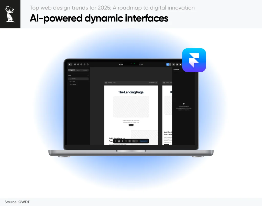
One of the defining 2025 web design trends is the rise of AI-driven interfaces that adapt to user behavior in real time. This approach goes beyond mere personalization; it creates fluid, ever-evolving layouts that reshape themselves based on browsing patterns, device type, or even regional preferences. Imagine an e-commerce store that automatically restructures its product grid when it notices a user spending more time on specific categories, streamlining the shopping experience and boosting conversions.
These modern web design trends also cut down on repetitive tasks for designers, since AI web design tools can handle layout adjustments or palette selections on the fly. As a result, brands gain a dynamic online presence that consistently reflects the latest web design trends, staying responsive and relevant in a rapidly shifting digital landscape.
2. Zero-waste digital design: Building for a greener web
Another key component of current web design trends is a focus on sustainability, specifically through zero-waste digital design. This concept emphasizes lightweight code, optimized assets, and carbon-neutral hosting solutions to minimize environmental impact.
With the latest web design trends increasingly highlighting green practices, search engines are taking note, rewarding eco-conscious sites with higher visibility. This mindful approach also resonates with user expectations, as eco-friendly practices often translate into faster load times and smoother navigation. By prioritizing zero-waste principles, designers can balance performance, aesthetics, and environmental responsibility all at once.
3. AR-driven storytelling: Bridging digital and physical worlds
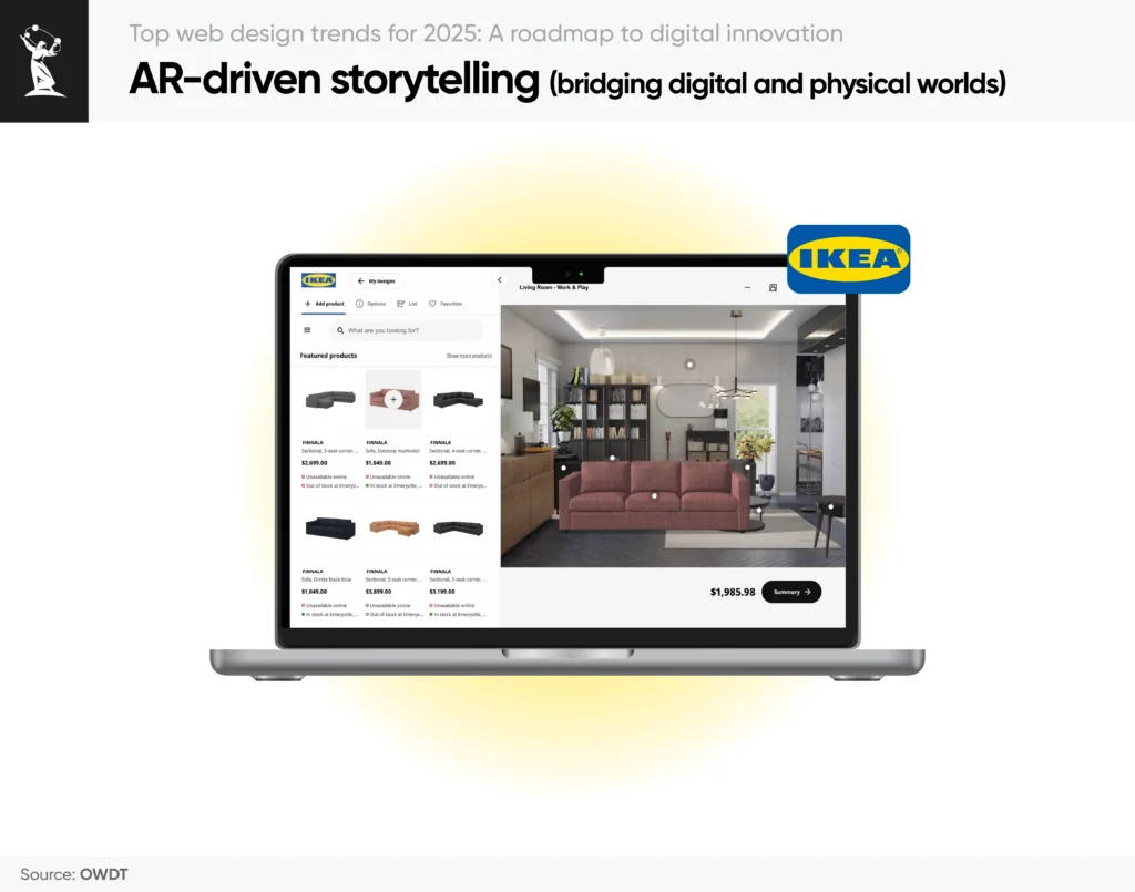
Augmented Reality continues to refine modern web design trends by weaving interactive experiences directly into responsive layouts. Think of a travel website that lets visitors explore a 3D model of a famous landmark, simply by moving their smartphone around. This level of immersion transforms static storytelling into an active, hands-on journey, heightening user engagement and emotional connection.
As AR technology matures, it’s no longer limited to gaming or retail try-ons; product demonstrations, virtual tours, and interactive narratives are becoming common features in the latest web design trends. By incorporating AR seamlessly into site design—ensuring it scales well across devices—designers can deliver memorable experiences that bridge the gap between digital and real-world interaction.
For designers, this means mastering tools like Unity and WebXR to create seamless, browser-based AR experiences. AR and VR in marketing, it’s a conversion goldmine: AR users spend 3x longer on product pages and exhibit 70% higher purchase intent.
4. Neo-brutalism 2.0: Raw aesthetics with purpose
Among the 2025 web design trends, Neo-Brutalism 2.0 stands out for combining bold, raw aesthetics with inclusive user experiences. Drawing inspiration from its 20th-century predecessor, this style leverages stark typography, minimal color schemes, and asymmetrical grids. Yet, it incorporates modern enhancements like subtle animations and WCAG 2.2 compliance for improved website accessibility.
This trend appeals to Gen Z audiences craving authenticity, while its lightweight code aligns with zero-waste principles. Designers use frameworks like Tailwind CSS to maintain visual chaos without sacrificing performance.
5. Voice-first navigation: Designing for the post-screen era
Voice search is no longer a novelty—it’s a cornerstone of modern user behavior. Recent statistics indicate that 50% of U.S. adults now use voice search daily, with 71% preferring voice queries over typing for speed and convenience. Experts project that by 2025, 30% of all web searches will be conducted via voice, driven by smart speakers and voice-optimized mobile interfaces.
For example, brands like Domino’s now let users order pizza through voice commands on their website, while news platforms like NPR offer audio summaries tailored for voice-first users. Local businesses are particularly impacted: 58% of consumers use voice search to find nearby services (e.g., “hair salons open now near me”), emphasizing the need for localized SEO and conversational content.
Designers are adopting tools like Google’s Dialogflow and Amazon Lex to build intuitive voice-responsive interfaces, while marketers optimize for long-tail, natural-language queries to enhance voice search SEO. By prioritizing these features, creators not only make digital experiences more convenient and inclusive—particularly for those with accessibility needs, but also stay ahead of the latest web design trends shaping how information is accessed and shared.
6. Decentralized web experiences
Blockchain technology is reshaping current web design trends by enabling decentralized web experiences where data is distributed instead of controlled by a single entity. Beyond cryptocurrency hype, this innovation allows user-owned data portals, token-based memberships, and transparent transaction histories.
Functional web design principles, where every visual element serves a clear purpose, performance is prioritized, and user journeys are distilled to their essentials, ensure that these complex, distributed systems remain intuitive and fast. Imagine a social platform where users truly own their content and earn tokens for engagement, or a professional community where skills are verified via immutable ledgers.
By removing reliance on centralized servers and pairing that architecture with functional, purpose-driven interfaces, sites become more resilient, safeguarding user information and fostering trust through transparency. As these platforms evolve, they challenge traditional norms of both architecture and interaction, steering the latest web design trends toward a secure, community-driven, and highly usable digital environment.
7. Emotion-driven design: Websites that “Feel”
Emotion-driven design represents a ground-breaking addition to 2025 web design trends, leveraging AI to interpret user emotions from real-time cues like facial expressions, voice tone, or typing speed.
Picture a meditation app that detects user stress levels and immediately adjusts the color scheme and content to create a soothing experience. By aligning site elements with a visitor’s emotional state, designers can deliver hyper-personalized interfaces that enhance engagement and retention. This cutting-edge technique paves the way for more empathetic digital interactions, where interfaces aren’t just reactive but proactively cater to user well-being.
As the technology behind emotion detection becomes more refined, it’s poised to define modern web design trends that highlight genuine human connections—offering unprecedented levels of interactivity and user satisfaction.
8. Custom illustrations: Where art meets AI
Custom illustrations and digital arts in 2025 are no longer static—they’re dynamic, adaptive, and deeply integrated with AI tools.
- AI-Assisted Organic Asymmetry
Designers now use tools like Adobe Firefly and MidJourney to generate fluid, asymmetrical shapes that mimic natural patterns. - Imperfections with Intent
Hand-drawn textures and “glitch art” dominate, with platforms like Procreate introducing AI brushes that replicate analog imperfections. Spotify’s playlist artwork, for example, uses uneven strokes to evoke raw, human creativity. - Y2K Revival 2.0
Retro aesthetics return with holographic gradients and 3D-rendered pixel art. Fashion e-commerce site ASOS uses Y2K-inspired 3D avatars to let users “try on” virtual outfits in AR. - Interactive 3D Storytelling
Brands like Nike now embed 3D illustrations users can rotate, zoom, or disassemble. Their sneaker product pages let shoppers explore sole designs layer-by-layer, boosting engagement by 50%.
Take Action
Learn more about our digital agency and options available to you, or contact our specialists to discuss how we can realize your vision.
9. Full-page headers
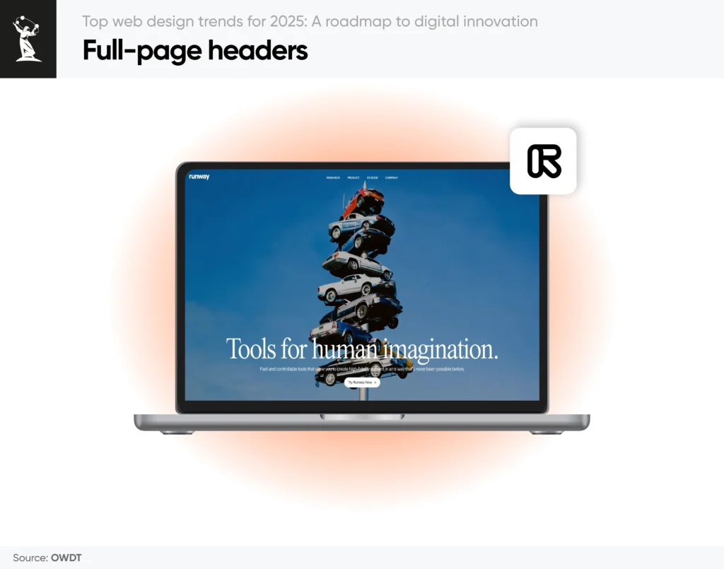
Full-page headers are reclaiming prominence in modern web design trends for 2025, setting the tone and atmosphere from the moment users land on a site. By spanning the full height of the screen, they create instant impact and encourage users to delve deeper.
- Brand-Centric Visuals
Large-scale imagery or animated brand motifs can strengthen identity, especially when paired with slight parallax effects or AR-driven overlays. These dynamic headers become both a statement piece and an interactive gateway. - Integrated Navigation
While impactful visuals remain a priority, clear navigation is crucial for a frictionless user journey. Voice-first or AI-driven menus can be embedded seamlessly in the header, ensuring users can quickly locate relevant content without losing the dramatic visual effect. - Bold Typography & CTAs
Taking cues from the latest web design trends, big, expressive fonts and succinct calls to action can stand out against the backdrop. Coupled with minimal but deliberate text, full-page headers can convert casual browsers into engaged visitors in moments. - Immersive Media
High-resolution videos or interactive 3D models can fill the entire header space, offering an immersive preview of a product or storyline. As video compression and streaming technologies improve, load times remain efficient, ensuring a smooth experience that doesn’t compromise performance.
10. Dark mode: Beyond aesthetic
Dark mode in 2025 is smarter, adaptive, and essential for inclusivity.
- Context-Aware Dark Themes
Apps like Slack now adjust dark mode contrast based on ambient light sensors, reducing eye strain. - Energy-Saving Modes
Dark mode reduces screen energy consumption on OLED/AMOLED devices, making it a sustainable choice for mobile-first users. - Customizable Palettes
Users can tweak dark mode hues via browser settings. GitHub’s new “Midnight Graphite” theme offers six adjustable darkness levels.
11. Color trends: Emotion & ethics
2025’s palettes balance psychological impact with eco-conscious choices.
- Biophilic Color Schemes
Nature-inspired hues like forest greens, ocean blues, and earthy browns dominate wellness and sustainability-focused brands. These tones evoke calmness and connection, catering to audiences prioritizing mental health and eco-awareness. - Carbon-Neutral Neutrals
Pantone’s 2025 “Earthen Silence” (a muted clay tone) dominates sustainable brands, symbolizing eco-awareness. Designers opt for low-impact dyes and digital palettes that reflect eco-conscious values, resonating with brands committed to reducing their environmental footprint. - Dynamic Brand Gradients
Fluid gradients now respond to user interactions, shifting hues as visitors scroll or click. This trend adds depth to minimalist designs while subtly guiding attention to key content. - High-Contrast Accessibility
WCAG 3.0-compliant palettes prioritize readability without sacrificing style. Bold contrasts between text and backgrounds ensure inclusivity, particularly for users with visual impairments.
Discover advanced techniques and best practices in our guide on optimizing color in digital design.
The future of web design: What’s coming next?
The future of web design is poised to push the boundaries of creativity and functionality even further. As 2025 web design trends continue to evolve, we’re seeing a clear shift toward more immersive, personalized, and intelligent experiences, spurred on in part by advancements in marketing artificial intelligence that enable deeper insights into user behavior. Modern web design trends now prioritize fluid interactivity and seamless integration of technology, ensuring that each digital encounter is both engaging and efficient.
Looking ahead, current web design trends indicate a deeper fusion of AI, augmented reality, and decentralized frameworks. Websites will not only react to user behavior in real time but also predict needs, create adaptive content, and foster genuine connections. With voice-first navigation, interactive storytelling, and emotion-driven interfaces becoming standard, the latest web design trends are set to transform digital landscapes into truly dynamic ecosystems, especially as AI and SEO converge to deliver more precise, data-driven optimizations.
Ultimately, what’s coming next is a web that feels more human—responsive, empathetic, and intuitive. As innovative tools and methodologies continue to emerge, the future of web design promises a more connected, sustainable, and user-centric digital world.
Consult OWDT for your web development projects
As a leading web design company, OWDT specializes in crafting visually captivating and user-friendly websites that merge aesthetic excellence with high-performance functionality. Our seasoned team of developers, designers, marketers, and SEO specialists also offers comprehensive SEO services to ensure that your brand stands out in a competitive digital landscape. Our awards and testimonials speak volumes about our commitment to quality and innovation, and our clients continue to thrive with the guidance and 24/7 support that OWDT consistently delivers.