Trident
Reassuring brand coverage
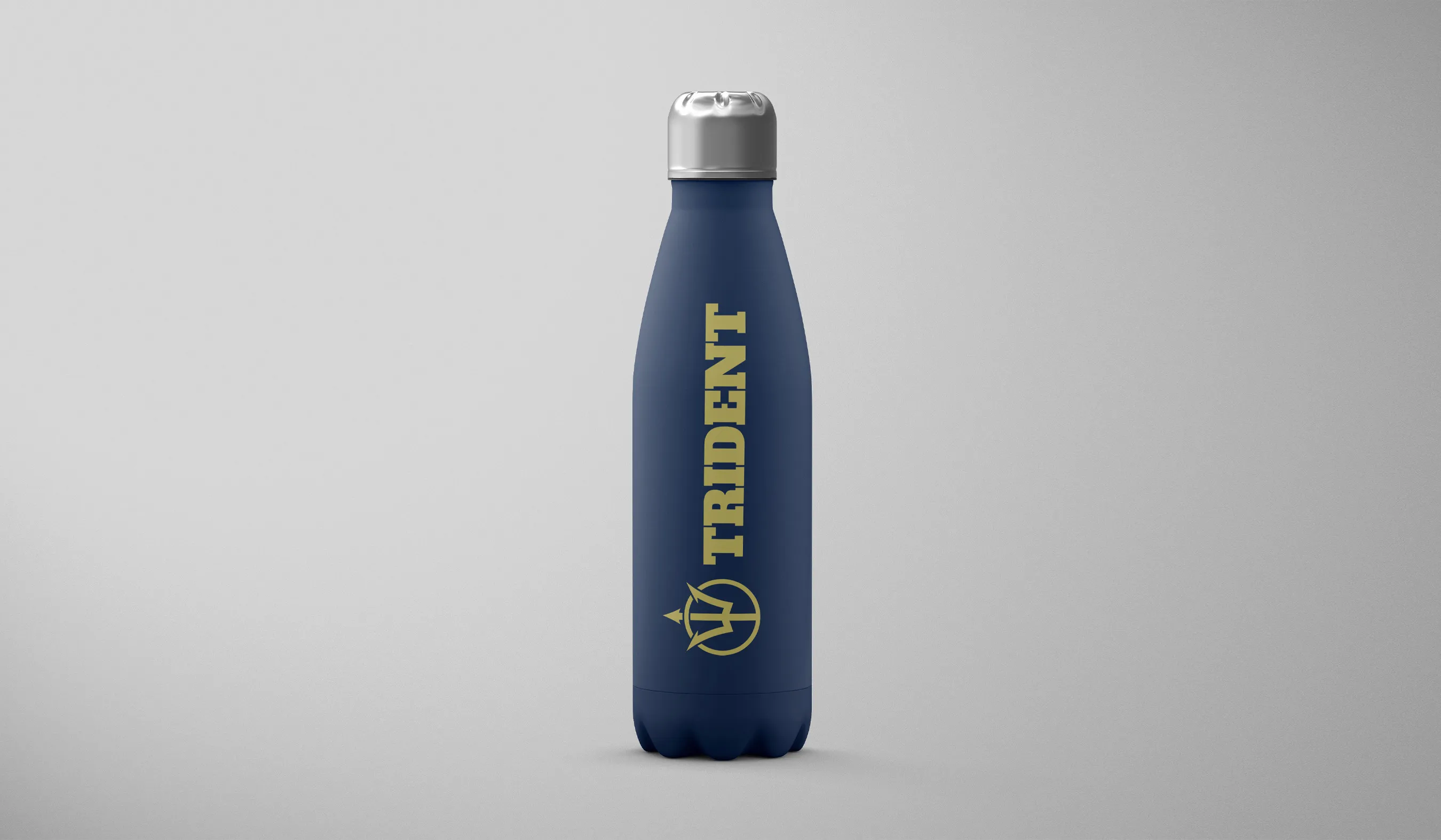
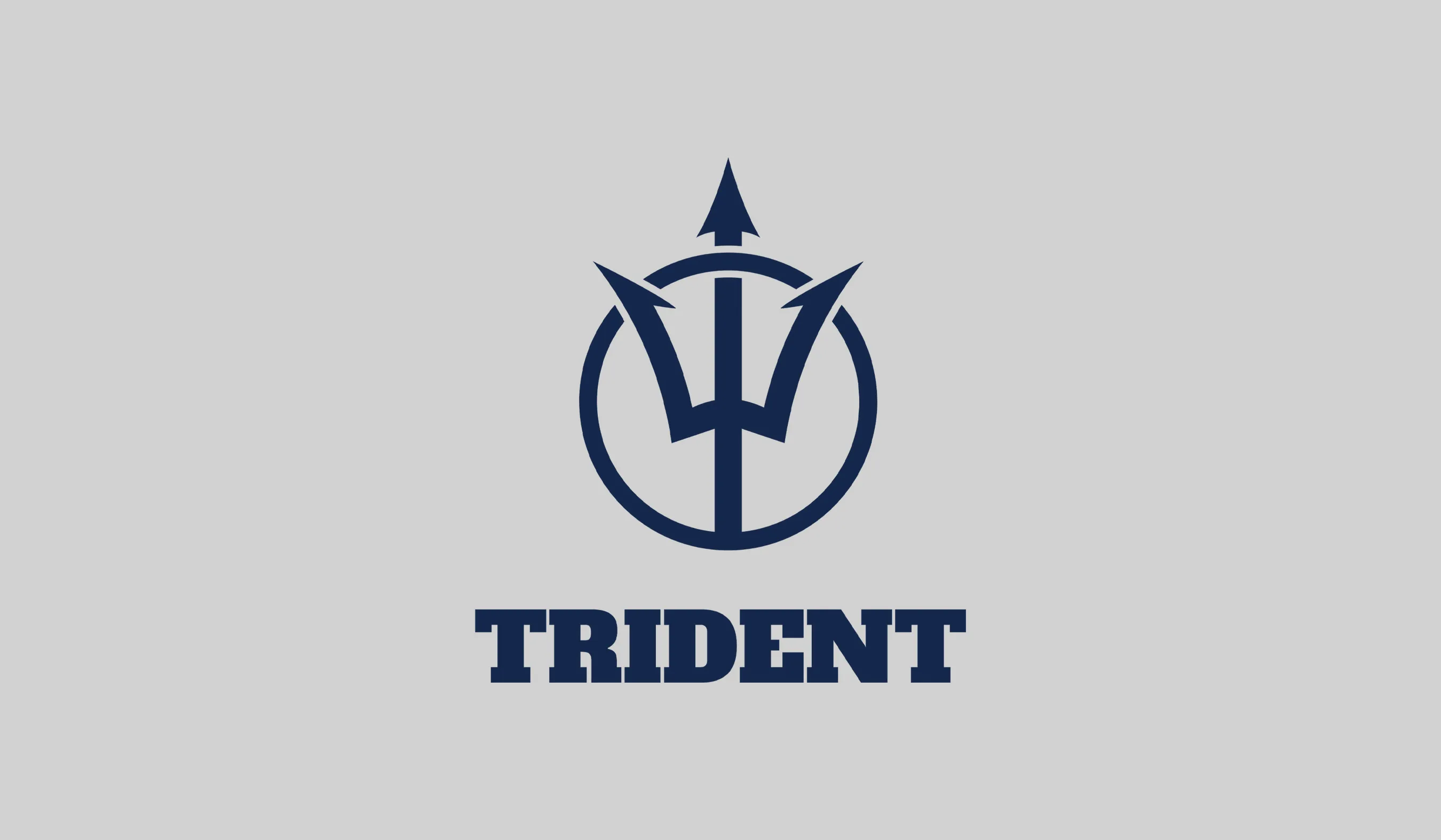
OWDT created a spirited brand identity for Trident, helping it stand out in a crowded marketplace while reassuring brand coverage.
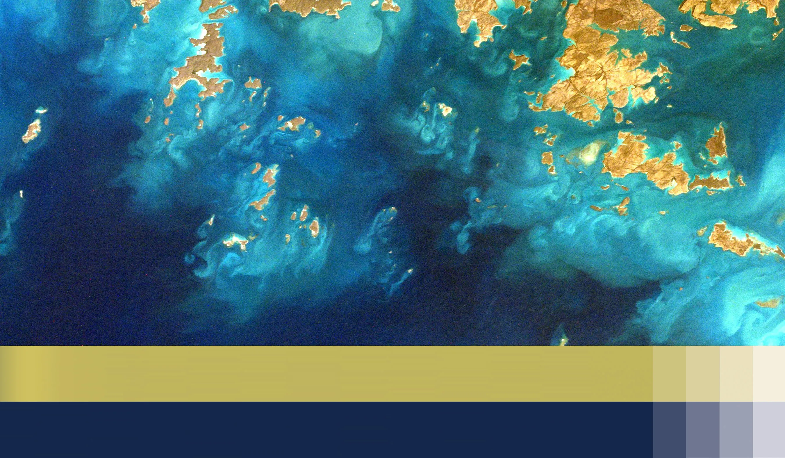
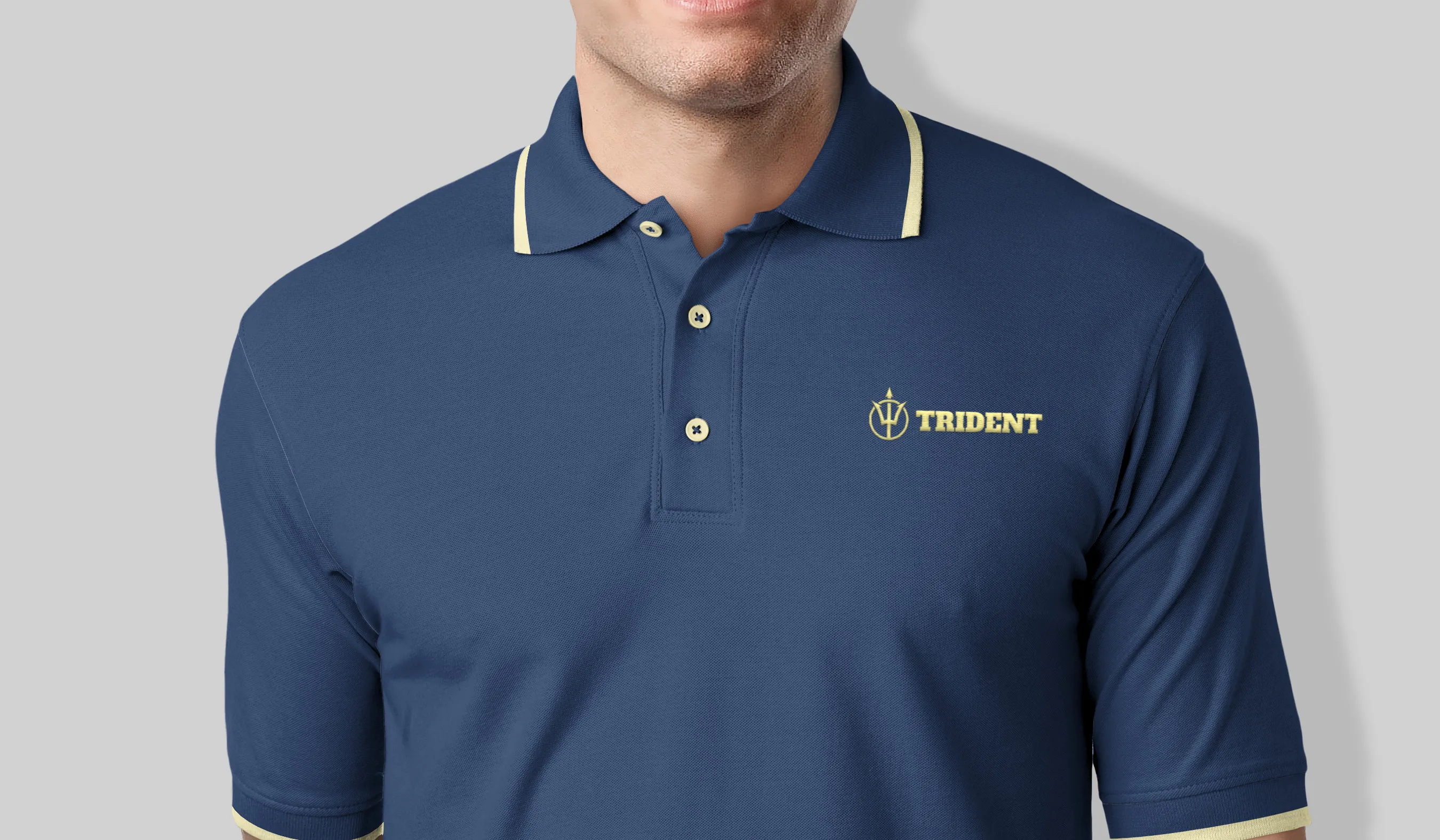
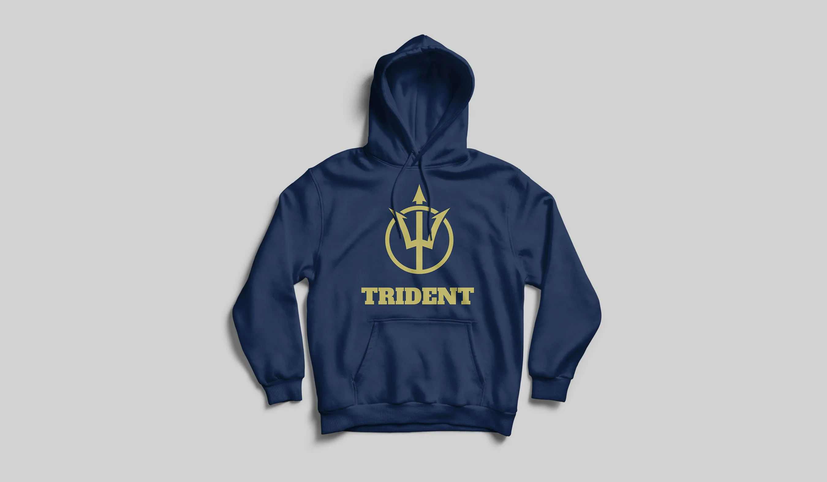
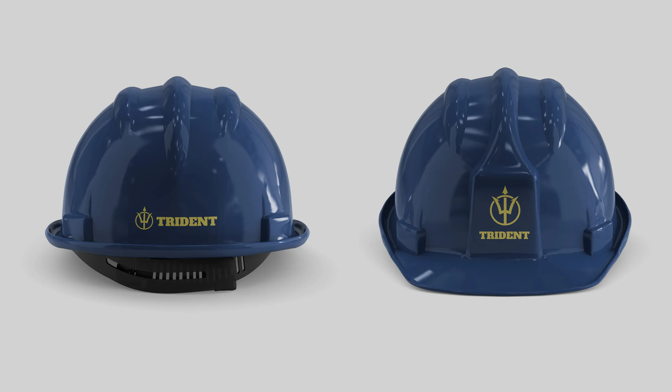
The first goal was to work on the trident iconic figure but calibrate the design to extract a unique expression that can separate itself from other brands that hold a similar visual presentation. For that, we selected a unique and confident typeface to feature the wordmark. Furthermore, we chose the bold color palette of navy blue and gold, a selection inspired by the thirty thousand feet view of uninterrupted seashores. Using the aforementioned color rationale, we enabled Trident to imply the high coverage level of its EPC services.
Client Goals
Stand Out in a Crowded Marketplace
Unique Expression
Imply Confidence
Increase Conversion
Covering Capacity
Bold Impression
We use the medium of web design and the principles that govern our psychology to deliberately evoke a sensory effect, persuading users to take specific actions that benefit them.
Our goal is to cultivate a multilayered communication that speaks to the responsive faculties of our being by using the domains and disciplines within content and design.


