JD Tactical
Penetrating a Competitive Landscape
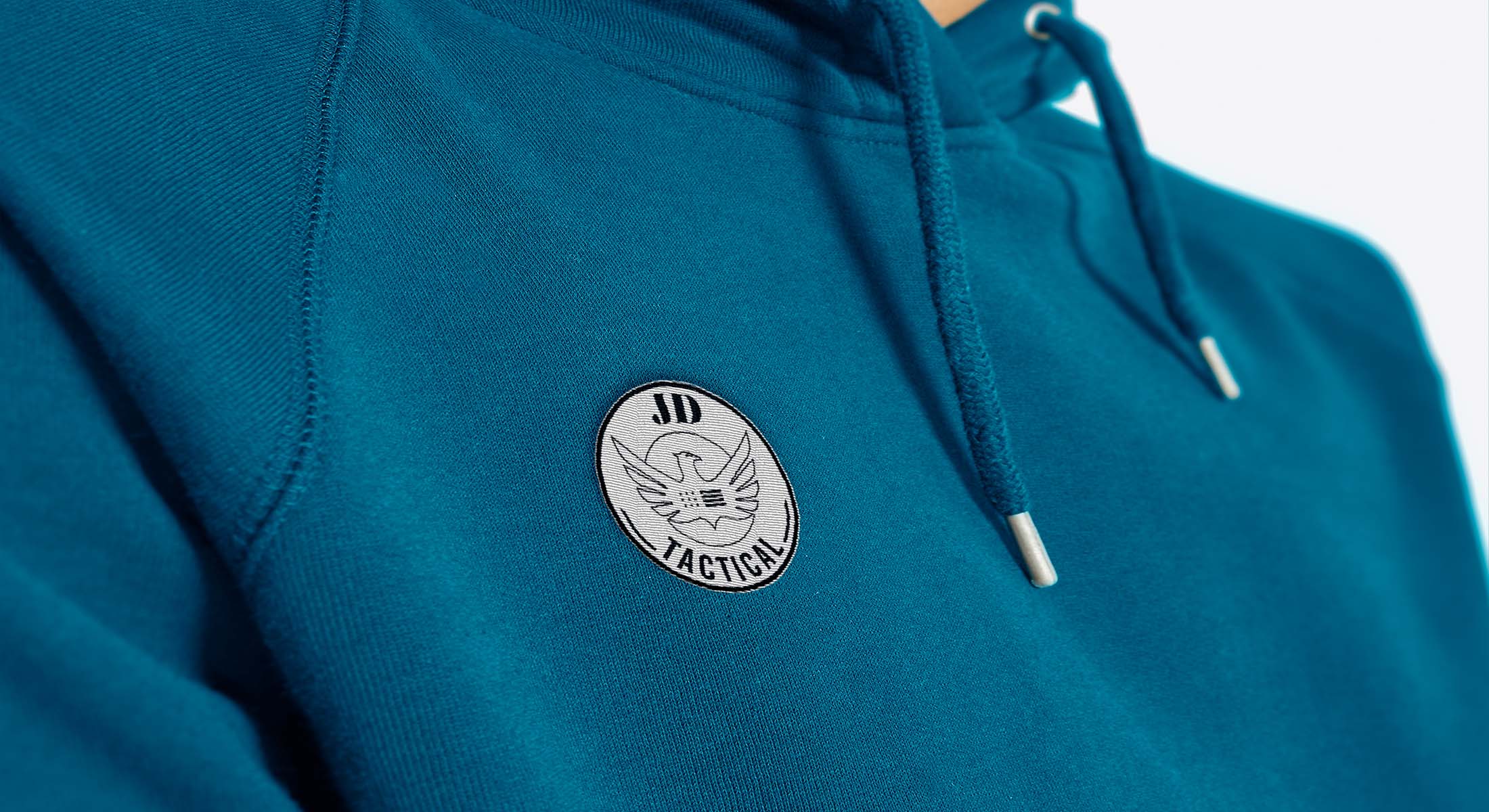
OWDT has developed a new brand identity for JD TACTICAL that reflects its culture, long history, and wide range of products. The new identity needed to provide JDT with a brand that reflected its ambitions; to increase the impact and improve relevance aimed at a saturated market segment.
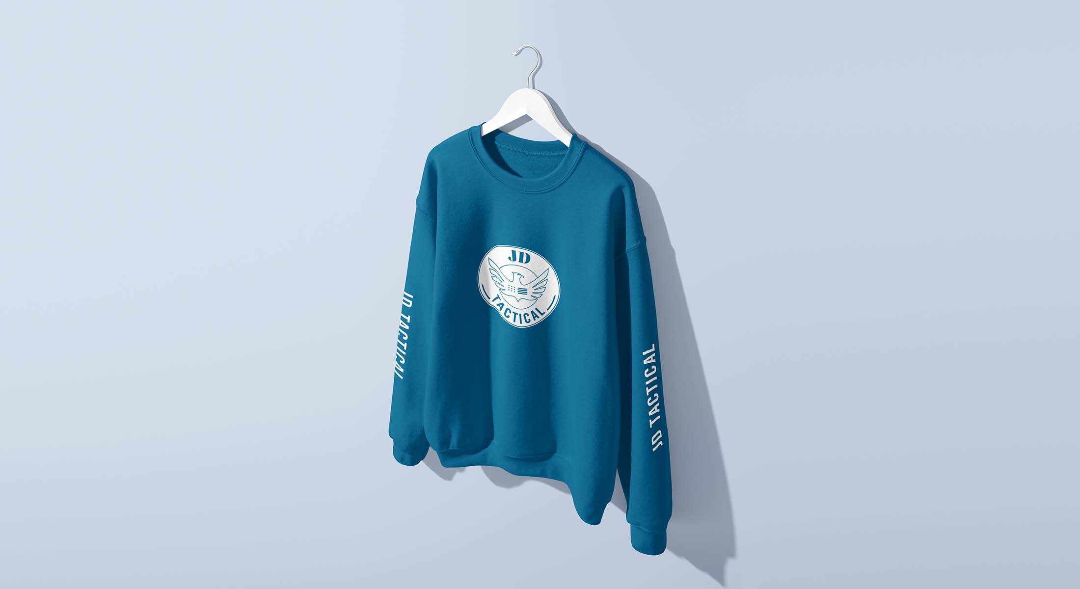
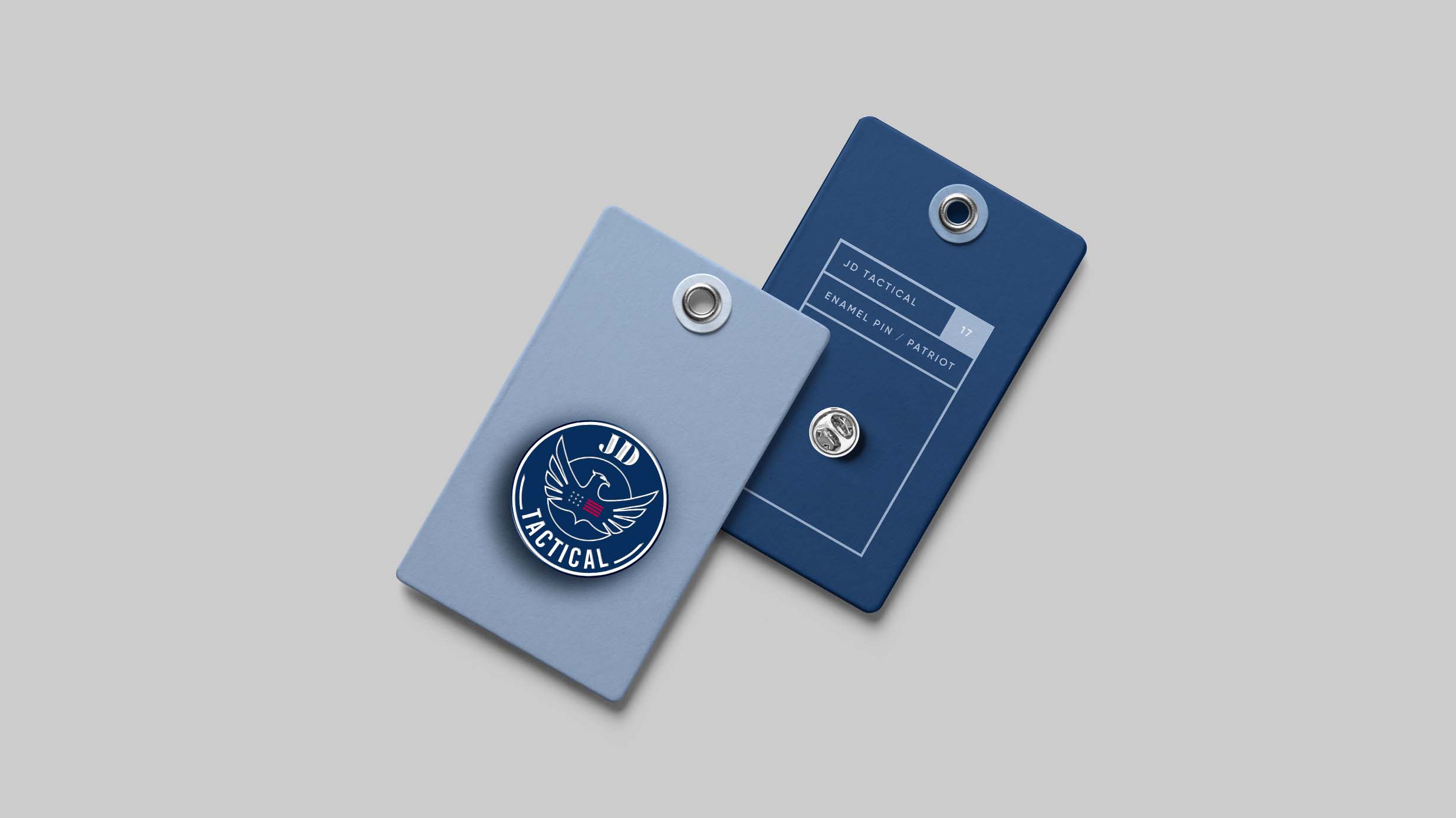
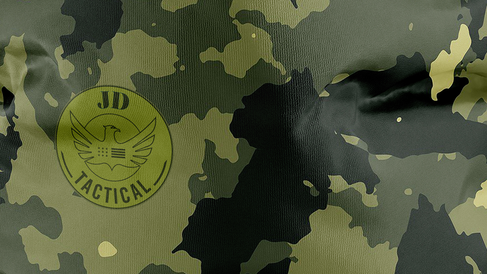
The new logo’s simple line art allows it to be used effortlessly over busy backgrounds as well as more challenging applications such as die-cutting and embossing. When used at scale, the logo has impact and clarity over complex backgrounds such as the store window and yet can look incredibly simple.
The confident color palette uses teal blue alongside black and white. We chose a vibrant color palette to distinguish JDT from its competitors. We used the primary color throughout and paid careful attention to ensure the final colors were politically neutral.
Client Goals
Reflected its Ambitions
Increase the Impact
Improve Relevance
Revitalize the Brand
Modernizing the Brand Identity
Cover Waider Range of Products


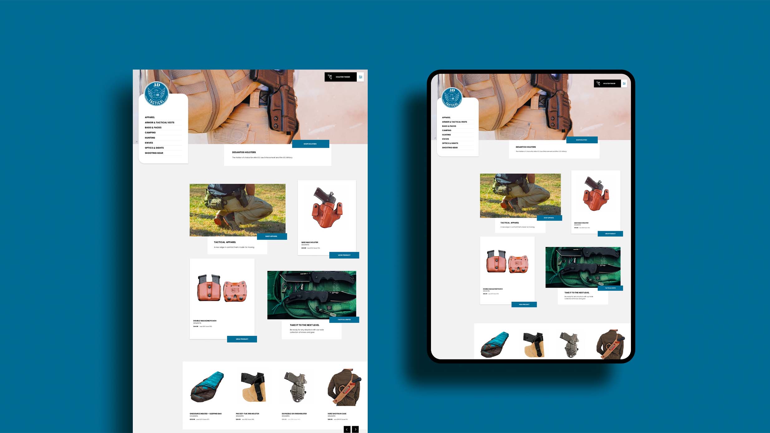
We use the medium of web design and the principles that govern our psychology to deliberately evoke a sensory effect, persuading users to take specific actions that benefit them.
Our goal is to cultivate a multilayered communication that speaks to the responsive faculties of our being by using the domains and disciplines within content and design.


